PIVOT TABLES
A pivot table is a data analysis technique used to summarize large datasets and answer questions about the data. It is available in spreadsheet applications such as Microsoft Excel and Google Sheets. Pivot tables are designed to extract meaning from a seemingly multitudinous clutter of numbers on the screen. And more specifically, it allows the grouping of data in different ways so one can easily draw helpful conclusions.
It is termed a pivot table because you can turn around the data in the table at any angle that deems fit to view depending on the viewer’s perspective. There is no addition or subtraction from the data when creating a pivot table but rather entails the reorganization of data to reveal the needed information as being sort after.
Though might seem cumbersome to create without any data analytical background due to the technicalities of creating one, it is easy to learn how to create it in a short period and begin to work with it for all of its benefits.
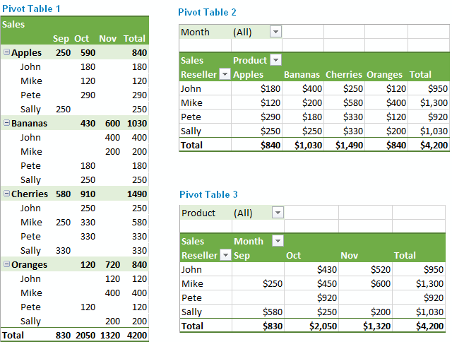
There are many uses for pivot tables or scenarios that require the use of pivot tables and some of these are;
- Present large amounts of data in a user-friendly way.
- Summarize data by categories and subcategories.
- Filter, group, sort and conditionally format different subsets of data so that you can focus on the most relevant information.
- Rotate rows to columns or columns to rows (which is called “pivoting”) to view different summaries of the source data.
- Subtotal and aggregate numeric data in the spreadsheet.
- Expand or collapse the levels of data and drill down to see the details behind any total.
- Present concise and attractive online of your data or printed reports.
SANKEY VISUALIZATIONS
By Emmanuel Mattey
A Sankey chart/visualization is the type that provides an overview of the flows in a system, such as movements, cost, energy or materials, or in advertising, the customer journey. Elements within the chart are represented with rectangles and texts from a source with links represented by arrows or arcs that have a width proportional to the importance of the flow to a corresponding destination.
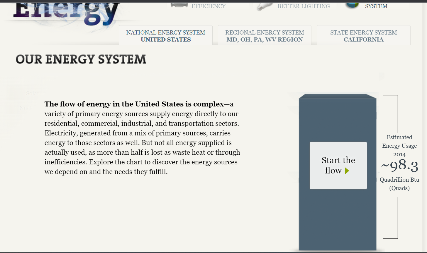
The National Academies of Sciences, Engineering and Medicine displayed Our Energy System using a Sankey chart/visualization which gives simply but detailed information on the energy sources/generation and the respective entities that use the energy in proportions and the overall useful and unused energy.
The site initially gives an overview of the energy situation and the respective end-users who make up the total. It also has tabs that lead to other important sources for more information on the subject as shown in the image below.
By clicking on the “start the flow” button, it displayed the chart with the sources of energy through to the respective users and the overall usage. The chart did not make much sense to me when it first opened but upon careful study and navigation, I got the concept and how it depicts the information therein. At the click of every button comes a pop-up containing (shown in the images below) information that gives the audience a better understanding of the concept/chart.
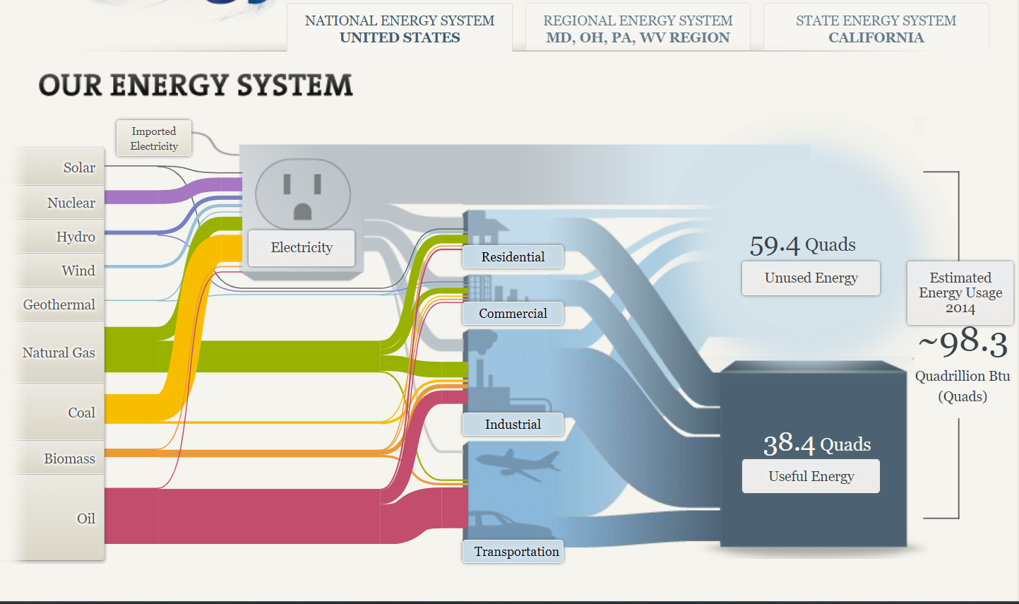
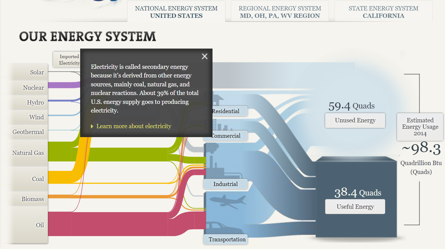
A Sankey chart/visualization is a great way of displaying information in a flow format. However, it does not readily make sense until carefully studied due to the complex look/nature with arrows/arcs crossing. It is therefore advisable to not over-clutter the figure and if possible ignore all weak connections.
PIE CHART – A PERFECT USE CASE
A pie chart is a graphical representation technique that displays data in a circular-shaped graph. A pie chart best suits the parts-to-whole relationship for categorical or nominal or proportional data which sums up to a whole, mostly 100% or 1. Due to its unique display of data, it is better to not use so many data points in order to keep it simple and attractive. Often time, people use large amounts of data points which displays a crowded chart with many points of less significance making the chart not relatable or difficult to analyze.
make sense to show a parts-to-whole relationship for categorical or nominal data. The slices in the pie typically represent percentages of the total.
Pie charts should be considered when the data possesses the following,
- Few components
- No time representation
- Distinct parts
- Easy visualization
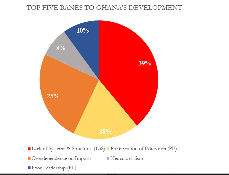
Figure 1.00 is a simple display of data on a pie chart. It has fewer data point and the total of the proportions sums up to 100%.
Though the data as presented in figure 1.00 can be presented in a column chart and would make sense just as the pie chart, I would still prefer the use of the pie as it is more engaging compared to a column chart. Figure 1.01 below show a column chart of the same data as in figure 1.00. Though simple, audience will naturally not be able to tell the proportions of each column or what the total is so in this case I will prefer to use the pie chart for much convenience and easy visualization.
There are some few design tips to consider when designing a pie chart and some of these are;
- Avoid using 3-D designs
- Use colors that match your data
- Avoid too many slices
- Use presentable fonts
- And many more…
Benchmarking
By Emmanuel Mattey
A benchmark is used to display relative performance and allows readers to compare data. Benchmarking is typically useful when you want to compare the performance against a certain average or a certain standard.
For example, the graph below compares winter temperatures in the US from the 1900s to 2018 to the 20th century average temperature. The graph shows that on average, US winters are getting warmer
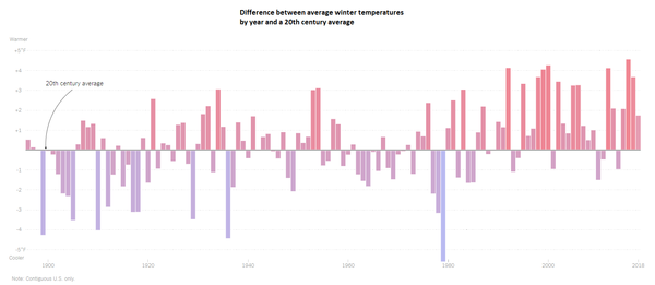
Source https://www.nytimes.com/2019/01/17/learning/whats-going-on-in-this-graph-jan-23-2019.html
The second graph also shows that oceans are generally getting warmer. It also shows both deep and shallow ocean warming and it demonstrates that the shallow part of the ocean, that is the portion of the ocean closest to the surface is heating up at a faster rate than the deeper part of the ocean.
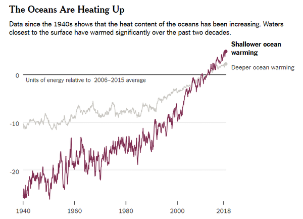
Source: https://www.nytimes.com/2019/01/10/climate/ocean-warming-climate-change.html
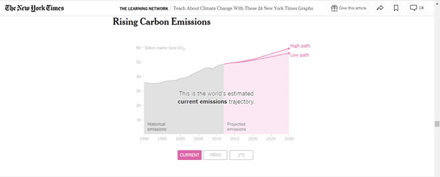
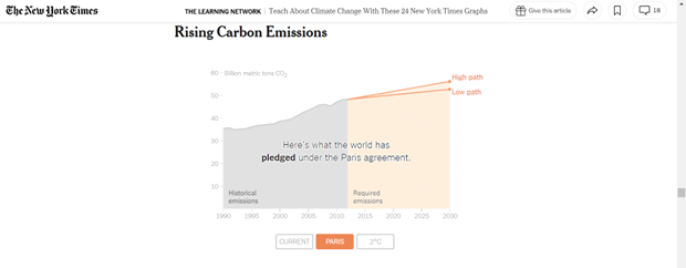
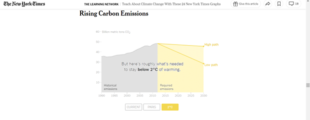
The final 3 graphs discuss global carbon emissions. In the first infographic, we see past emissions and projected global emissions. The second infographic compares historical emissions with the pledges that were made under the Paris agreement on climate change and the third one shows what actually needs to be done to keep global warming under 2 degrees by 2030. By comparing all 3 graphs, one will notice that both the Paris agreement and the projected emissions contain higher emission levels and this means that by 2030, global warming would have exceeded 2 degrees Celsius and the impact of global warming and climate change will get worse.