Pivot Tables
Pivot tables are very user friendly. You do not need to be an expert in Microsoft Excel in order to create one. Pivot tables summarize large amounts of data and automatically sort and count the data and display it in a table. It allows you to convert rows into columns and columns into rows. They make it very easy to find patterns within your data. You can analyze your data in numerous ways with just a few clicks of a button. Pivot tables sort your information in different ways which allows you to get insight about your data that might not have been so obvious in a different type of table.
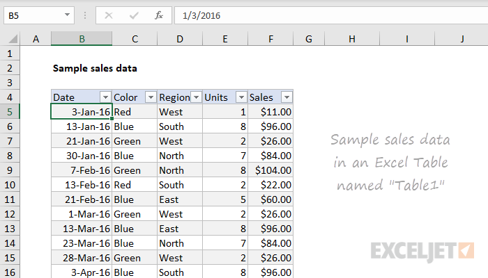
Here is an example data set that we will look at as a pivot table. We have lots of data that is being displayed here: dates, color, region, units and sales. This is a lot to look at and comprehend in just one table, so we are going to look at it in a pivot table and it’ll be more understandable and appealing.
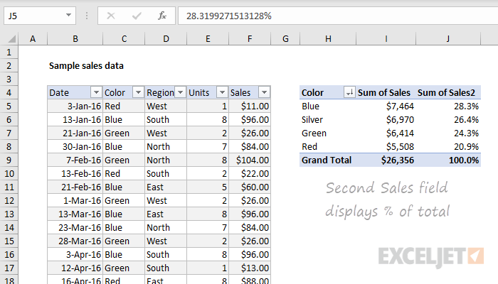
Here, we see a pivot table on the right summarizing the sum of sales by color. It looks better then the chart on the right because we are just looking at colors rather than dates and regions, but we are able to look at this data as well.
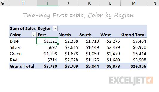
Now, this is a good pivot table. We can look at the sum of sales per region and by color. This one table shows us lots of information here that we can interpret. And if you click on the drop down bar next to “Region”, it will change our table to be “Sum of Sales per Date”. This is why pivot tables are great. You can display certain information at a time, or all of your information at once.
Pivot tables allow you to focus in on specific information, or look at the whole picture. Some people may be overwhelmed by looking at the very first picture and all of that information. But, by turning this information into a pivot table, we can focus on specific data in our table and we are simply able to change to other data with an easy click of the drop down bar and changing it to what we would like to see. Pivot tables are easy to read, easy to create and easy to use.
Pictures from: https://exceljet.net/articles/excel-pivot-tables
Sankey
This Sankey Visualization is in interaction visualization that shows how our energy system works in the US and how how it is used throughout the company. This tool is a great way to display this type of information. Being that it is interactive, you are able to click your way through and learn about the Energy System.
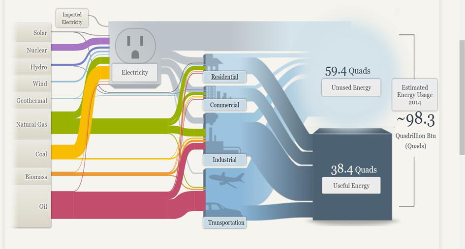
The column on the left side is interactive and shows information bases off of each tabs topic. Depending on which tab you click on, the information is unique that that tab and shows different numbers and links to the column in the middle. This shows which tabs down the left are connected to the tabs down the middle. While clicking through all the tabs, little blurbs pop up explaining each tab and the number in detail.
Sankey Visualizations are great tools to use to display this type of data such as how things work, and how subcategories of certain topics are linked to each other and all equate to one thing. Sankey Visualizations show how a topic’s information can relate to other topics that show the general idea of something. I think they are very easy and simple to follow. They are also not overwhelming to look at because there is information hidden in each tab with a link to explain the information in more detail.
Pie Charts
Pie charts are great for displaying percentages or parts of a whole when it comes to data. Most likely, pie charts will be used when its based off of a percentage of 100. For example, I created a pie chart to present the household pets in New Jersey. Below you can see that of the households in New Jersey that have pets, we are looking at whether they have dogs, cats, or another kind of pet. Just by examining the chart we can see that the majority of households have some other kind of pet that is not a dog or cat. Then we see that the next biggest is dog, then cat.
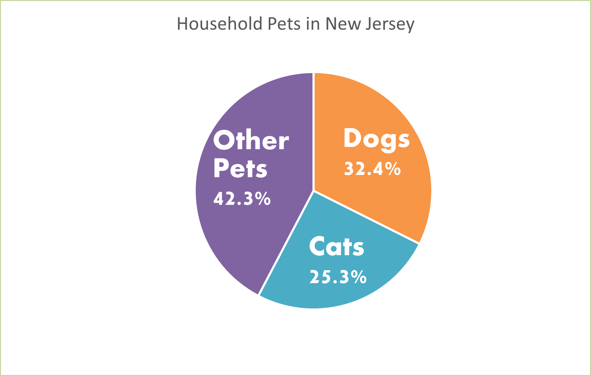
This information could also be displayed as a bar graph. We could have separate bars for each category but instead of using the percentages, we would use the real number of how many pets in each household rather than the percentage of each different pet in households. But since the numbers are very similar, I think that the pie chart is the best because it is showing percentages of each type of pet.
Pie charts are very easy to make on Microsoft Excel. You can make them unique by changing the color and style of them by making them 3d. You can add a legend and add the percentages to your chart as well. I like to add the percentages to my pie charts so your readers know what they are looking at and exactly what number is being displayed. Don’t forget when you create your pie charts to add titles and labels so your readers know what the pie chart is displaying.
Lollipop Charts
Bar charts are very boring when it comes to displaying data. We see them being used all of the time. They are very simple and easy to create but are not very eye catching. Lollipop charts are much more visually appealing and fun to look at.
Lollipop charts can be used in place of a bar chart. Any information you can display in a bar chart, can be displayed in a lollipop chart. Since they are not as popular and overused like a bar chart is, you will draw in more viewers to your chart because it is more unique and attractive to look at. Here is what one may look like:
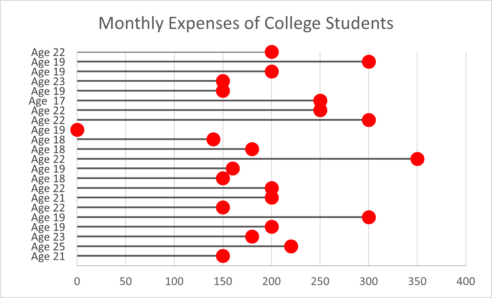
Lollipop charts can be horizontal like the one above, or vertical just like a bar chart. They are not difficult to create if you follow directions from a website or in the textbook “Effective Data Visualizations”. They are very easy to understand and a great way to display information. Next time you think of using a bar chart to display your information, remember that the lollipop can display the same information but in a fun and creative way.