Pivot Tables
By Nick Ligameri
A Pivot Table is an extremely powerful tool that Excel offers that is used to easily manipulate aggregated data. According to www.lumeer.io, “a Pivot Table is used to summarise, sort, reorganise, group, count, total or average data stored in a table. It allows us to transform columns into rows and rows into columns. It allows grouping by any field (column), and using advanced calculations on them.” I think that, for most people, Pivot Tables can be intimidating because there are a lot of uses for them. In this post, we’ll look at a couple of uses that make learning how to use Pivot Tables worth it.
Pivot Tables are useful when you have large amounts of data that you want to analyze quickly. If you are a direct-to-customer (D2C) business, you should probably learn how to utilize Pivot Tables. My wife falls into this category, as she operates a cottage food business from our home. She sells her baked goods directly to customers. A way that I am going to investigate implementing a Pivot Table specifically for her business is to see how many of which ingredients she uses each month. This can allow her to forecast how much she’ll need to buy each month. This would allow her to purchase from a supplier in bulk, vs going to the grocery store on a weekly basis. She’ll save time and money, which leads to larger profits!
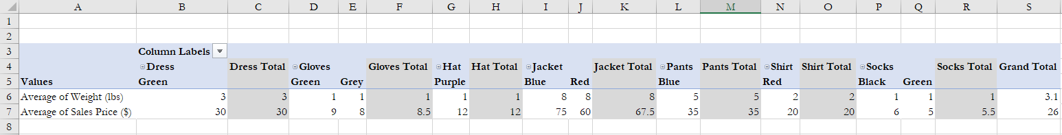
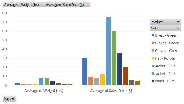
The above example I found from lido.app shows us that you can use a Pivot Table to quickly show average prices without having to create any formulas. It also organizes the data based on product information. This example breaks it down by color. You can also use Pivot Tables to quickly insert graphs based on what you need the data to tell you. Below you can see that the same data is used to create a visualization that can be used in reports.
Sankey Visualization
By Nick Ligameri
According to www.ifu.com, a Sankey diagram is a “specific type of flow diagram used for visualization of material, cost or energy flows. They show energy or mass flows with arrows proportional to the flow quantity. They have directed arrows featuring flows in a process, production system or supply chain.” Given this definition, it is easy to understand why this visualization was chosen to represent the flow of energy within our country.
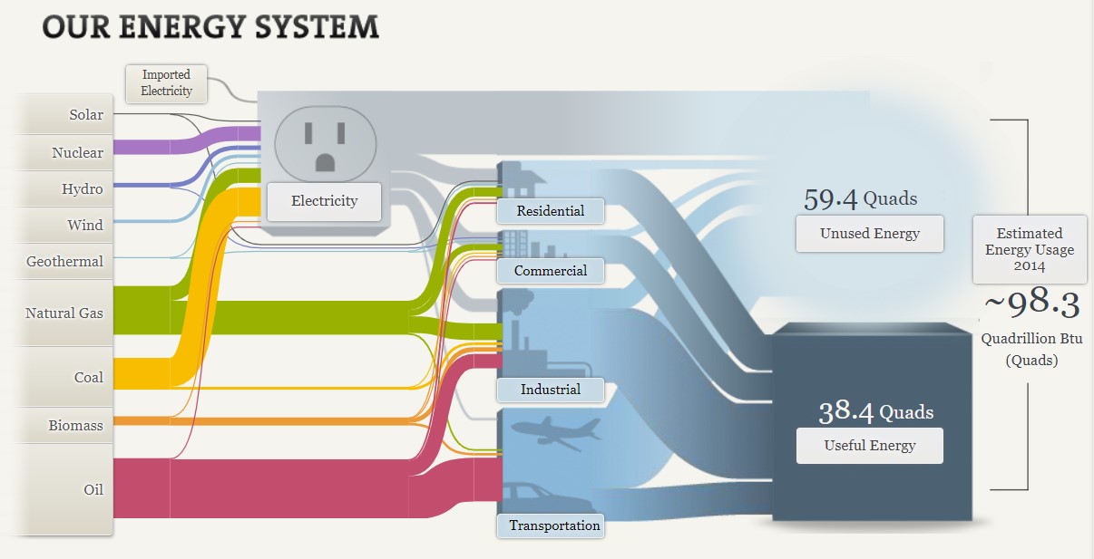
The above Sankey visualization does a wonderful job at taking a complex dataset and showing not only how much of each resource is used, but where it is used. At a glance, the visualization does seem a bit messy, but I like to think of it as organized chaos. What I like about this is that you can quickly see what resource we utilize the most and, more importantly, what industries have the most waste.
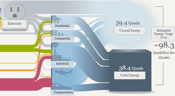
In the above image, you can see that the most waste is generated from electricity and the transportation industry. When you click on the Unused Energy button, it explains that the waste comes in the form of heat that is generated when converting energy into a different form of energy. It is striking that we produce more wasted energy than we consume. From this diagram, you can quickly determine the need to produce a more efficient energy source.

This website also shows two different energy systems besides the national system. My immediate thought was to compare these two systems. To do that, I had to click back and forth between each page. I think this tool would be even more powerful if the author could have provided an easier way to compare the two. This is even more important considering that California consumes roughly three times more energy than Maryland, Ohio, Pennsylvania, and West Virginia combined. I would want to highlight this somehow, possibly with some variation of a column or bar chart.
Overall, I feel this Sankey visualization does an effective job of communicating a complex story in a relatively simple way. The user interactions feel intuitive and lead the viewer along. This type of visualization seems like it would be difficult to learn how to build, but completely worth the effort.
The Perfect Use Pie Chart
By Nick Ligameri
When you think about charts, the pie chart is probably the first chart that comes to your mind. It is one of the most well-known types of chart. Because of this notoriety, pie charts tend to be misused. This misuse leads to pie charts getting a negative reputation. According to storytellingwithdata.com, there are two main reasons to use a pie chart. These reasons are to how a part (slice) relates to the whole (pie) and to show that one slice is larger or smaller compared to the pie.
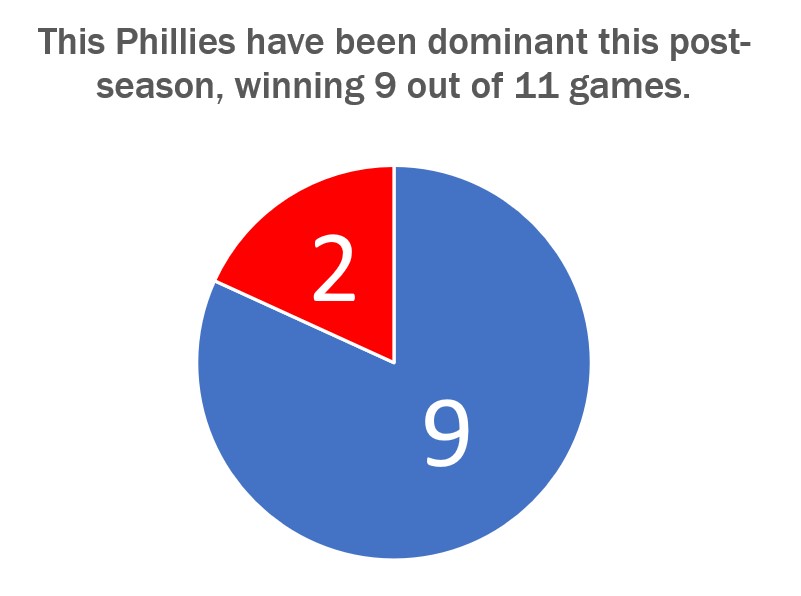
The graph shown above just so happens to convey both of these uses very well. Today, 24 October 2022, is a day after the Philadelphia Phillies won the National League Pennant and secured their spot in the World Series. I thought it would be appropriate to show how dominant the Phillies have been in the post-season. They have played eleven games so far and have won nine of them.
Storytellingwithdata.com explains that we perceive the area that a slice takes up. This pie graph shows that the Phillies’ nine wins cover most of the pie. It also shows that the Phillies are winning a high percentage of their playoff games. This is why this specific pie chart does a great job showing how the Phillies’ nine wins convey a sense of the part-to-whole relationship and is relatively large compared to their two losses.
The design of this graph was kept very simple. We are only working with two numbers so there is no need to get crazy on the design. The colors that I used were the Phillies’ colors, red and blue, for the two slices. The message I am trying to convey to the audience is that the Phillies are a dominant force right now, and this design shows this in a straightforward way. The data I used was sourced from www.baseball-reference.com. I had to click on a few links and do some basic counting and math to aggregate the data I wanted.
Go Phillies!
Benchmark Comparisons
By Nick Ligameri
Today we are going to take a look at different ways you can use infographics to show comparisons to a benchmark. According to Google, benchmarking is when you “evaluate or check (something) by comparison with a standard.” There are many benefits and reasons to benchmark. According to bbgbroker.com, benchmarking is useful because it shows you how something stacks up against competitors, improves efficiency and effectiveness, allows you to track the progress of goals and objectives, and discover new growth opportunities. The results can be used to motivate staff and hold people accountable, boost the performance of sales, and improve the quality of products.
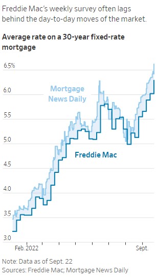
The first benchmark we are looking at is comparing Freddie Mac’s weekly mortgage rate survey compared to the actual daily mortgage rates. The Wall Street Journal utilizes line graphs to show the data. This infographic is powerful because you immediately see that Freddie Mac’s data always lags the actual mortgage rates. This is important because if you are in the market to buy a house, you want to have accurate mortgage rates. If you use old data that is up to a half percentage point off, that could lead to thousands of dollars difference in what you think you can afford compared to what you can afford.
The Wall Street Journal points out a few reasons that Freddie Mac’s data is lagging behind the actual data. One reason is that, right now, the housing market is extremely volatile. Historically, mortgage rates do not move as quickly as they are now. A weekly benchmark was usually a good measure of the market. Because the market is more volatile, there is a need for a more accurate benchmark. Another reason for the lag in data is that reported mortgage data is usually about a month behind what is happening. This is because it takes between thirty and forty-five days for a home purchase to close.
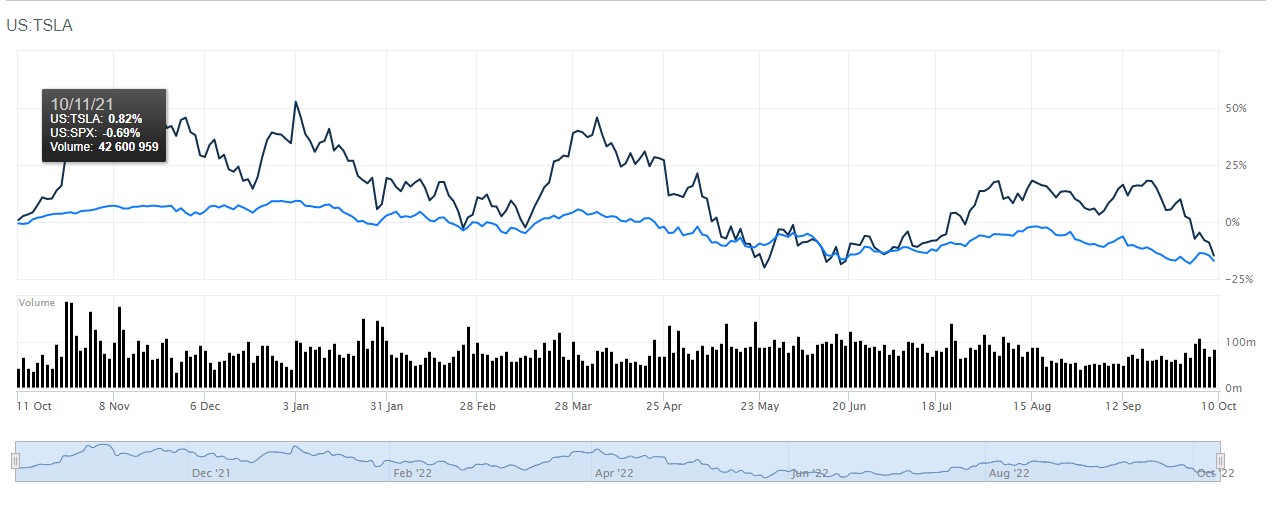
Another use of a line graph benchmark is this one that compares Tesla to the S&P 500. This is more straightforward. If you’re an investor who is looking to outperform the market, this is a useful tool. Using Barron’s comparison tool, you can see how different stocks compare to the index of your choice. You can change the range from the most recent day to all of the historical data available for the stocks you are comparing. This chart shows that, over the last year, Tesla has regularly performed better than the S&P500. Tesla may be a stock you would want to invest in.
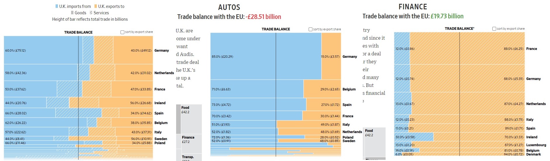
The next type of benchmark chart we will be looking at is a horizontal bar chart. This one is a bit different because instead of showing how something compares to a standard, it is showing parity between two different things: imports and exports. The “benchmark” here is the balance between the UK’s imports to the EU compared to its exports to the EU. A glance at the first chart shows that, overall, the UK imports more than it exports. A deeper dive shows how the UK imports and exports compare in different industries. The next graph shows that the UK heavily imports automobiles from different countries. The last chart shows that the UK provides a lot of financial services to the EU. The practical use of these graphs would be to show where the UK could improve its exports if it wishes to be less reliant on its neighboring countries.
There are many different ways to show a benchmark. The line chart is probably one of the most common in business. The horizontal bar chart shown here is a bit different from the norm and I liked how you can quickly understand what you are being shown. You can also gather a lot of information and make many different decisions based on how you break down the data. Hopefully, this helped show you some of the many uses of benchmark graphs.