Pivot Tables
Pivot tables are a great tool to use when able to summarize, analyze, explore, and present summary data.
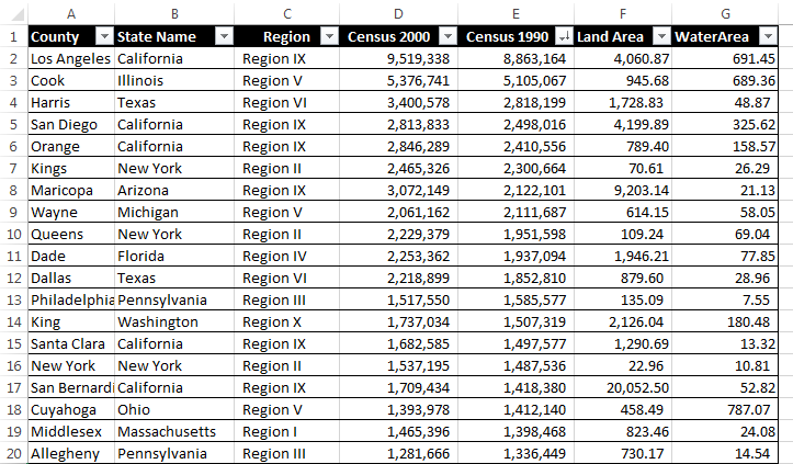
Here is an example that compares the data of 19 different state county’s based on region, two different census years and water/land area. Besides what is shown in this one image there are many different things one can do with pivot tables to express their data. Some examples include averaging, grouping by date, directional icons, and percentage of row total.
More things that can be done with pivot table can be found here.
Sankey Visualizations
With Sankey Visualizations being a technique that helps the user to displays flows within data, it is a very helpful tool when trying to string many different charts and diagrams regarding the same topic together.
While reading through the site talking about our energy system I noticed how many different pieces of information were available to me on just one of the pages. I did like how this site was formatted but there was one thing that I feel like could make the site too crowded.
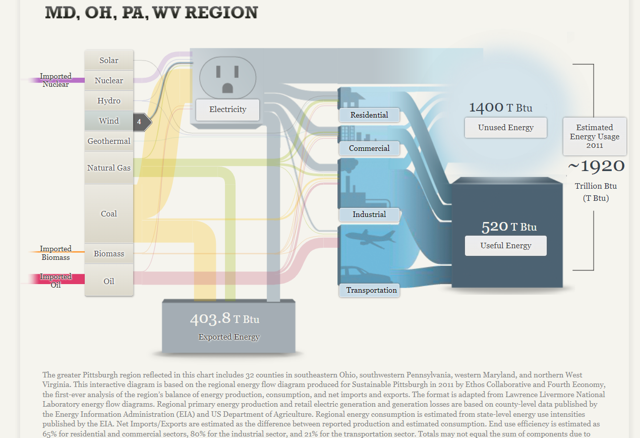
Within just this page from the complete site there are 17 different things that the reader can click on that reveal even more information to them. While I do understand that this is the information they are provide, I feel that separating it even more will help the reader not miss any points of information if they don’t click on every single tab per page.
Pie Charts
A pie chart can be an exceptional tool when trying to display the totals out of 100% compared to other kinds of charts and graphs. When using a pie chart to break down complete totals it helps the viewer visualize the 100% since the whole pie is right there and they can see the portions of it cut out relative to the percentage.
This is an example pie chart I made which breaks down the weekly phone screen time usage between a handful of apps on my phone.
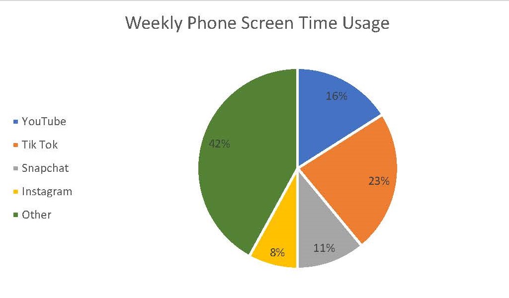
As one can see the slices very clearly show how 100% of a weeks worth of phone screen time can be broken up between these 5 subjects. One tip however for creating an effective pie chart is to limit yourself on how many slices or subjects are in the chart. If there starts to become too many then it makes it harder for the viewer to see each respective slice. In that situation than something like a bar graph will be more effective.
For more on the effectiveness of pie charts, click here.
Lollipop Chart and When to Use It
When it comes to the decision on whether or not to use a lollipop chart or a regular bar chart there are some advantages that the lollipop graph has in it’s favor.
One of these advantages being that the columns of the lollipop chart are very skinny so when dealing with charts that use high value numbers it will make the chart more appealing to the reader compared to long thick bars.
This is an example of a lollipop chart used to represent the percentage of different streaming services used among the 34% of streaming viewers.
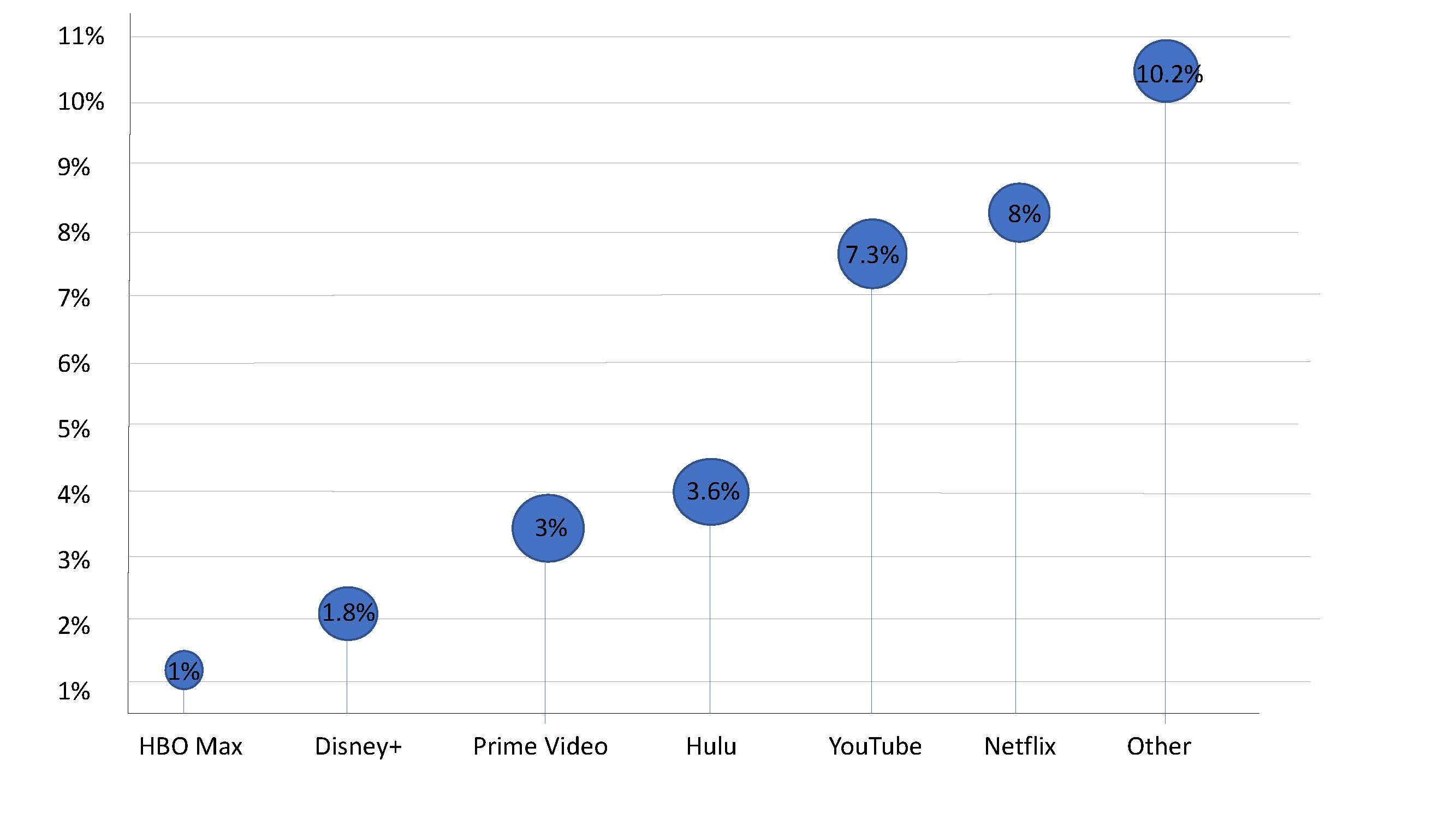
As you can see the stick of the lollipop chart takes up very little room and makes it easier to highlight the top of the lollipop that displays the exact percentages.
For more information on lollipop charts visit here.