Pivot Tables
Pivot tables are a powerful excel features that allows users to organize their data with the click of a button. Useful for quickly analyzing large sets of data, pivot tables allow you to quickly find the measures of central tendency, frequency of data entries, as well as sums, products, and more. To dig into an example, check out the pivot table below:
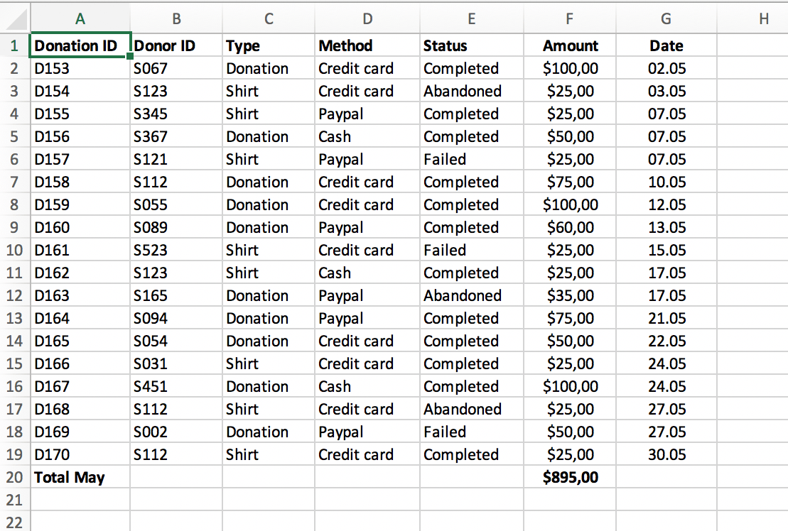
To highlight some useful functions, imagine a business that has a system of keeping track of client transactions. The table above contains information regarding the donorID, which is a unique identifier for each donor. If a business owner was interested in keeping track of their most frequent and largest donors, trending dates in which donations are more likely, or the average donation, all of this information would be available at the click of a button.
Source: https://www.perfectxl.com/excel-glossary/how-to-use-pivot-table-excel/
Sankey Flowcharts
Overview
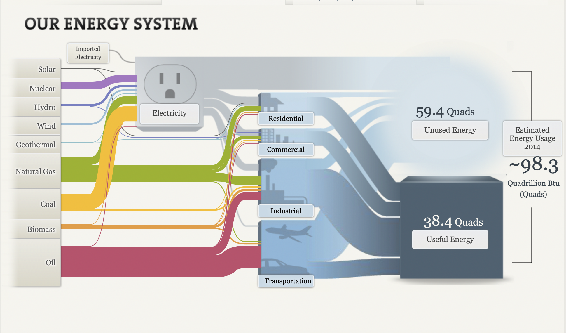
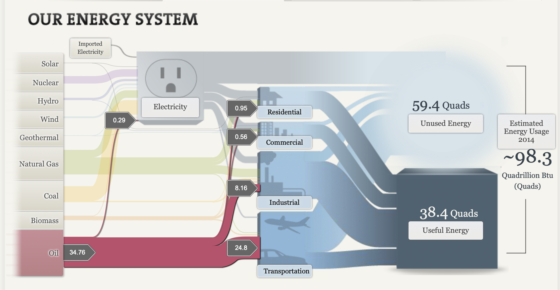
Sankey flowcharts are a type of chart the describes what constitutes a whole, not dissimilar to a pie graph. Sankey however can provide subcategories for the values displayed.
Pitfalls-
With all the minutiae that the Sankey provides to viewers the big picture is in danger of being drowned out. In this example if the goal was to highlight the amount of energy being wasted by the transportation industry for instance, readers might not be able to interpret it without looking for it. Pie charts are definitely a better chart for bringing attention to large discrepancies in parts of a whole.
Interactivity-
Although some of the finer details present in the data are hard to read at first glance, the dynamic nature of Sankey charts allows dedicated creators to capitalize on this by providing awesome in-depth features like the NAS does here.
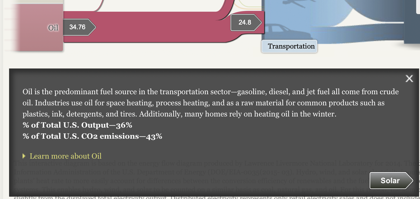
If you know your audience is interested in really digging deep into the data, implementing features like those shown here are a surefire way to make your chart into a showstopper.
Pie Chart
The humble pie chart, a simple yet effective tool for anyone interesting in making data visualizations. Aside from the necessities that pie charts should represent 100% of a total figure, and the chart should be legible, it’s hard to go wrong with a pie chart.
In addition to the above factors, there are others that make a pie chart go from a working choice to the correct one. For the true strengths of a pie chart to shine the data should tell a story. Components of the chart should be instantly recognizable as a very large or small fraction of the total figure.
For my example I chose the distribution of wealth in the United States, and I was able to find data from 2017. This data has a clear total figure, the sum total wealth owned by civilians in the U.S., and the data tells a clear story.
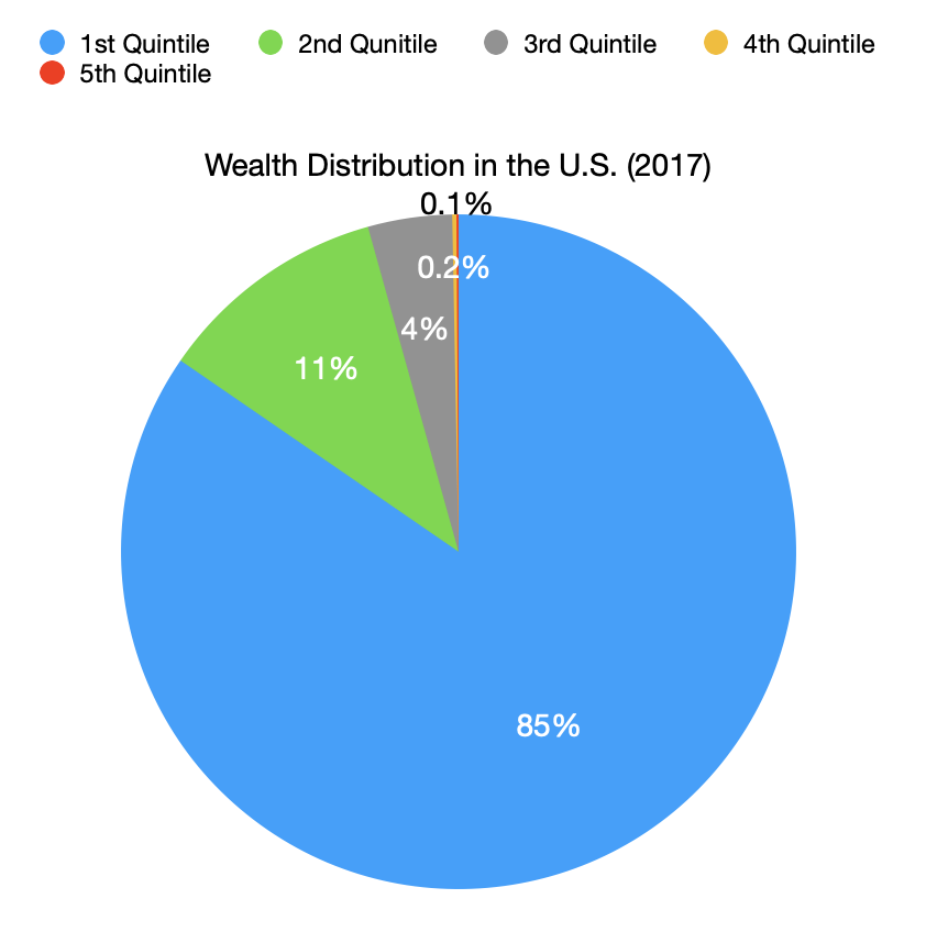
No other chart would tell readers what I was trying to convey as quickly and clearly, that wealth inequality in the U.S. is staggering.
When making your own visualizations, remember to choose a pie chart if the individual components tell a story by their relation to the total figure.
Lollipop Charts
A lollipop chart is a novel spin on the classic and universally appreciated bar chart. Applicable in the same situations as the illustrious bar chart, lollipops serve the same purpose but have the added benefit of cutting back on unnecessary clutter. When your data has a large number of data points being compared or you’re just aiming for a simpler visualization (that saves on ink!) a lollipop chart stands out as a strong alternative.
Some research (Blasio & Bisantz, 2002) even shows that lollipop design can lead to faster response times and greater accuracy (Gillan & Richman, 1994). Some other studies have shown (Inbar, Tractinsky & Meyer, 2007) that lollipop charts are not viewed as visually appealing as the timeless bar chart. As time goes on and these new minimalists styles of data visualization command more mainstream use, who knows what the future holds?
Below is a chart showing the percent of National GDP each of the top ten states makes up:

A simple, no-frills method that shows the single important value for each data point clearly and quickly, that is the strength of the lollipop chart.
Benchmarking Graphs
Benchmarking your data visualizations is an excellent way to convey an important
factor in your graphs, what the numbers should look like, and how they fare
in comparison to that number. Helpful in showing outliers like how something is over-
or under-performing, or showing how perfect fit a value is towards some specified goal
benchmarks are a powerful tool that can be added to most graphs.
To show you an example, the following graph tracks goods and services pre-
and post-pandemic.
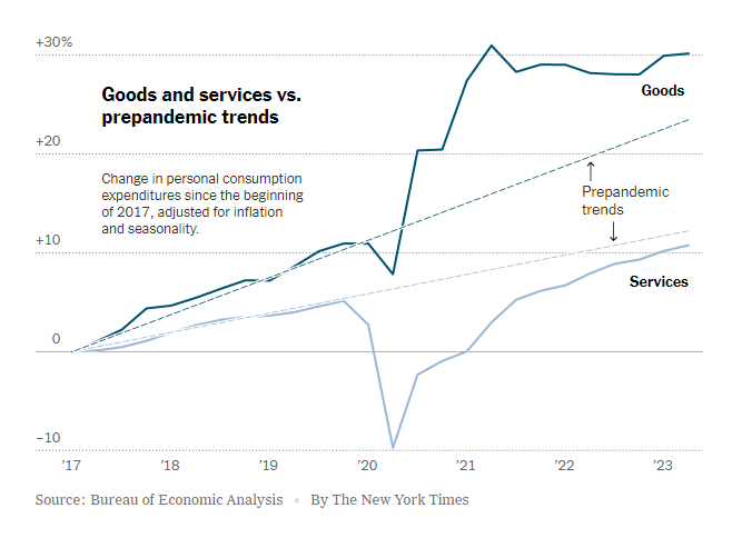
https://www.nytimes.com/2023/07/27/business/economy/us-economy-gdp-q2.html
It is easy to see the strengths of the trend lines as a way to measure the expected
values for the services and goods and how they compare to the trendlines before and
after the pandemic.
The following graph makes use of a perfectly horizontal benchmark line. This makes
reading the graph even easier than trend lines as being able to reference the single
value of the benchmark reduces user effort.
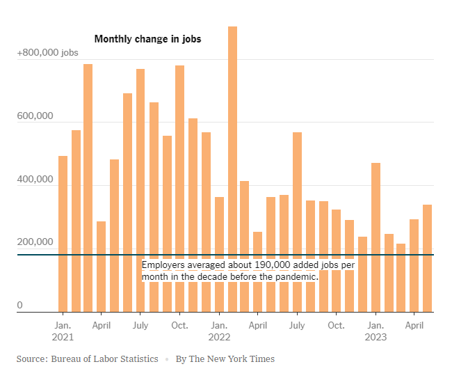
https://www.nytimes.com/2023/06/08/business/economy/us-economy-inflation-fed.html
The anomaly of the employment boom following the pandemic is immediately apparent with this example, highlighting the clarity that benchmarking provides.
Finally, this benchmark is just an average of the values in the graph. While not as
easy to interpret as the other methods, this one is a near-universal improvement that
can be made to any graph.
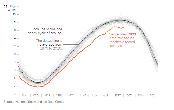
https://www.nytimes.com/2023/10/04/climate/antarctic-sea-ice-record-low.html?searchResultPosition=4
Visualizing Health
http://www.vizhealth.org is a informational website developed by the University of Michigan, dedicated to providing resources for creating better data visualizations in healthcare and medicine.
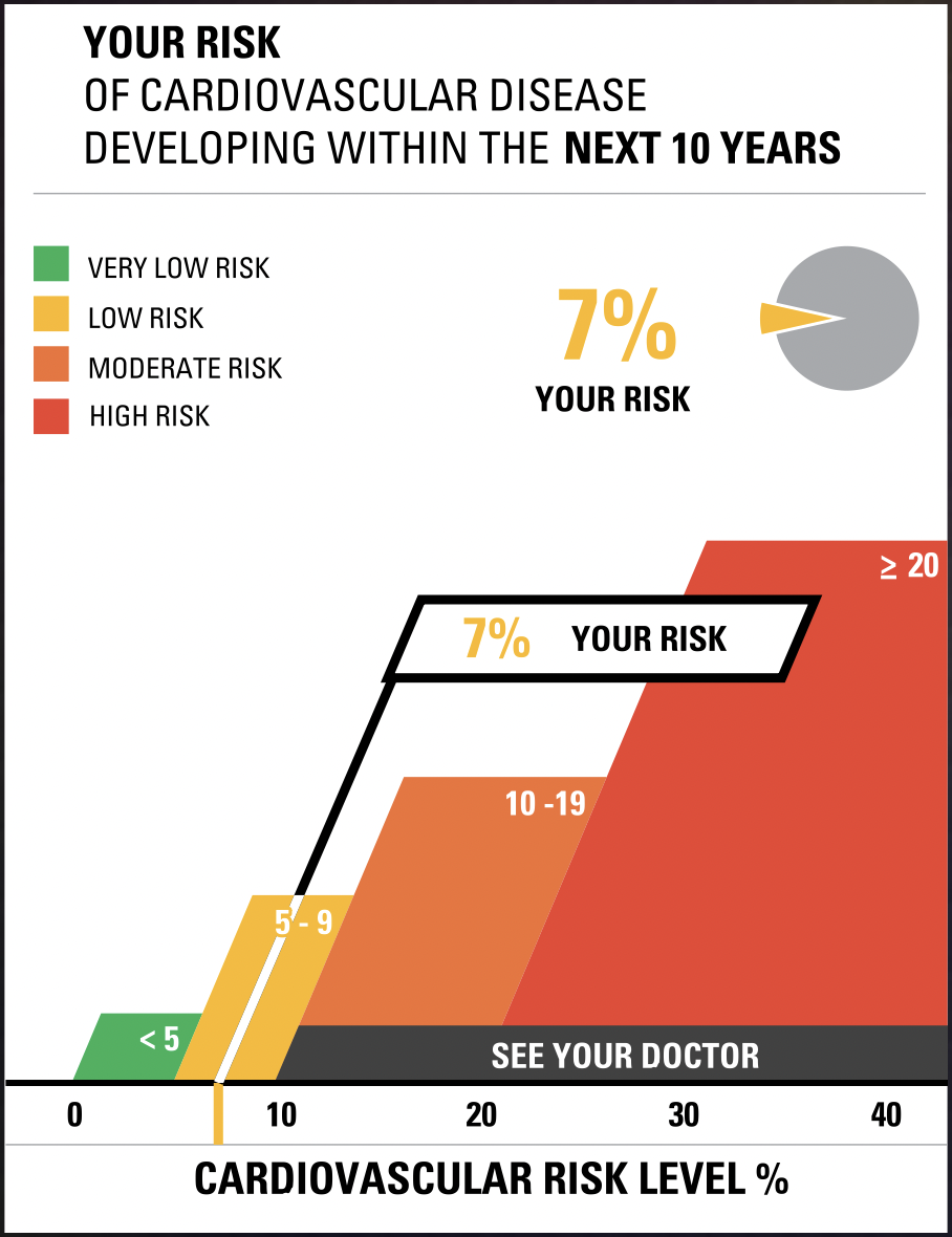
Although many pages of the website are currently defunct, a few useful resources are still functional. vizhealth.org has a built-in cardiovascular disease assessment which after a very brief questionnaire displays your risk for developing cardiovascular disease within the next 10 years. The formula used by the risk calculator was supplied by the Farmington Heart Study, an ongoing research effort which began in the 1940’s. This risk calculator is an exemplary display of interactive data visualization, my results below shows how a professional graph can be produced through engagement from an audience
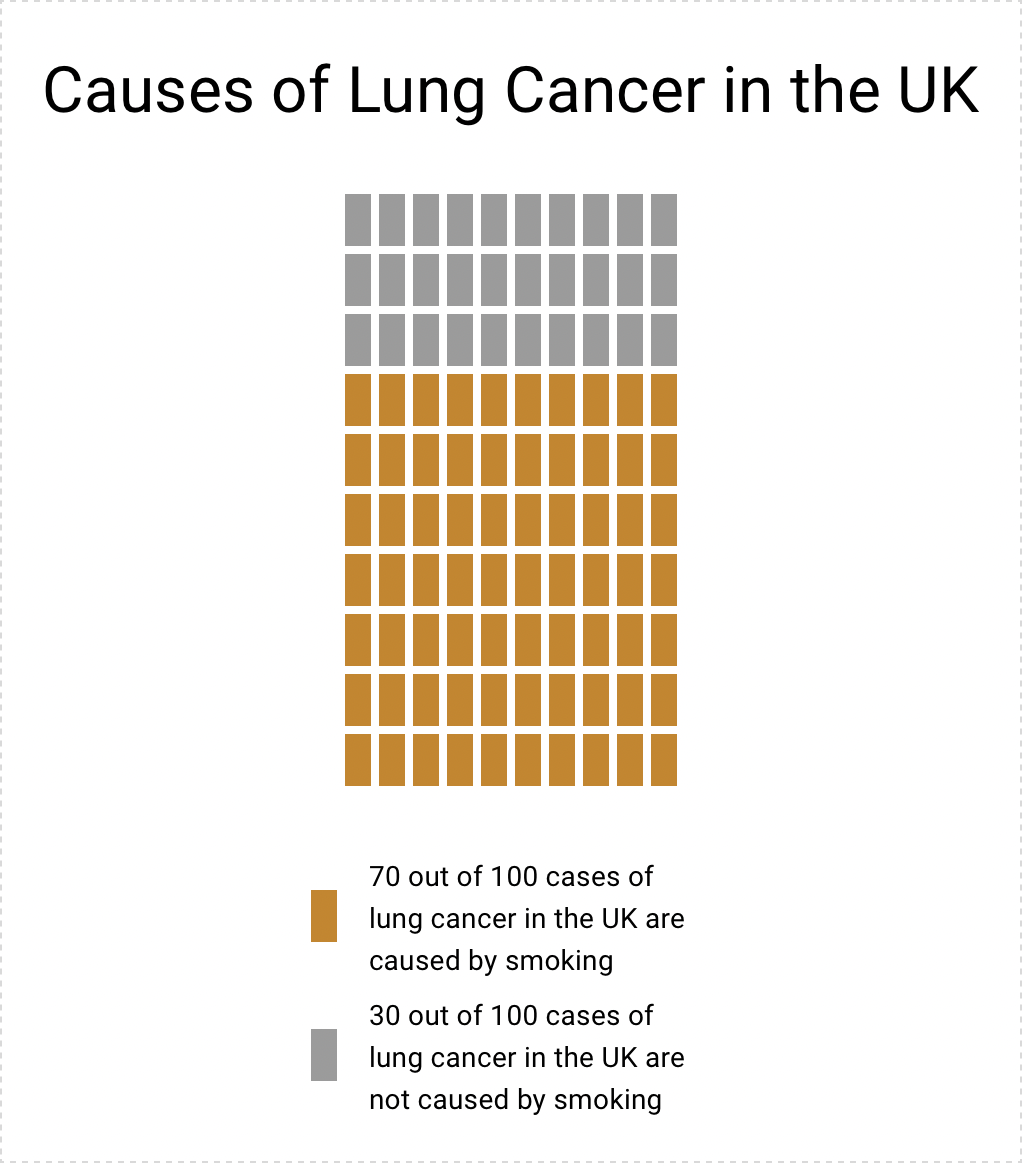
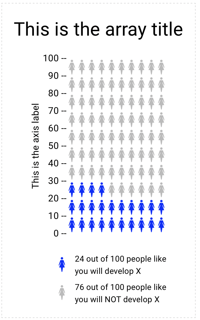
Another useful tool on vizhealth.org is a link to https://iconarray.com, another University of Michigan platform which hosts an interactive icon array visitors are able to experiment with and produce. Below are some examples:
Overall, vizhealth.org provides some useful resources for those interested in data visualization, and is indicative of all the useful tools available on the web.
Useful Dataset Repositories for Information Visualization.
With the overwhelming of data to sort through to begin working on your infographics, choosing where to start can be daunting. Here are a few websites to get you started:
UC Irvine Machine Learning Repository
Link: https://archive.ics.uci.edu
UCI Machine Learning Repository is a free repository of datasets purposed for machine learning, maintained by UCI. With over 600 datasets excellently catalogued this website has excellent datasets to work from and build ideas if you’re unsure where to start.
If you’re unsure where you want to start and you want a well curated dataset to start off with.
Kaggle
Link: https://www.kaggle.com
Kaggle is a similar resource to the UCI Machine Learning Repository, in that it is also a repository geared to machine learning and A.I. applications, but the breadth is much greater as it is not as well curated as the UCI collection.
Perfect if you have a good idea of the type of data you’re looking for.
Data.gov
Link: https://data.gov
Data.gov is the United States government’s free and open repository featuring data collected from census, state and lower governments, and other various agencies and bureaus from around the country.
Great for information directly related to statistics regarding state and national characteristics.