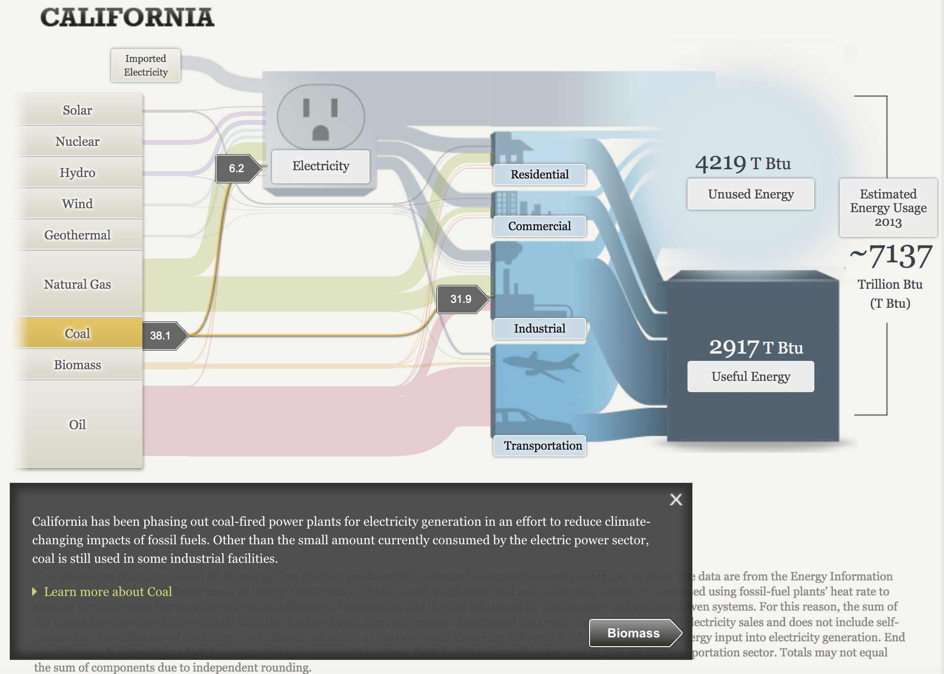
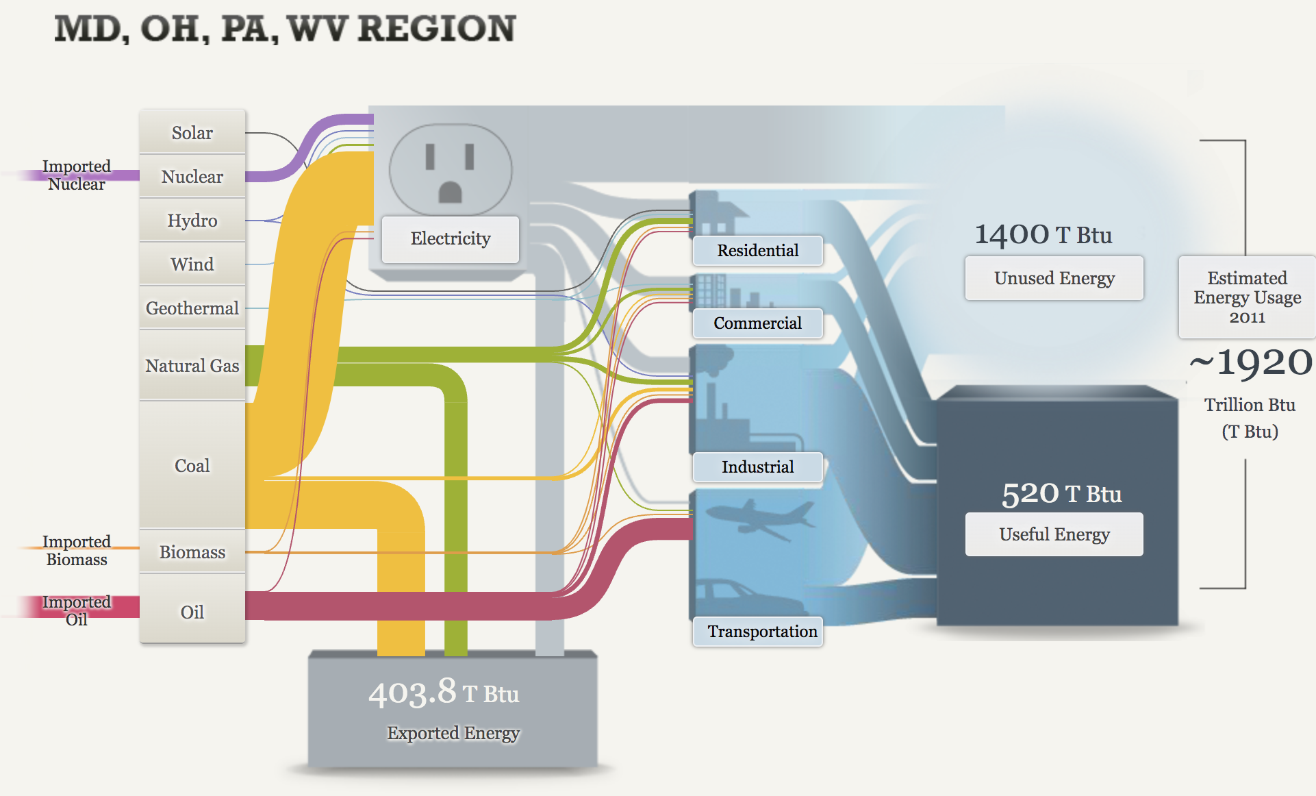
Sankey: Our Energy System
This interactive data visualization tool was very fun to explore. There was a lot of really good information all packed neatly into a tight and organized visualization. It was also a really good tool to compare energy sources from different areas.
California is very anti-coal use and this graph really shows it. It gets more interesting to me when you can see the coal use in other stats such as OH, MD, WV, Pa regions.
Using those same comparisons, it is also interesting to see how much more oil California uses than Md, OH, PA, WV region.
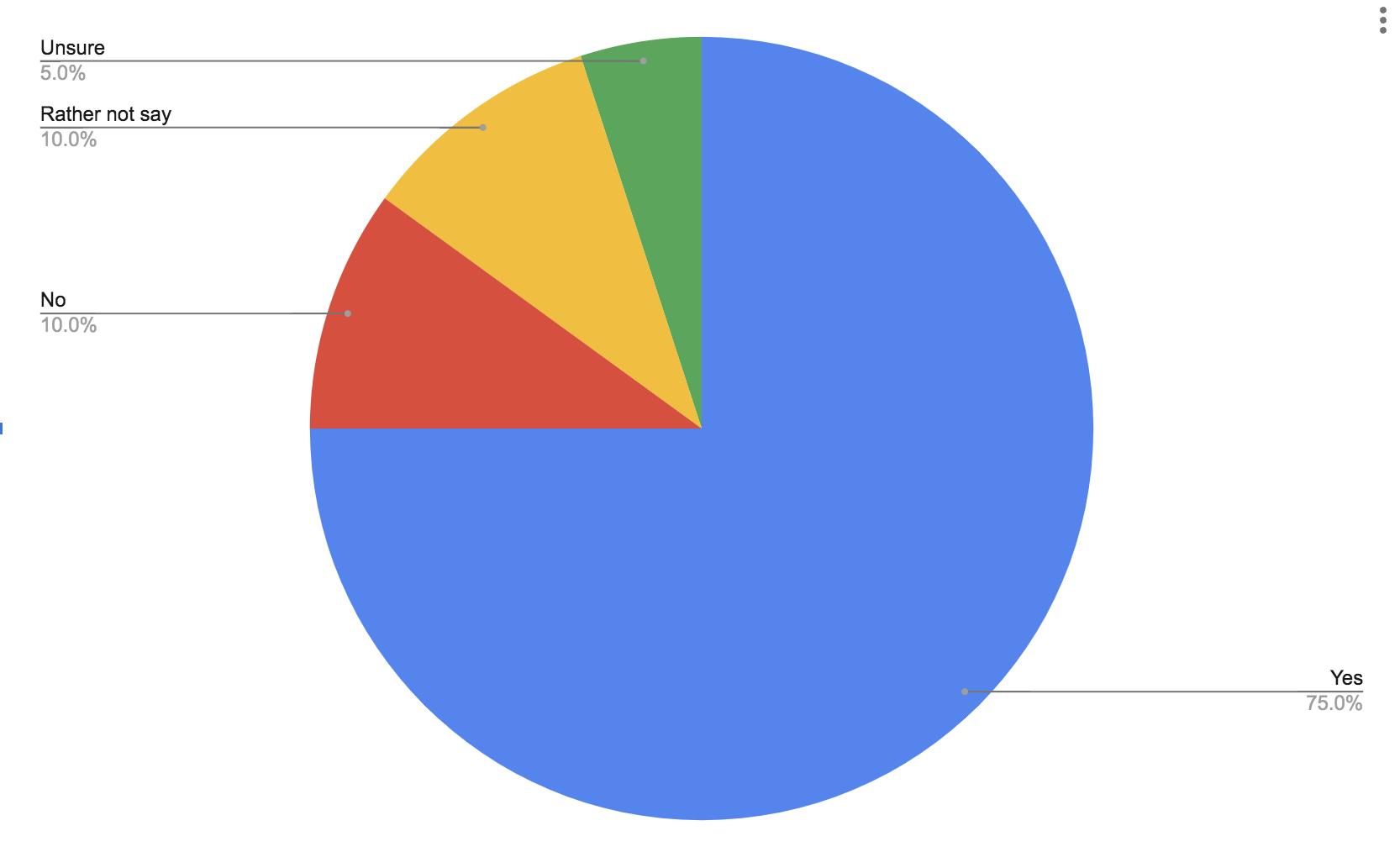
Pie Charts
Part charts extremely easy to make and they can get the point of your data across very clearly. Pie charts tend to do better with a few categories rather than more because they can also become too busy very quick. Here is a pie chart to show data from a simple poll of whether people like ice cream or not.
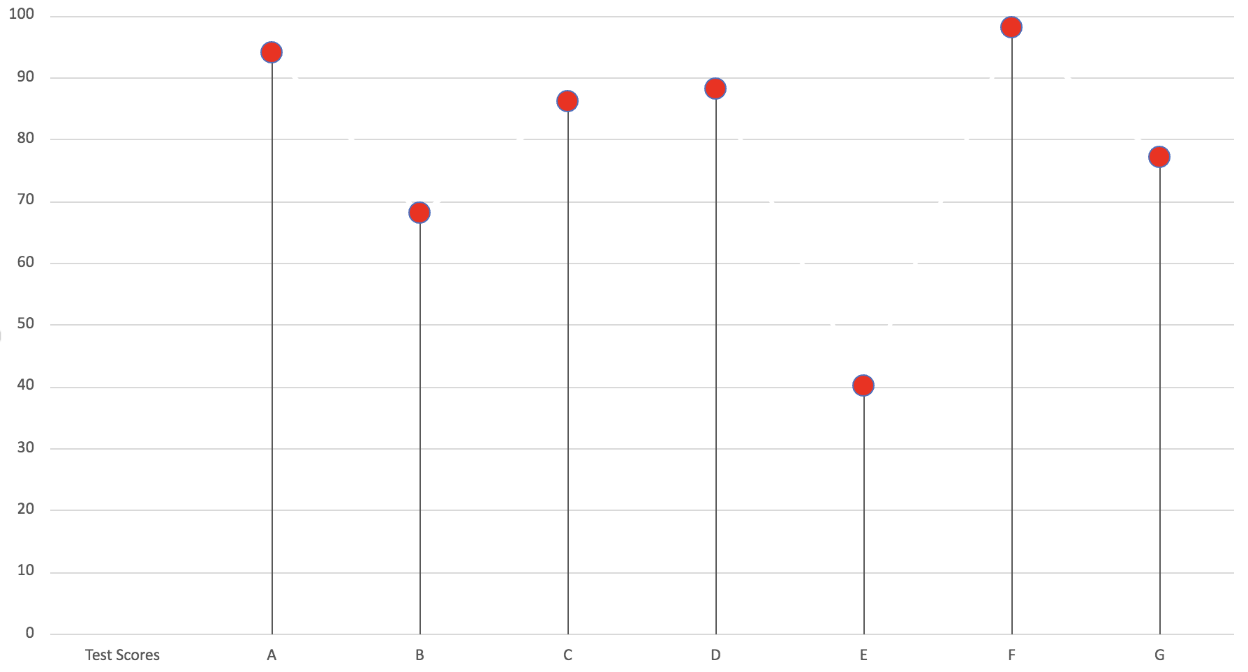
Lollipop Chart
Lollipop charts are a really simple and useful infographic to get basic information across. Here I made a lollipop chart using test scores for A, B, C, D, E, F and G. It is easy to follow and see the test score that each letter received. In my opinion, this graph is a very simply play on a normal bar graph just with a bit of added “fun” to make it less basic and square.