Pivot Table
So, the election date is coming up soon and I want to have an interesting topic that can be use with a Pivot Table. From what I understand is Pivot Table is used to summarize a long data set with multiple repeat data. What can be repeated multiple times and also related to the election date is the party and religious affiliation of U.S. presidents.
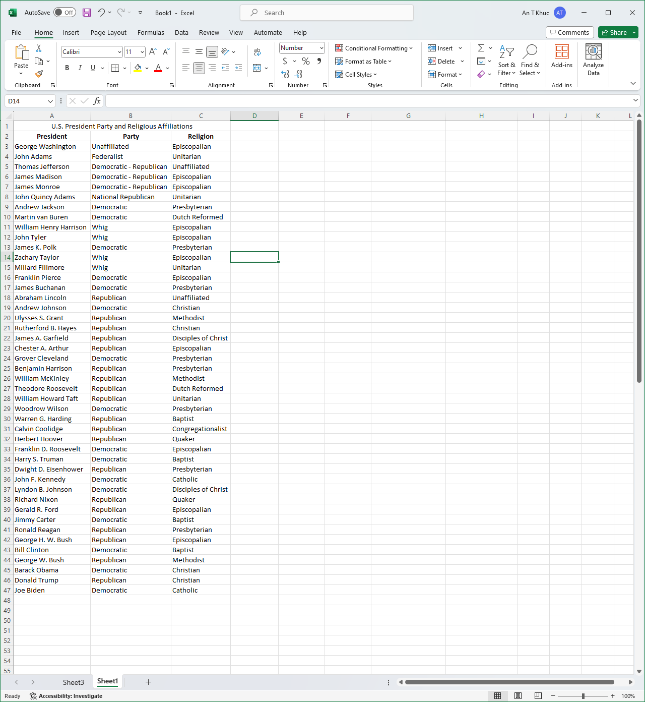
Here I written out a set of which president belongs to which party and which religion that said president affiliated with. It is useful in the case of “How many presidents is in this party?” or “How many presidents is following this religion?” because we have seen so many Democratic and Republican presidents from the past that we can’t easily summarize it by imagining it.
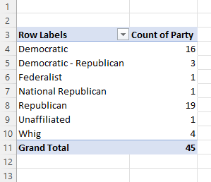
Using the Pivot Table helped sort out the total number of presidents belonged to any of the party and it can be vice versa to see how many presidents following what religion as well.
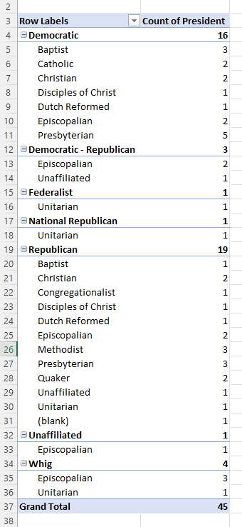
As you can see here is another interesting take on the Pivot Table. You can create a sub-topic and see which party is affiliated with which religion. It is entirely based on your need for what you can do with Excel, but another problem is how you create your table as well because I have not yet find a way to split party and religious affiliation into separate data set.
Usage of Pie Chart
From my knowledge, pie charts alongside with bar graphs and line graphs are the most used type of graphs when it come to comparing data. They each have different uses. For bar graphs, it can be used to compare between different groups or track the progression over time. For line graphs, it usage can be quite the same literally but it can pick out the tiny difference between values and can compare data progression over a much longer period of time and wouldn’t cluster the graph like a bar graph would do. Pie chart does compare between groups or categories. However, a pie chart does not compare the values over time. Instead it compares the data of a whole subject and represents percentage, as if everything would add up to 100%, the total.
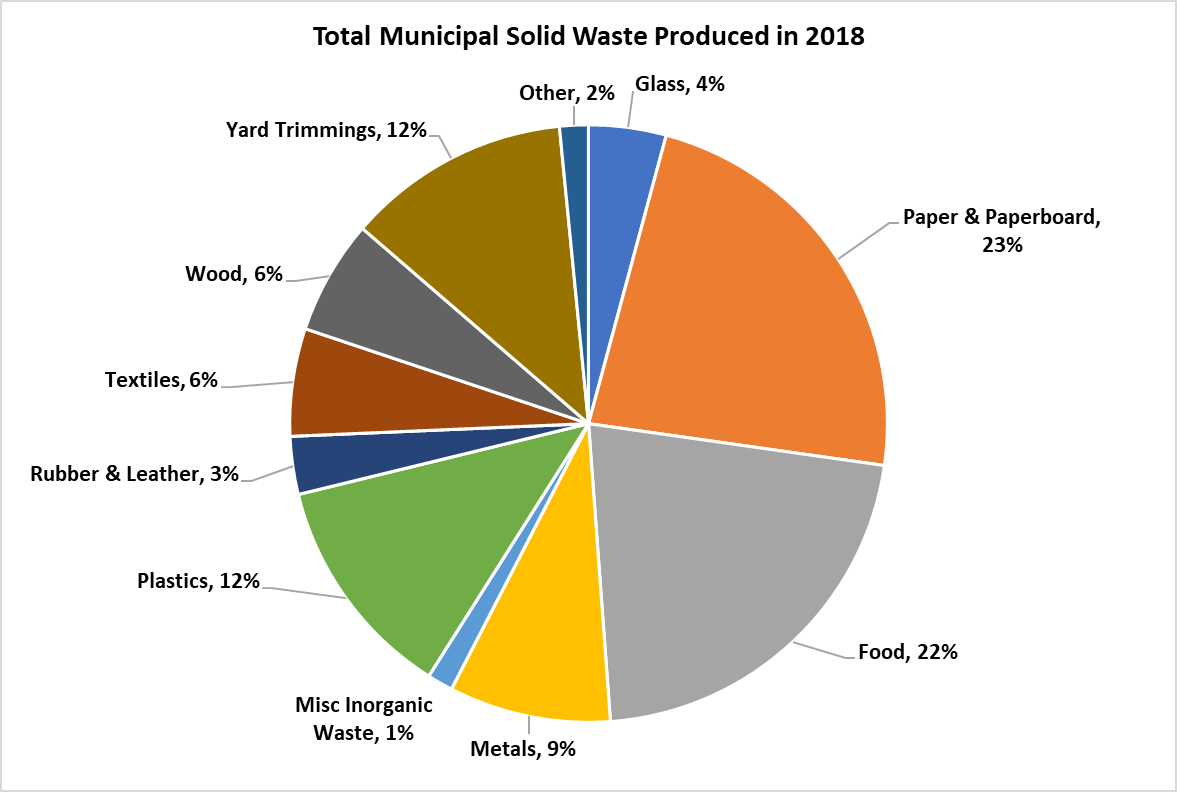
Here I take an example about the total municipal solid waste (MSW) produced in 2018 from the EPA. Using pie chart is ideal here because you would want to compare between each value (type of waste) of an entire subject (waste produced) and each slide of color here represent each value. Readers can easily see the difference base solely on the size of each slide and quickly understand the data. A pie chart of this consist of 11 values and if used on a bar graph, I would think the graph would be clustered with 11 bars and from there you would have to adjust the size accordingly to squeeze every bar into a graph thus made a bar graph a hassle for this type of data. A line graph for this one is also out of consideration. The topic here is the ‘Total amount’ and not ‘Wastes produced from month to month’, there are no over time progression in the data to compare using a line chart. Overall, a pie chart for this type of data is easy to made, easy to understand with minimal effort.
Usage of Lollipop Chart
When it comes to the creating a chart in Excel to display the needed information, we tend to only think of a bar, line, or pie graph. However, it is possible to be more creative and workaround with those existing graph choices. This time we learned about the lollipop chart. From what I think, lollipop is much more appealing to the eyes than other standard horizontal bar chart. It can tell length which distinguish the proportion in which one is higher or longer in value. In other words, it works the same as a bar chart. There is a difference. Bar charts are most likely used when there are not too many data to display and then it would become clustered. Being clustered can basically fill out the entire chart with all different colors which can irritate the eyes. Lollipop chart achieved the minimalistic view even with higher number of data. It does require many additional steps comparing to just insert a graph with the traditional bar chart. It started with a scatterplot and with a number of formatting the data sets, labels, etc…. There is a down side to use this lollipop chart. The value needs to be clear and apart from another. It is difficult to tell the end point of each line if there is no label especially when data are close to each other. I can see this graph to be use in a more professional environment.
Benchmark Comparisons
Infographic as a whole usually display information such as sales on year by year comparison. However, these type of graphics can come in handy when looking at a benchmark. I am taking an example from National Oceanic and Atmospheric Administration’s website and few other regarding the global temperature
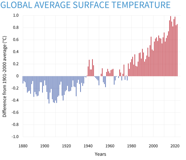
This first graph here is a “Yearly surface temperature compared to the 20th-century average from 1880–2022” and blue bars indicate cooler-than-average years; red bars show warmer-than-average years. One thing can be seen from this type of graph is how you can easily see how much of a difference between years. The graph only listed from -1.0 to 1.0 Celcius (30.8 to 33.8 Fahrenheit) but the short distance between the maximum and the minimum y-axis makes a small difference much more exaggerated. At first, I would have like to know the actual average temperature on a yearly basis but this would not fit in this type of graph due to the amount of spaces needed for additional data.
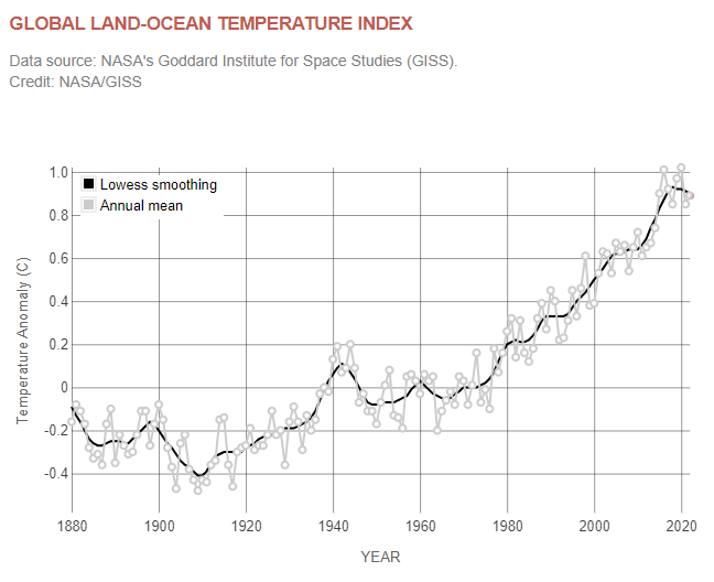
This graph is a similar graph comparing temperature from NASA’s website. This offer one more variable to look at is the LOWESS smoothing. By definition from NOAA’s website, LOWESS or LOESS is a nonparametric method for smoothing a series of data in which no assumptions are made about the underlying structure of the data and is effective when there are outliers in the data. However it is difficult to understand any of the scientific terms but overall just another example on how current temperature can be shown on a graph.
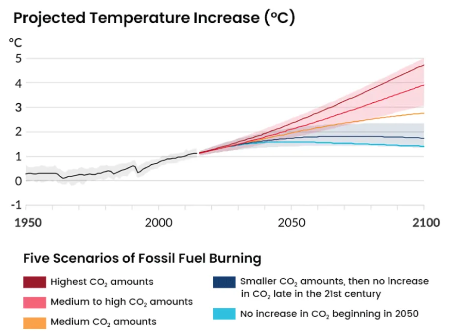
This graph here is “Projected Temperature Increase (°C)” from Center for Science Education. This graph is benchmarking the future temperature on a few different scenarios as listed within the graph itself. Black line and grey area perhaps are the accepted temperature change by many scientists. This graph is definitely great in comparison and it shows the temperature entirely depends on the decisions of humans. However what is missing here that makes me wonder is what is the different between CO2 amount from each scenarios such as would the highest CO2 be somewhat for an example 10 million and medium to high would be somewhere 3 million to 5 million and so on. Overall, it may seem that the actual number of CO2 because it is not the main focus of this graph.
Comparing Numbers
Statista is perhaps well known to many people including myself as I have used their website a few times. Statista offer wide range of useful data visualizations regarding some available topics and include detail explanations.

Netflix is a great choice to use because when someone such as myself think of Netflix I think it would be a massive platform available worldwide and it is. The number of users in Netflix is incredible but it does not mean that Netflix is at all the number one choice in all countries perhaps due to strong regional competitors or availability of content in that region. As we can see on the infographic, Netflix is well known to many American but Netflix is not the strongest in the market, only one-fifth of the entire market. As I stated above, this is possibly due to strong region competitors such as Disney+, Hulu, HBO, and many on the rise such as Apple TV+. The most surprising fact included in the picture is India. Netflix only took up 3% of the entire market. I have not deep dive into India’s streaming market to fully understand what Netflix is competing in the region. Moreover, as the infographic only include a few notable countries from each continents, some region I would want to see more such as China or Russia. Despite them label all major streaming providers included, it is unsure whether China or Russia does not provide any data or that Netflix dominated in their markets. It is the censorship in China and whether the sanction by the United States effect the availability of Netflix in those two regions.
Statista offers more information regarding Netflix about financials, number of employees, etc… can be found here. This particular infographic can also be found here.
Using Icon Array – Vizhealth
Vizhealth’s website for me is a great website that provide information about creating image or visualization in medical field, hence the name Vizhealth. Overall, this site helps newcomers with a few examples of how appealing infographics can be while providing crucial information such as the ‘Risk Calculator’ also provided on the website. While it is helpful as to display medical data on an image, the use of infographic does not limit to one field. Vizhealth is a great first step to learn and then develop your own image for your own topic.
While Vizhealth is about display medical data on an image. I found that their ‘Icon Array Generator’ can be use for unrelated field. This icon array I created is about the market share of worldwide operating system. While ‘market share’ perhaps does not equal to ‘phone usage’ but I thought this could be a fun demonstration. The image sure helps to generalize the idea around the market share topic despite the data provided is so large.
I also include the news article for this topic here.
Creating an Infographic
Here are some of the tools I found incredible to create an infographic in each pricing categories.
CANVA (Free)
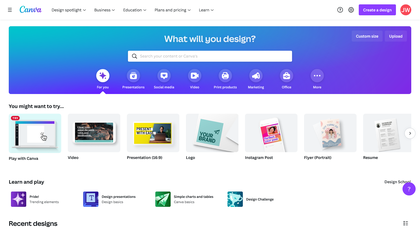
Canva is a tool that perhaps well known among many especially younger people. Canva is hugely popular due to its simple way of creating an infographic, poster, presentation, etc… with a few touch of a button. As a free tool and with a wide selection template, Canva is no doubt a perfect place for creating high-quality visuals with no design experience required.
Adobe Illustrator (Monthly Subscription)
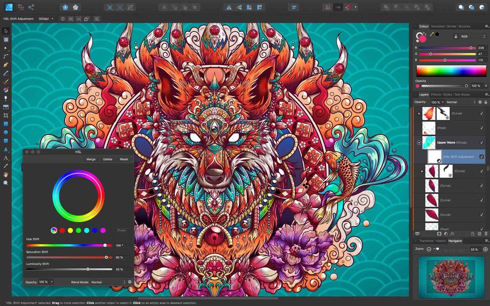
Adobe Illustrator is practically the industry standard and often the program of choice for professional graphic designers and digital artists. Its available tools and features allow to efficiently create and edit high-quality designs for a wide variety of uses. Comparing to other free choices, Adobe Illustrator is much more difficult to use due to professional settings. Adobe Illustrator is costly to use as its monthly subscription does not come in one application rather than a package with multiple applications.
Affinity Designer (One-time Purchase)

Designed as a cheaper alternative to Adobe Illustrator but a strong rising competitor. Affinity Designer can be use in a similar way to Adobe Illustrator but it has a much more gentler slope of learning comparing to its predecessor. Designer is also available to many platform with its iPad app became one of the best and best selling design apps on the market. One down side of Affinity Designer using on multiple platform is the need to purchase separately for tablet version and PC/Mac version.