Pivot Tables
Pivot tables are an extremely important data visualization tool. While they are usually not fancy eye catching infographics or your everyday chart you are used to seeing they are immensely important when it comes to summarizing data. According to an article posted by Lorman Education (https://www.lorman.com/resources/the-6-benefits-of-using-a-pivot-table-in-excel-17423?srsltid=AfmBOorilMT3KbGTr5SUhkNiuLVKiUIeKvuuAmAej7E1n-N3S3G7kmtX) there are 6 main benefits for using pivot tables:
- Simplicity
- Data Analysis
- Data Summaries
- Pattern Recognition
- Quick Reports
- Decision Making
Pivot tables can be helpful in distilling down large raw data into a summary of thousands or more entries to create a report based on data collected. For example, our book gives us a couple thousand survey entries on student’s gender, race, whether their parent has a college education, free or reduced lunch. high school name, graduation year, and other data. It becomes a sea of data to comb through and calculate.

This is where pivot tables come into play. It takes messy raw data like this and converts it into this.

It also gives us the ability to change the parameters of the chart if we want to examine it a different way. The applications of pivot tables could be endless such as business financials evaluations, evaluating performance, and any other thing that you collect data on!
Sankey
After reviewing the blog titled “What You Need To Know About Energy” (http://needtoknow.nas.edu/energy/energy-use/) i really enjoyed how the information is presented and how the site is laid out. At the top of the page we have four main navigation buttons that give the broad topic about what that page is going to cover. Within that page the data is broken down into other sub topics based on the main topic. Each sub topic has a small blurb about it and uses colors and a slightly larger text to highlight key points of the sub topic. I had no idea how much our energy consumption affects things such as security and the different energy generation forms we can use to create energy.
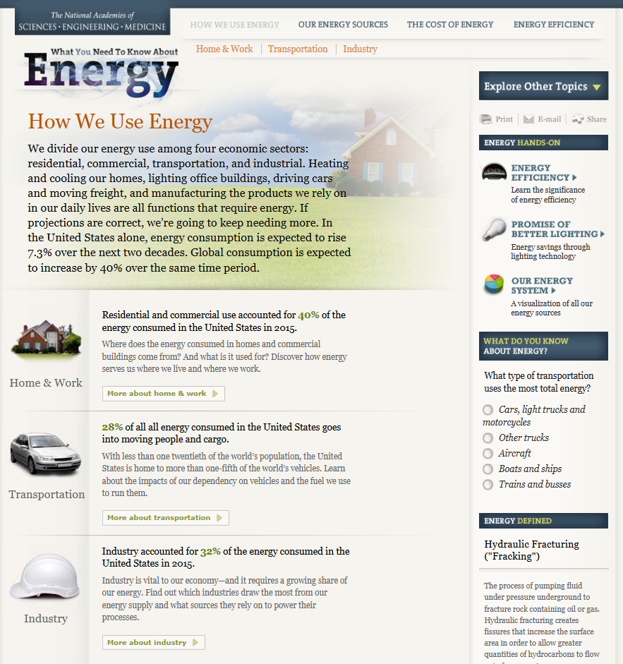
If you click on the sub topic you will get a more in depth explanation about it and reveals any charts used to represent the data.

While this seems to be more of a professional setting and display of data I believe the author could have used more visuals and less text to more efficiently display the various statistics referenced throughout the blog. For example this page does not have any visual representation. Rather then writing about the international energy estimates the author could have used a single large number or even a donut or pie chart with a large percentile and contrasting color to highlight the significances of this estimate and what it means specifically for our security in this instance.
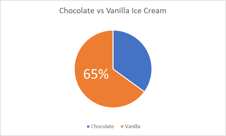
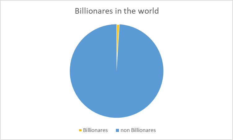
Pie Charts
Probably one of the first charts we learned at a young age was a pie chart. I can remember learning percentages in elementary school and seeing pie charts used to help us visual what a percentage represented. According to story story telling with data (https://www.storytellingwithdata.com/blog/2020/5/14/what-is-a-pie-chart) “pie charts are probably better than any other visual for expressing part to a whole relationship.” There are two primary uses for a pie chart and when they make the most amount of sense. First, if you want an audience to have a sense of a part to whole relationship and the size of the slices is less important. This leads us into our second best use is to convey a piece of something that is small or large. This is beneficial when emphasizing how small or large a percentage is in reference to the whole thing. When piece of the pie are similar in size it makes it difficult for us to understand the significance of those pieces.
I made a pie chart comparing two items with data that i completely made up for educational purposes. This helps show parts of a whole in large and small proportions in order to convey a message. I do not think that displaying this data would be done in a better way and believe to be the best possible option for these scenarios.
Lollipop Chart
Lollipop Charts are used to compare objects or groups the same way that bar or column charts do. So why not just use a bar chart? Lollipop charts are a great way to make longer bars less visually distracting by removing the ink from actual bars themselves and highlighting the key data being portrayed. That has been some research conducted (Blasio &Bisantz, 2002) that supports that ideology and that by making a more ink friendly design can impact readers ability to interpret the data and lead to faster response times.
Lollipop charts are derivates of more commonly known charts and can be created by modifying a scatter chart or line with marker charts. While this may be a little more complex and require you to have a better understanding of excel it is a great tool to add to the toolbelt. They are essentially a large dot with a tail attached to it which is adjusted based on the height of the bar.
It a normal everyday practical use like the chart below they can very easily highlight the end point data you are looking for without the other distractions. Below is a chart of the average points allowed per game by NFL teams so far this 2024 season. The NFL has 32 teams in it and to have a thick column or bar chart could lead to the bars being closer together and more difficult to read. By eliminating that we can clearly see the data that we are focused on looking at.
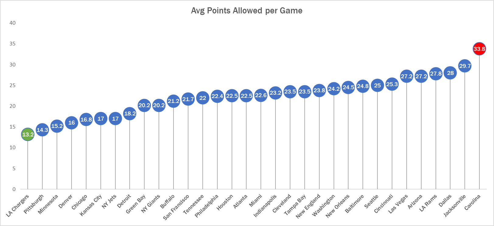
See! Super easy to read. Here we can clearly see that the Carolina Panthers are allowing the most points in the NFL while the LA Chargers are allowing the least. Simple but very effective.
Benchmarks and Economics
The United States economy and stock market like many other countries is driven by forecasts and hitting those expectations also considered to be benchmarks. In addition, most economies are dependent on how other countries economies are performing as we operate primarily in a global economy where the news and events of one country directly impact other countries. Forecasts act as benchmarks for particular data news such as consumer price index (CPI), producer price index (PPI), job creation numbers and unemployment rate to name a few. This forecasts act as targets and if the news comes in above or below expectations this can create volatility in the markets.
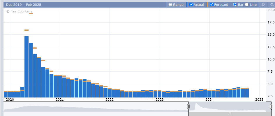
Above is a chart of the unemployment numbers represented as percentages. Each month the forecasts are created by analysis displayed as the gold bar. The actual number is the blue bar. When major news is released it is typically released at 8:30am EST an hour before the New York Stock Exchange opens. This is important as this will influence in what happens in the market that day and how it affects long term trends. A majority of people save for retirement by investing in 401ks, IRAs, and other retirement plans and the numbers being released give you a read on the pulse of the economy. These negative reactions can create downward pressure on the markets and lead to losing money or having diminishing returns on those accounts.
Another way benchmark performances are evaluated is by comparing a particular stock versus an index fund that is similar to the underlying stock. Take a look at the chart below.
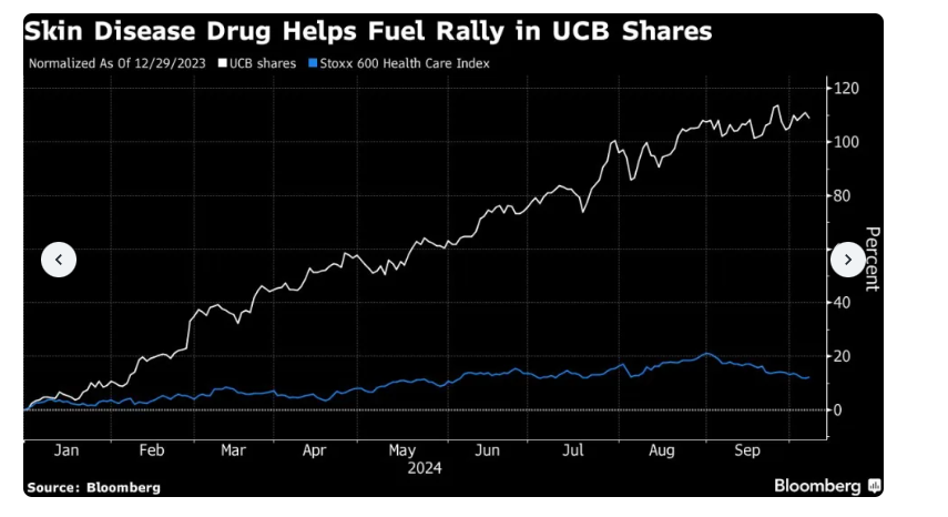
The chart above uses line graphs to compare ticker symbol UCB versus the Stoxx 600 Health Care Index. This shows that the shares of UCB has outperformed the index significantly. This largely is because of their release of a drug to treat psoriasis. This is important when managing funds and rotating different investments to receive the highest return possible.
Benchmark analysis is a critical component to not only our economy but the global economy. By being able to accurately evaluate the data it can help make informed decisions. There are different ways to display benchmarks but all are important when understanding the data and how to evaluate it.
Sports: Analytics or Talent?
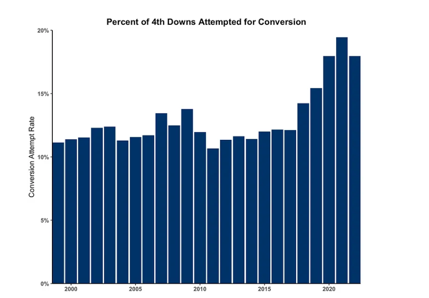
Sports management today is very different then it was in the past. A lot of in game decisions being made by coaches and managers is analytical driven based on probabilities and past results. Analysts have been employed by teams and have one responsibility, comb through the data and provide insight on when a team should make a decision based on probability not feelings. For example, the NFL has seen a surge in fourth down attempts. In 2000, NFL teams only went for it on 4th down about 10% of the time, in 2021 it was almost 20%!
This analytical approach was first attempted in 2002 by the Oakland Athletics baseball team’s general manager Billy Bean and assistant GM Peter Brand. Bean, a former player who knew that salary capacity played a direct role in how successful a baseball team would be was desperately trying to find a way for his small market team to be able to compete with larger market teams. Simply put, bigger markets paid more money to players and could build a more talented team. Peter and Billy developed a way to build a team of under valued talent in their scouting and analysis of players, popularized in the film Moneyball. This was the test of the theory that changed the landscape of professional sports as we see it today. Teams focused on data to not only evaluate players but how to manage games and seasons.
While the average fan won’t be making game time decisions that affect the outcomes of games they do debate who the best teams and players are. https://www.sports-reference.com/ , is a website dedicated to sports data and can be used to develop data visualizations to help fans win their arguments with their friends or make a case on why they believe their opinion on something is best. Whether you’re a fan, an analyst, coach or manager there is no denying that sports data plays a significant role in sports today then it did twenty years ago and the comparison of numbers plays a crucial role in sports today.
Health Visualization
After visiting vizhealth.org I found a new perspective on how we can use scientific data to communicate health concerns to an audience. The website offers a pretty cool but limited interactive experience through their risk calculator. While it states that the risk assessment is only an estimation and shouldn’t be used for medical diagnosis it can certainly help bring to light a potential risk that maybe people didn’t realize was even a risk. I took some time and ran my own risk calculation and while I wasn’t expecting to be at risk a little reassurance never hurt anyone.
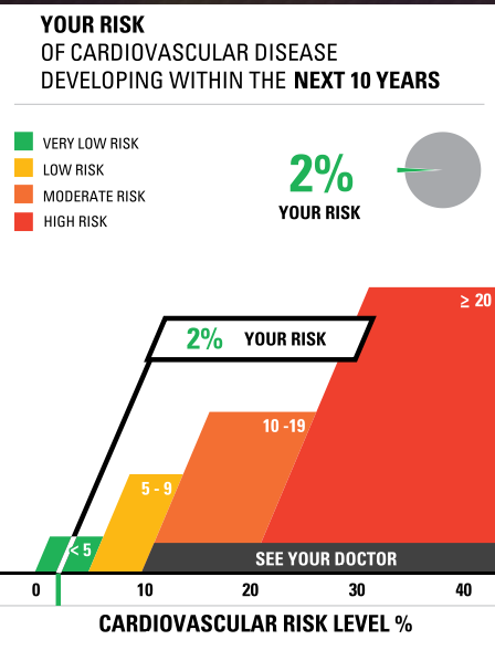
I think that this site is valuable to learning data visualizations. As it shows how a short questionnaire that requires the viewer to interact with then converts into a visual that is simple and easy for a person who has no medical background to understand. It also has an array generator that allows you to create your own. I took some time and created my own.
Constructing Infographics with Visme
Infographics are more popular than ever and are a great way to communicate ideas without reading pages and pages of information. Creating an infographic may seem like a daunting task that could takes hours to complete. Some might question is it really worth it. Well, the data show’s it certainly is!
With Visme, creating infogrphics is simple and easy.