Pivot Tables
https://exceljet.net/articles/excel-pivot-tables
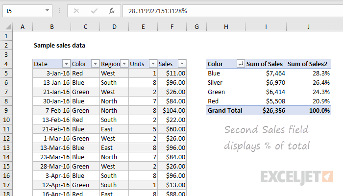
A pivot table can be used for a variety of reasons to portray data. A pivot tables usefulness truly comes to light when one has to summarize large amounts of qualitative/quantitative data. It can provide a flexible and efficient way to not only separate the data into individual rows and columns, but also make it easier to identify patterns, and trends that may not have been noticed. As shown by the data provided above by Exceljet, the pivot table ran automatic calculations on the summed/counted values and the data was segmented by date, color and other variables. Furthermore, with the information provided, the user can now calculate the percentage values of each calculation if desired. Lastly a pivot table is also very easy to create as well as understand. There is no need to learn complex formulas and one simply has to enter the data and insert the table or use drag and drop tool depending on what visualization tool they are using. All in all, pivot tables are a great way to organize data into rows/columns and simplify data.
SANKEY
by joseph12
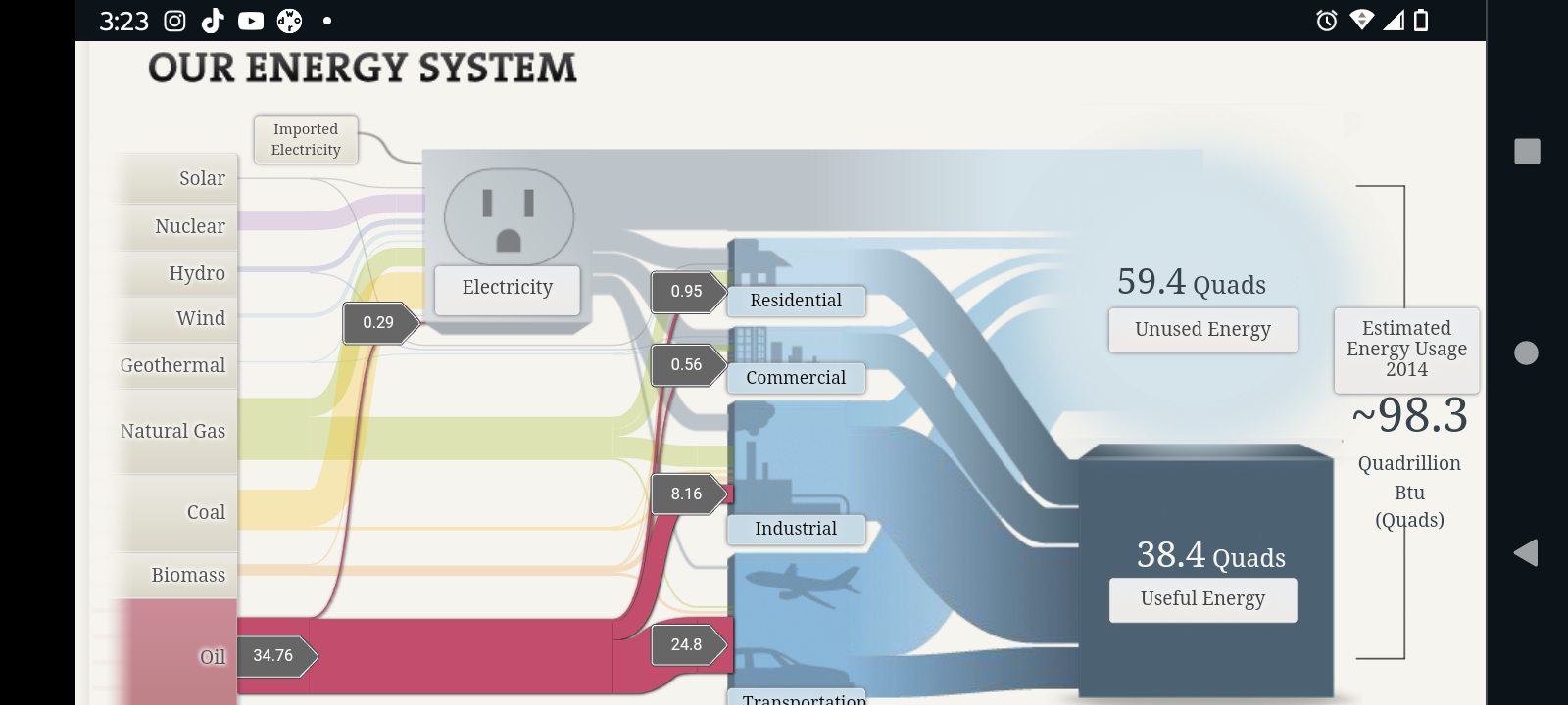
My first impression of Sankey was that it looked like a very detailed and easy to understand visualization tool that accurately portrayed the amount of used/unused energy in the United States. Perhaps to no one’s surprise, Oil was the most abundant and used energy in the U.S with the majority of it being used for transportation and industrial purposes. Natural gas was second and was followed by coal in terms of energy usage. Solar and wind were far lower than I was expecting, as there are major companies that generate billions of dollars yearly using wind/solar energy.
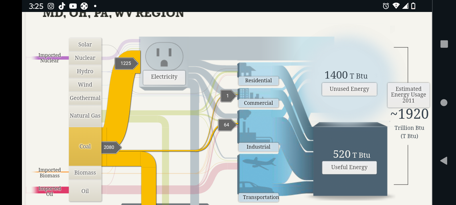
For areas such as Maryland and Ohio, the most used form of energy was coal, and it was mainly used for electrical and even some industrial purposes. Although the top 3 sources of energy (i.e. Coal, Oil, and Natural Gas) remained the same as the rest of the United States, unlike most of the other other states, Maryland and a few other states most used source of energy seemed to be coal, followed by oil and Natural Gas.
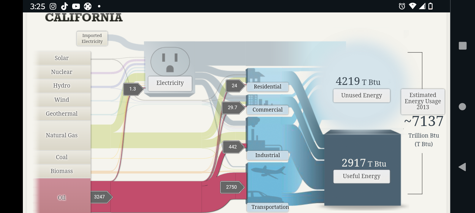
The first thing I noticed about California’s energy expenditure compared to other states was that it was far greater than the rest. As a matter of fact, when comparing the results, it appears that California alone uses more energy than a combination of multiple states from the previous screenshot. Furthermore, like most other states, oil was its main source of energy, and natural gas was close second.
All in all I do believe that Sankey was a very good and efficient tool to portray energy used and energy lost. It is incredible detailed and all the while manages to somehow retain a simplistic aspect to it. The visualizations are very easy to understand. So much so that one would be able to understand what is being portrayed even without the numerical values being shown. The only criticism that I would personally give would be the fact that the data used may have been a little bit outdated as there were estimated energy usages going back as far as 2011.
Pie charts
By Joseph
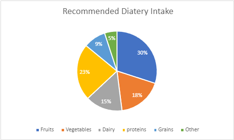
Pie charts are one of the many types of visualizations that one can use to portray both complex or simple data. A pie chart can be especially good when the data being portrayed are all parts of a whole. As shown by the pie chart above, the values for the Recommended diet intake are all individual parts that add up to a 100%. Furthermore there are both small and large data sets that needed to be represented such as, the dairy value and the fruits value. Both data sets are vastly different in terms of percentage and hence the amount of space that they take up visually. To convey this, a pie chart is the perfect visualization to use in this instance. This is especially true when one considers that the appearance of a pie chart also falls in line with the topic of the graph itself which is diet and food intake. the values not only add up to a 100%, but also the data appear to reflect a plate, with each data set representing a specific food intake. Upon making this pie chart, I did come across some suggestions as to how I could improve my data such as changing the color of the data set or make one value stand out by removing color from every value except for one. One could also disconnect a certain piece from the whole to visually represent something to the audience. These design methods are all very valid and useful in data visualization, but I decided to make the pie chart I created very simple to understand. The more elements that one adds to something, the more important it is that the information is clearly conveyed. Not only was there not a need to apply extra designs for the data that was conveyed, but there would also be a risk that the audience may misinterpret certain designs choices if they poorly represent the data. All in all, a pie chart is very efficient visualization to represent data that is part of whole.
Lollipop Chart
By Joseph
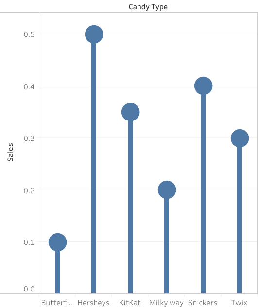
A lollipop chart is a great way to portray large number values in the form of percentages in a simple and easily understandable way. As you can see by the chart above, the data shows the candy type and the percentage of sales generated by the company. Simply by looking at the chart and using the lollipop visualization, one can tell which values are higher and which ones are lower. Much like a bar graph, a lollipop chart is very straightforward in the data that it is representing, there is not a correlation between data points to be determined nor is there significant distribution between the information given. However, one aspect that can be said to be better than a bar graph would be the fact that a lollipop chart is more efficient when it comes to avoiding a cluttered appearance as a result of many data points. Often times, a data graph can look cluttered as a result of too many data points being represented. Furthermore, a lollipop chart can be somewhat inaccurate without the percentage values being included withing the circles at the tip of the line. As shown by the graph, it is somewhat difficult to tell where the value ends with the circles and what value it represents. With that being said, there will always be pros and cons regardless of what chart one decides to use in order to represent data. A lollipop chart is also a great way to be catch the readers attention with its set of tall columns that are evenly spaced out, but it could also be seen as an inefficient method to portray data trends or comparisons. It is up to the individual to decide what kind of visualization is best for the data that they want to portray.
Benchmark Comparisons
By Marc Joseph
Source https://humanbenchmark.com/users/6523996c62704b00084820c5/reactiontime
Reaction Time Charts
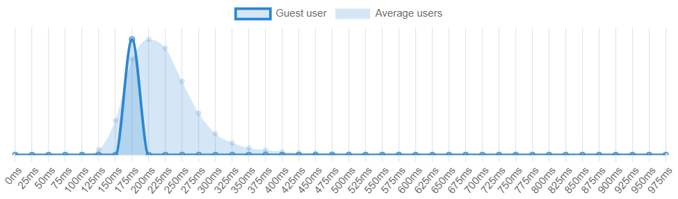
There are many different ways one can use benchmarks in order to determine whether a measurable value is over or under an expected value. As shown by the reaction time benchmark from Humanbenchmark.com where I scored an average of 191 m/s which put me in the top 74.46% percentile. The graph that is darker represents my value while the lighter colors represent the standard of comparison, or the average of all the other users. As shown, my values are slightly skewed to the left which means that my reaction time is above average when compared to the values of the lighter blue.
Investing Charts
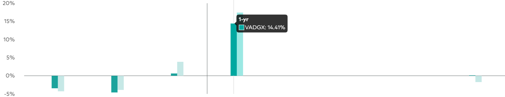
https://investor.vanguard.com/investment-products/mutual-funds/profile/vadgx#performance-fees
Another application of benchmark comparisons would be an investment or stock that generates a projected profit after a certain period of time. As portrayed by investorvanguard.com, they have a bar graph that shows the amount of returns and projected returns within a year. The darker green color represents the current value while the light green represents the expected goal. They used a darker color to bring attention to the value that they want the reader to see the most and a lighter color in order for the other value to be less distracting.
All in all, there are many different ways to shows benchmarks and simplify information. One can use bar graphs, line graphs, bell curve, and many more options in order to accurately portray data. Using the data, the audience can then make a more informed decision on their topic of interest (i.e. stocks, investing etc.). Hopefully this article gave you a good idea of the effectiveness of benchmarks and their many uses.
Comparing Numbers For political candidates

Data visualizations are a major aspect in simplifying complex data to a broad population of people with different cultures, and languages. As shown by the New York Times bar graph of the speaking times of political candidates and the amount of attacks that each political candidate received in comparison to their speaking times. Taking a look at the bar graph, it is very clear what it is trying to convey. The graph not only labels the time in increments with labels, but also states the total amount of time that each candidate ended up speaking for. Though the graph for comparison is separate from the bar graph of the total time, the clarity of the information being presented leaves very little room in regards to which graph is what, and what it is they are trying to convey. What was interesting about this comparison is that the person that was the most attacked was surprisingly not the person that spoke the most, but rather someone that they didn’t even speak at all. Furthermore, there are also a plethora of other data visualizations that compare numbers that could have also been used to portray the data besides the a bar graph. Two such examples would be doughnut chart or a pie chart. Both would not only accurately represent the data, but also offer a visual representation of the percentages that each candidate spoke in comparison to the total time given. With that being said, Data visualizations for comparison of numbers can be applicable for a number of different topics, aside from political topics, and portrayed in many different kinds of graphs.
Using Visualization in Health
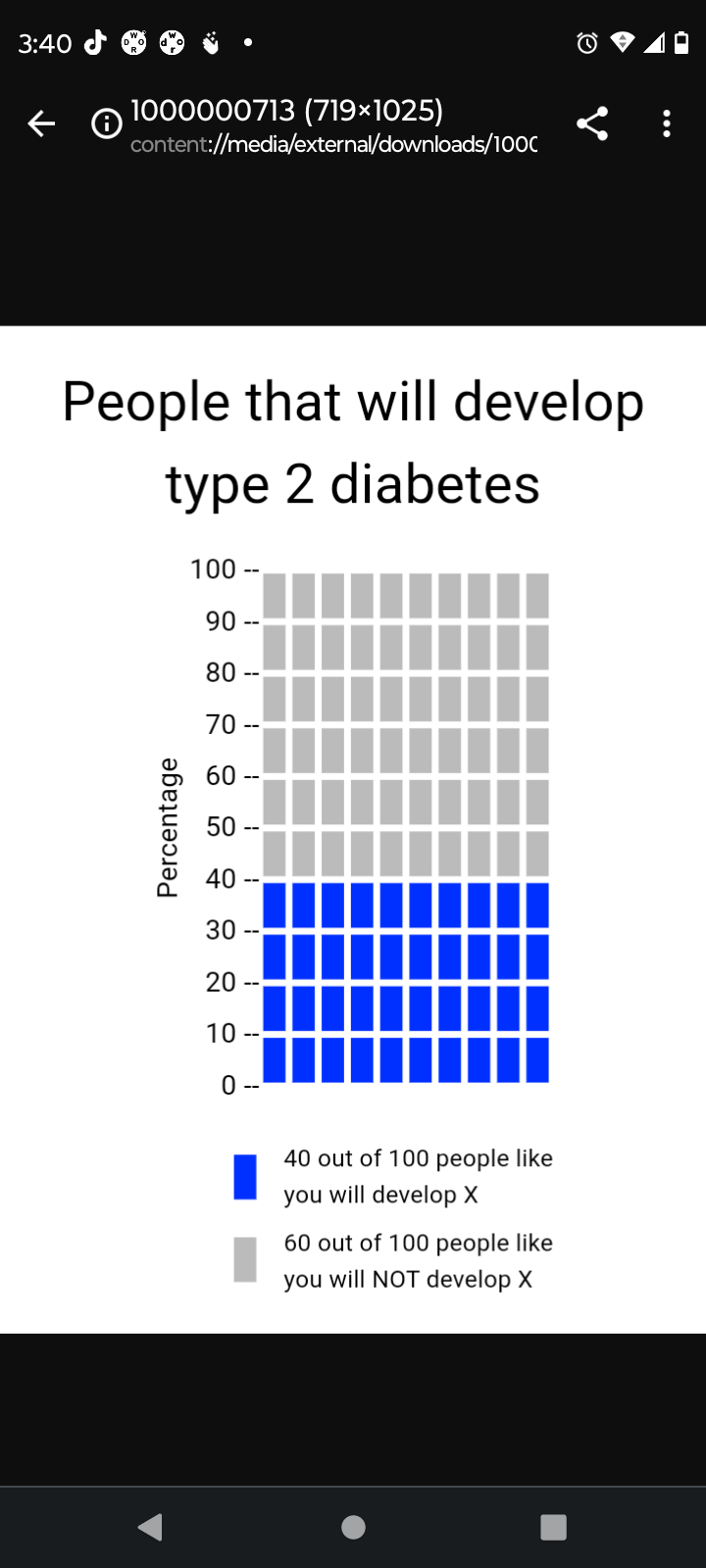
The implementation of visualization in health is a very crucial part in simplifying health literacy for the average individual/patient. This is especially true when one considers that patients come from many different cultures and backgrounds, all of which have an abundance of different languages. If done properly, a visualization transcends language barriers and cultural differences between a patient and a healthcare provider. With that being said, the Visualization in health website offers a variety of resources in order to create a proper visualization. To begin with, the website offers many different options for the types of graphs someone can use in order to measure a certain topic. There are disparities graphs and individual risk graphs which measure the likelihood of someone having a certain type of diseases/condition. There are also very simple risk graphs which can tell one their likelihood of contracting a certain type of disease based on the individuals health. As seen above, a simple graph was created in order to show the likelihood of someone contracting type 2 diabetes within their lifetime. The data being shown is very easy to understand and the graph properly conveys the values with proper labels. All of this was done in the span of 2 to 3 minutes and the features were very user friendly. People all around the world can use these features not only to see their likelihood of contracting a certain medical condition but also to find out what their current level of fitness is. All in all, this website can be used by both health professionals and regular patients in order to find out information and is a major part of data visualization.
The Importance Of Infographics and Data Visualizations
https://visme.co/blog/best-data-visualizations/
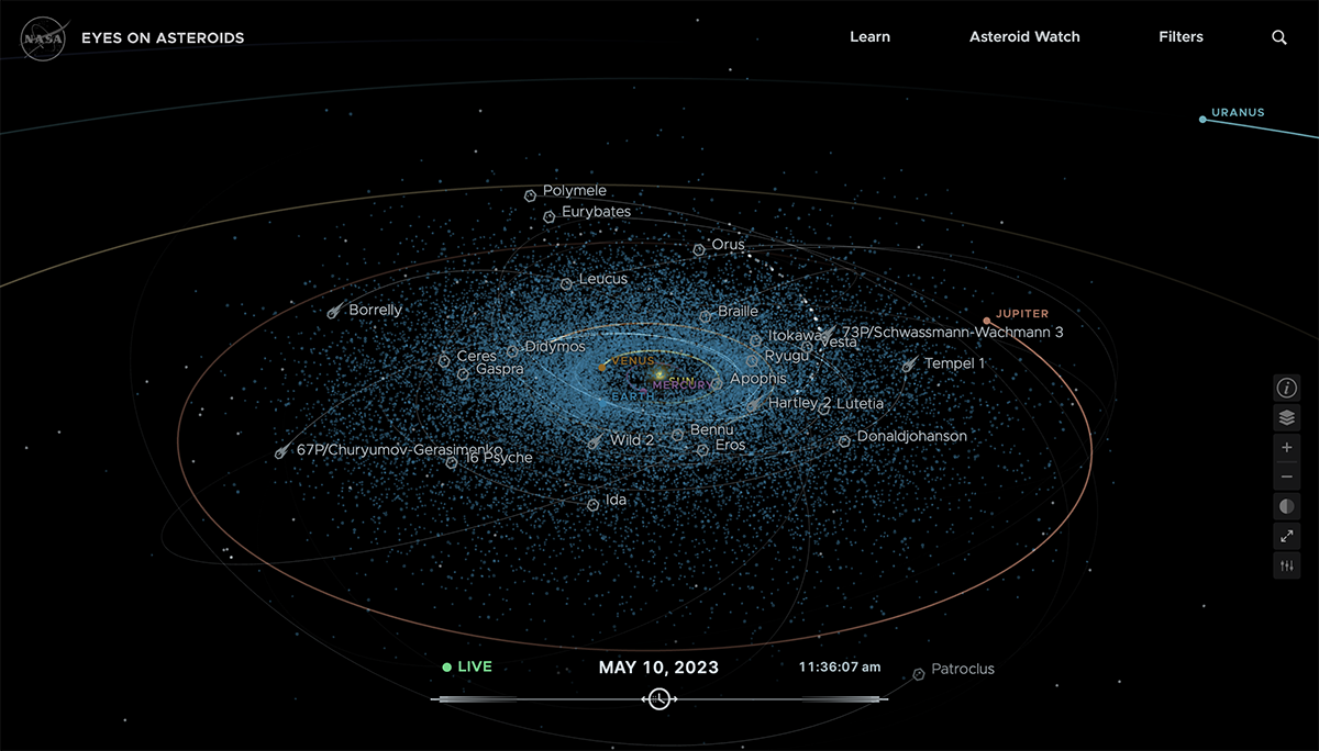
Infographics is an everyday part of our lives. There are many instances where it can be used to aid others in understanding certain complex concepts through the use of visual aids. It can be used anywhere from teachers trying to teach a class about a certain topic, or a marketing firm presenting a new product. One such method that uses infographics includes the use of data visualizations to not only observe but also predict the current course of asteroids in space. According to Visme, NASA’s eyes on asteroids visualizations ” provides up-to date information on the position and trajectory of asteroids”. This means that NASA is able to use the data visualization to possibly see any threats that could be approaching our planet and prepare ahead of time. Furthermore, as shown by the picture above, the data visualization contains a plethora of information about many asteroid paths with their names and projected paths. There are even some planets that are within our solar system such as Jupiter. The abundant amount of information being shown in such an easy to understand manner is only possible because of infographics. To add on to this, there is also a higher chance of the information being shown to be retained by the audience because of its simplicity. It has long been known that people are typically more likely to remember information that leave a strong impression on them, and portraying a 3D real time model of space is definitely one way to do that. However, predicting asteroids isn’t the only thing that infographics are used for. There are also many data visualizations that analyze the social or historical aspects of society such as the seven wonders. With that being said, Infographics is a major resource that can be utilized in many ways in order to learn, retain, and predict information.