Pivot Table
Carlita Holloway
What is a pivot table?
A pivot table is a type of visualization that let the user lay out huge samples of data in one sheet for the user to analyze and examine. They are typically used for all kinds of business practices or financial consultations. Here is an example of one.
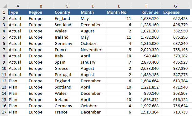
With a pivot table like this, a user can take data and organize or “pivot” the information to reconstruct and look at the information differently. That is where the word “pivot” in pivot table comes from.
That is one reason pivot tables are so handy with working with large groups of numbers; being able to organize large complex sets of data and organize them into more comprehensible forms of data makes it much easier for both the reader and presenter to digest. Attached is a video describing how to create a pivot table of your own.
Sankey
Sankey is a chart or a visualization that shows off the gradual progress of something. this type of chart is ideal for showing off the process of an event, the history of a certain topic, or the rise of a movement. It is a good way to show the continual progress of something in an interactive way.
This visualization is showing the audience how energy is used throughout the US.
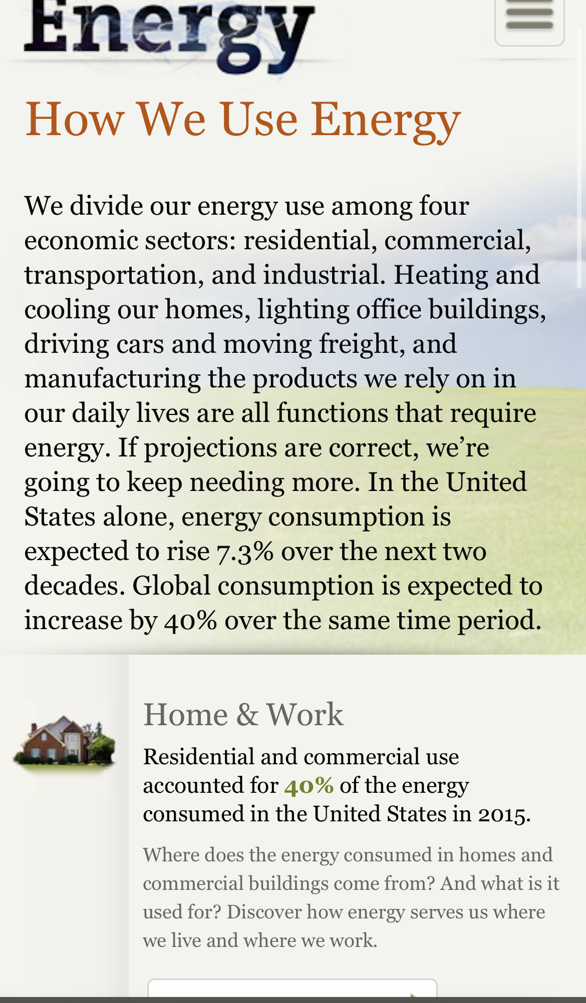
The site has a tab that shows in great detail the nuances of the US energy system and all the intricate parts attached to it. For example, one of the visualizations shows off how much energy overall the US population consumes in one year.
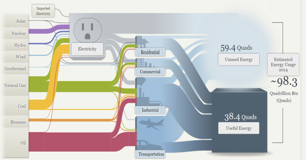
Overall, Sankey Visualizations create an innovative and new way to present presentations. They give the audience a chance to dive into the subtopics of a subject and weave passageways of information. I believe that this is the kind of presentation that would be excellent for an audience that is eager to comprehend the complexities of a topic.
Pie Chart
I decided to create a pie chart based on the types of pools within the U.S.
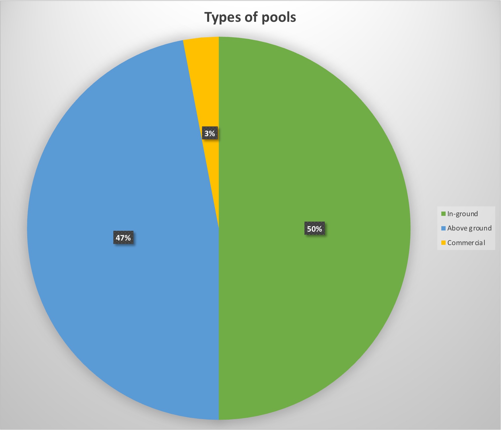
For my data, I decided to use data of the 10 million pools within the country to see what was America’s favorite set-up for their pool.
The reason this data is served best as a pie chart is the simple fact that percentages are perfect for pie charts. Not only do they look visually appealing, but they show exactly in visual terms what America prefers best, which looks split between above and in-ground pools. It’s a simple and visually pleasing way to show percentage data without being too complicated.
Pro-tips for creating a pie chart is to include the percentages within the graph. That way the reader does not have to search long for the data but instead focus on the graph data with ease.
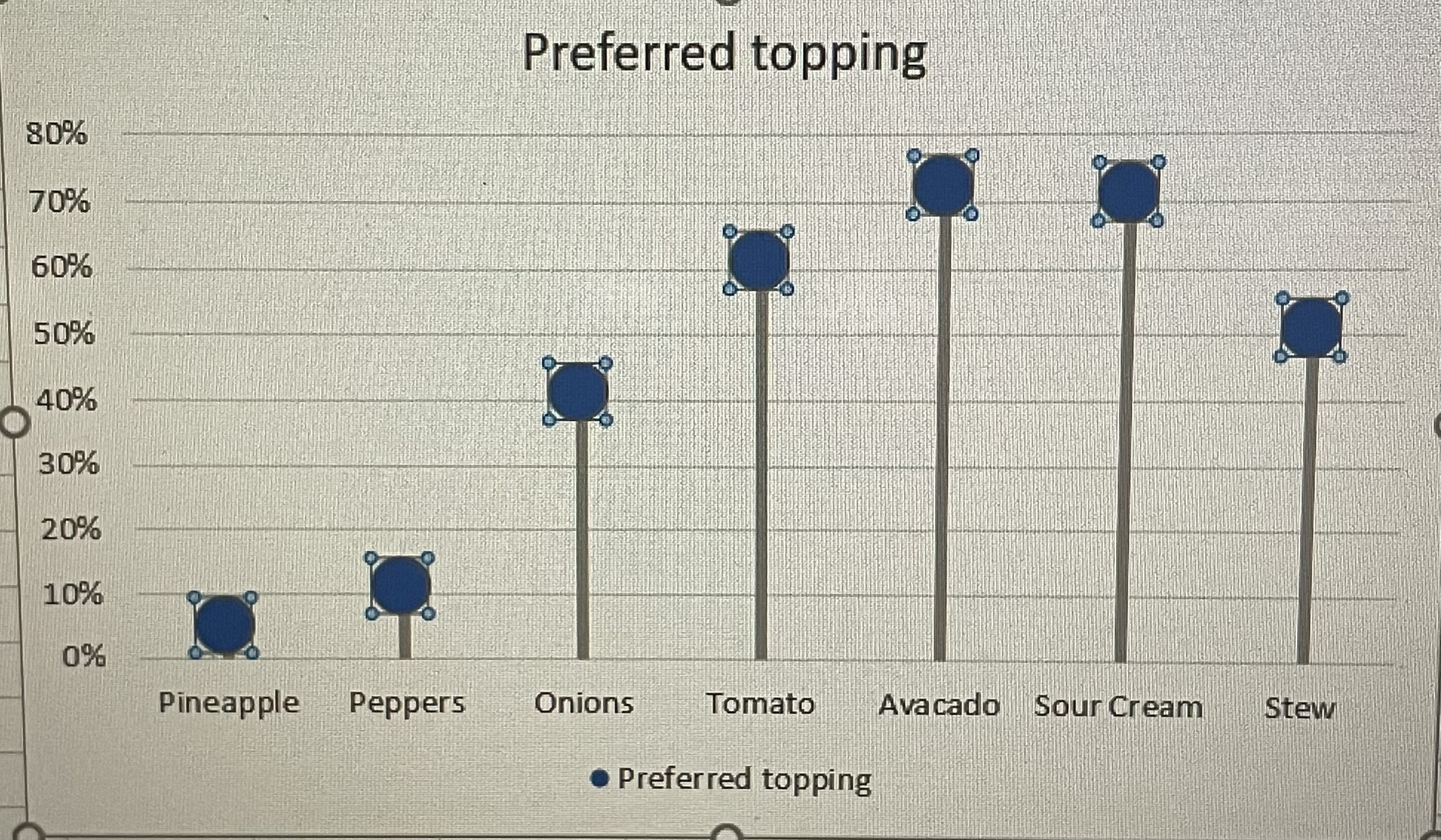
Lollipop Chart
A lollipop chart is a different variation of many graphs and visualizations one can use. It’s just a line and a dot, instead of the typical bar. Visually similar to a lollipop. Lollipop graphs are useful for measuring trends, categories, ranking, and comparing data.
Here is an example of a lollipop graph, my own created lollipop graph.