Visualizing Health-Diabetes in America
The site Visualizing Health has many resources to better interpret and explain health information. There is a risk calculator that can aid in the determination of whether medical intervention is necessary in cardiovascular health. Simple questionnaires like this can make health easier to understand. By entering different values into the quiz before you can see how different sexes, age and other characteristics can manipulate the chart.
For example, I chose these options and this visualization was my result. When choosing different options the picture will change to adapt your answers to what research has shown is a trend in cardiovascular health.
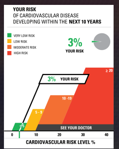
When using the risk calculator easily manipulating the chart by choosing different options can give you a better idea of cardiovascular health.
The site also has another tool the icon array. This is a very useful graph which can be changed to display information in a way that makes it much easier for a person to see the impact of something. For example, the CDC studies diabetes across America and the trends in the disease. According to their website 1 in 10 Americans have diabetes. While this statement alone can bring some awareness to the disease, a pictogram such as the one shown below may prove more helpful in visualizing the information.
You can change the color and shape of the icons, the titles of the graph and axes, as well as include a legend if necessary by utilizing the dialog box on the right.
This is such a handy tool to better explain information that could be written out and misinterpreted.
Utilizing Visualizing Health in data visualization across the medical field will prove to be a more effective way to interpret data.
Sources:
Visualizing Health
Insightful Data Visualizations
Crash Course YouTube and Website
Infographics are a creative and fun way to better explain information in a way that sticks with the reader more effectively.
They are used in both professional and academic settings to aid in learning for all ages across all subjects.
One of the best aids in not only data visualization, but in general learning is the YouTube channel and website “Crash Course“.

These two brothers create informative videos and lessons that give you a ‘crash course’ in a particular subject or topic. By browsing their YouTube channel you can see over one thousand videos categorized in different playlists by subject. These videos can aid anyone in continued learning at any age.
While these videos are not in depth each contains immense amounts of information , cited by reputable sources, as well as each links resources for you to delve deeper into each topic.
These videos are filled with different infographics, they even have a video about data visualization, that help the watcher better understand the information better. As a partner of PBS Studios these brothers are aiding in bringing free education to everyone.
They have a diverse and inclusive creation space that can be appreciated by any learner.
In their two video course on data visualization another member of the team explains the different ways and forms of infographics.
Watch both videos here:
Watching any of their content will help you become just a little more fluent in any topic. If more interested be sure to check out their links as well!
Sources:

https://thecrashcourse.tumblr.com/downloads/stats