What Are Pivot Tables?
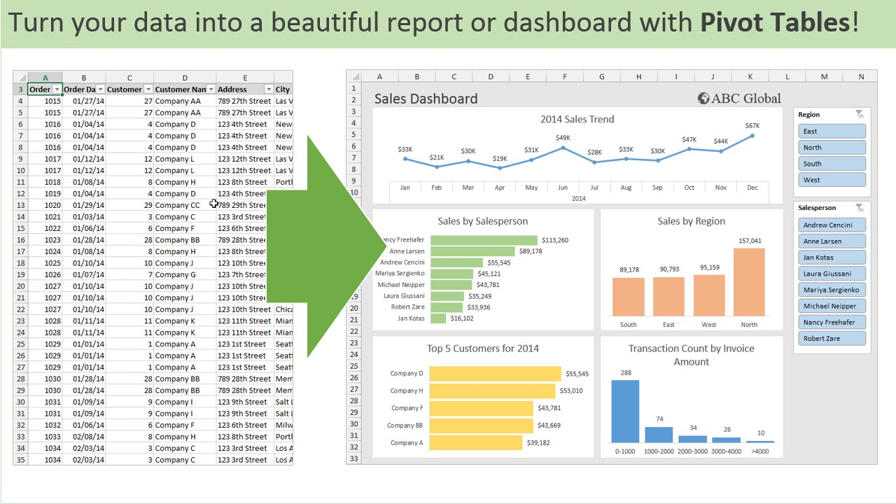
Pivot tables are an incredibly powerful feature found in various spreadsheet software applications, such as Microsoft Excel, Google Sheets, and others. They serve as a vital tool for users who need to summarize, analyze, and interpret large sets of data efficiently. By allowing users to reorganize and manipulate data, pivot tables transform rows into columns, which significantly enhances the ability to identify patterns, trends, and relationships within the data. This transformation is crucial for extracting meaningful insights from complex datasets, making pivot tables an indispensable resource for data analysis.
One of the standout advantages of pivot tables is their ability to facilitate quick data manipulation without making any changes to the original dataset. This means that users can experiment with different arrangements of data, apply filters to focus on specific subsets, and perform various calculations—all while preserving the integrity of the original information. This non-destructive approach to data analysis empowers users to explore their data from multiple angles, leading to more informed and effective decision-making. The flexibility offered by pivot tables is particularly appealing to a wide range of users, from students conducting research projects to professionals analyzing business performance.
Moreover, pivot tables allow users to create dynamic reports that can be easily updated as new data becomes available. This capability is especially beneficial in fast-paced environments where timely insights are crucial. Users can quickly adjust their pivot tables to reflect changes in the underlying data, ensuring that their analyses remain relevant and accurate. The ability to generate visual representations of data, such as charts and graphs, further enhances the interpretability of the information presented in pivot tables.
In summary, pivot tables significantly simplify the process of data analysis by providing users with a versatile and user-friendly interface for creating comprehensive reports. They save time and effort by automating many aspects of data manipulation, allowing users to concentrate on the most critical elements of their analysis. Overall, pivot tables are an essential tool for anyone looking to work with data effectively, whether for academic purposes, business intelligence, or personal projects. Their capacity to streamline data analysis and uncover valuable insights makes them a favorite among both novice and experienced users alike.
Sankey Visualizations
Sankey visualizations are a specialized form of flow diagram that provide a powerful means of illustrating the movement of resources, energy, or information across various entities or stages within a system. Named after the Irish engineer Matthew Sankey, who first used this type of diagram in the late 19th century to depict energy flows, Sankey diagrams have since evolved into a versatile tool applicable in numerous fields.
One of the defining features of Sankey visualizations is their use of arrows whose widths are proportional to the magnitude of the flow they represent. This visual representation allows viewers to quickly grasp the relative sizes of different flows, making it easier to identify significant relationships and distributions within complex systems. For instance, in an energy management context, a Sankey diagram can effectively illustrate how energy is generated, consumed, and lost across various processes, providing insights into efficiency and areas for improvement.
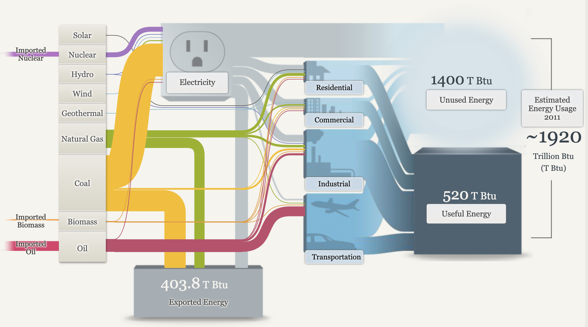
After viewing the data provided by the Sankey visuals, there is plenty of data about energy consumption we can gather from them. The United States imports a small amount of its electricity from Canada and Mexico, mainly from hydroelectric power and fossil fuels. Electricity is called secondary energy as it is generated from primary sources like coal, natural gas, and nuclear power, accounting for about 39% of total U. S. energy supply. In 2015, residential energy use was 21% of total consumption, with major uses being space heating, water heating, space cooling, and lighting. The commercial sector, including offices and stores, consumed 18% of energy, primarily for heating and lighting. The industrial sector used 32% of energy, focusing on energy-intensive industries like refining and paper production. The transportation sector, dominated by oil, consumed 28% of energy to move people and goods.
There are opportunities to improve energy efficiency, though some energy loss as heat is unavoidable. Useful energy refers to the energy that effectively performs tasks like moving a vehicle or heating a space. The total energy consumption in the U. S. is immense, measured in quadrillions of British thermal units (quads), with one quad equal to the annual energy use of a city the size of Chicago.
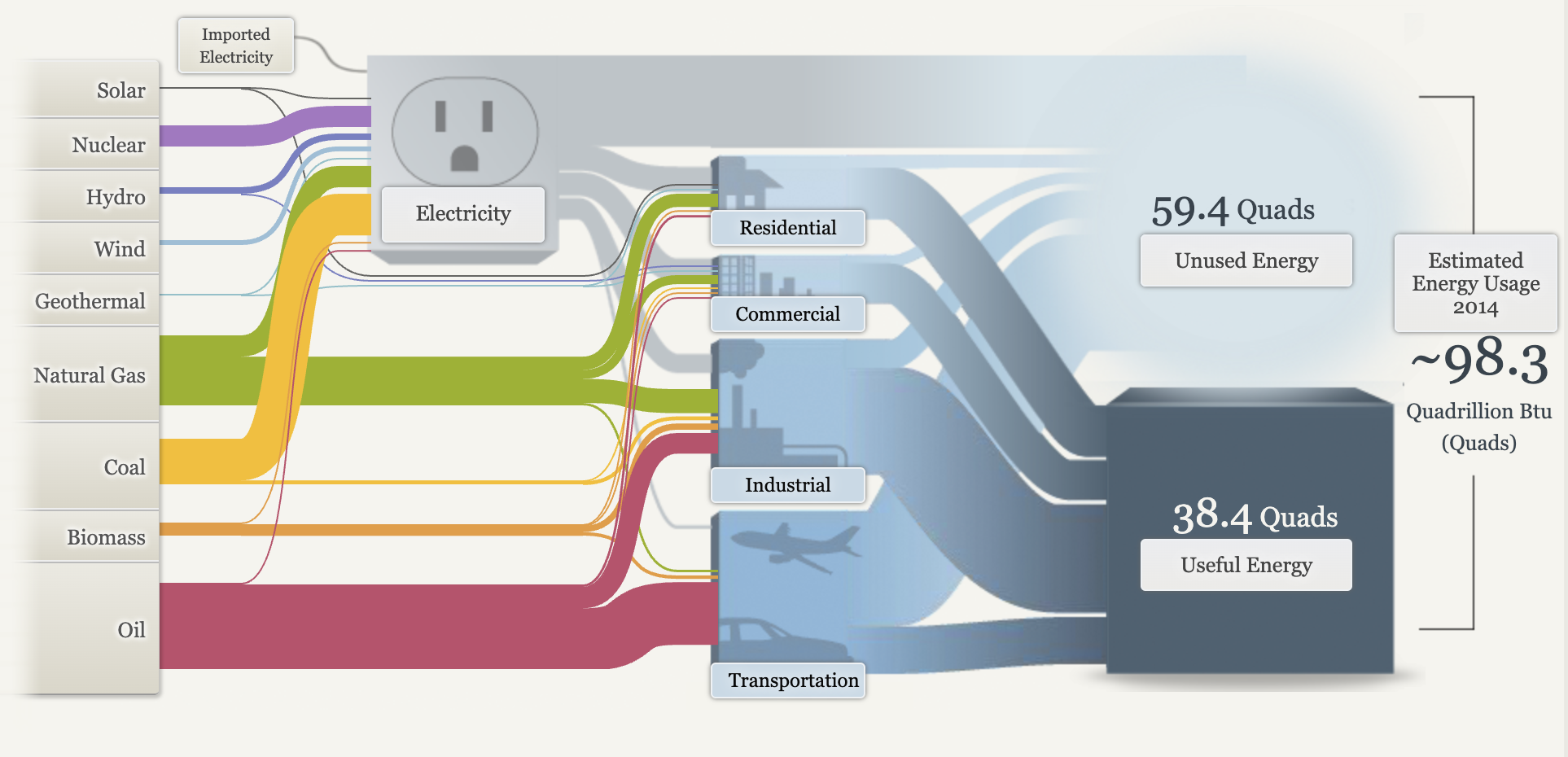
After learning about Sankey visualizations and the data being represented, I do feel that they are the right visual choice for this data. Sankey visualizations are effective for illustrating data on energy consumption due to their ability to clearly represent the flow of energy between different sources and uses. By employing proportional arrows, these diagrams facilitate an intuitive understanding of how energy is distributed and consumed, allowing for easy identification of trends and inefficiencies. This visual format enhances the comprehension of complex data, making it accessible for analysis and decision-making.
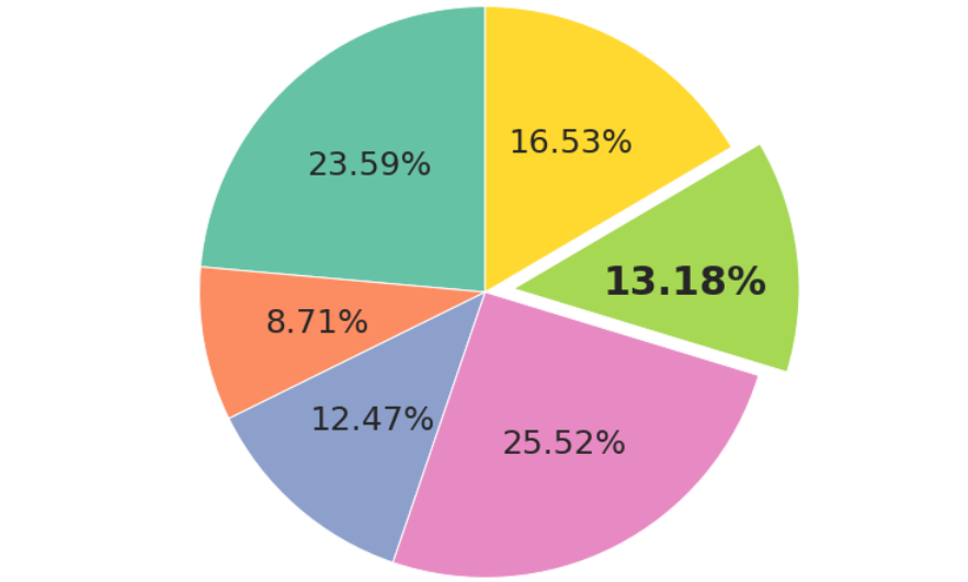
The Usage of Pie Charts
A pie chart can effectively illustrate the distribution of various racial groups in America by visually representing the percentage of each demographic. This graphical representation allows for a clear understanding of the diversity within the population, highlighting the proportions of different races in a manner that is easily digestible for the audience. Utilizing a pie chart not only enhances comprehension but also emphasizes the significance of each group in the broader societal context.
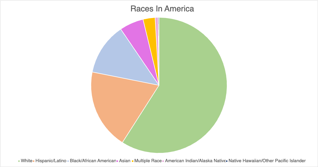
When constructing a pie chart to depict racial demographics, it is crucial to ensure that the data is accurate and sourced from reputable studies or census data. For instance, the U.S. Census Bureau provides comprehensive statistics that can be utilized to create a reliable chart. Additionally, incorporating color coding for each racial category can enhance the visual appeal and clarity of the chart, making it easier for the audience to differentiate between the various groups. It is also beneficial to include a legend that clearly labels each segment, as this aids in the immediate recognition of the data being presented.
In terms of design tips for creating an effective pie chart, simplicity is key. Avoid cluttering the chart with excessive text or overly complex designs that may distract from the data itself. Instead, focus on using contrasting colors that are visually distinct to represent each racial group, ensuring that the chart remains accessible to all viewers, including those with color vision deficiencies. Furthermore, consider incorporating a brief narrative or context alongside the chart to provide additional insights into the significance of the data, thereby enriching the viewer’s understanding and engagement with the information presented.
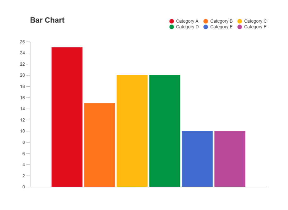
When deciding between a bar graph and a pie chart for data representation, one must consider the nature of the data and the specific insights one aims to convey. A bar graph is particularly advantageous when comparing discrete categories or groups, as it allows for a clear visual comparison of the values associated with each category. The length of the bars provides an immediate visual cue regarding the magnitude of each category, making it easier for the audience to discern differences in size and to identify trends across the data set. In contrast, pie charts are often less effective for this purpose, especially when there are numerous categories or when the differences between the values are subtle. The human eye is generally better at comparing lengths than angles or areas, which can lead to misinterpretation when using pie charts. Furthermore, bar graphs can accommodate a wider range of data types, including negative values, which pie charts cannot represent. This versatility makes bar graphs a more suitable choice for comprehensive data analysis. Despite using a pie chart for this data, I feel that a bar graph would better show the smaller values.
Lollipop Charts
One of the primary advantages of using a lollipop chart is its ability to highlight specific values while maintaining a clean and straightforward visual presentation. This is particularly beneficial when dealing with a limited number of categories, as it enables the audience to focus on the key differences without being overwhelmed by excessive information. The visual simplicity of the lollipop chart helps to draw attention to the most important data, making it easier for viewers to interpret the results. Moreover, lollipop charts can enhance the aesthetic appeal of your data presentation. Their playful design can make your report or presentation more engaging, capturing the audience’s attention and encouraging them to interact with the data. This visual appeal is especially valuable in settings where you want to convey information effectively while also keeping the audience interested. Whether in business meetings, academic presentations, or public reports, a lollipop chart can serve as a powerful visual tool that aids in communication.
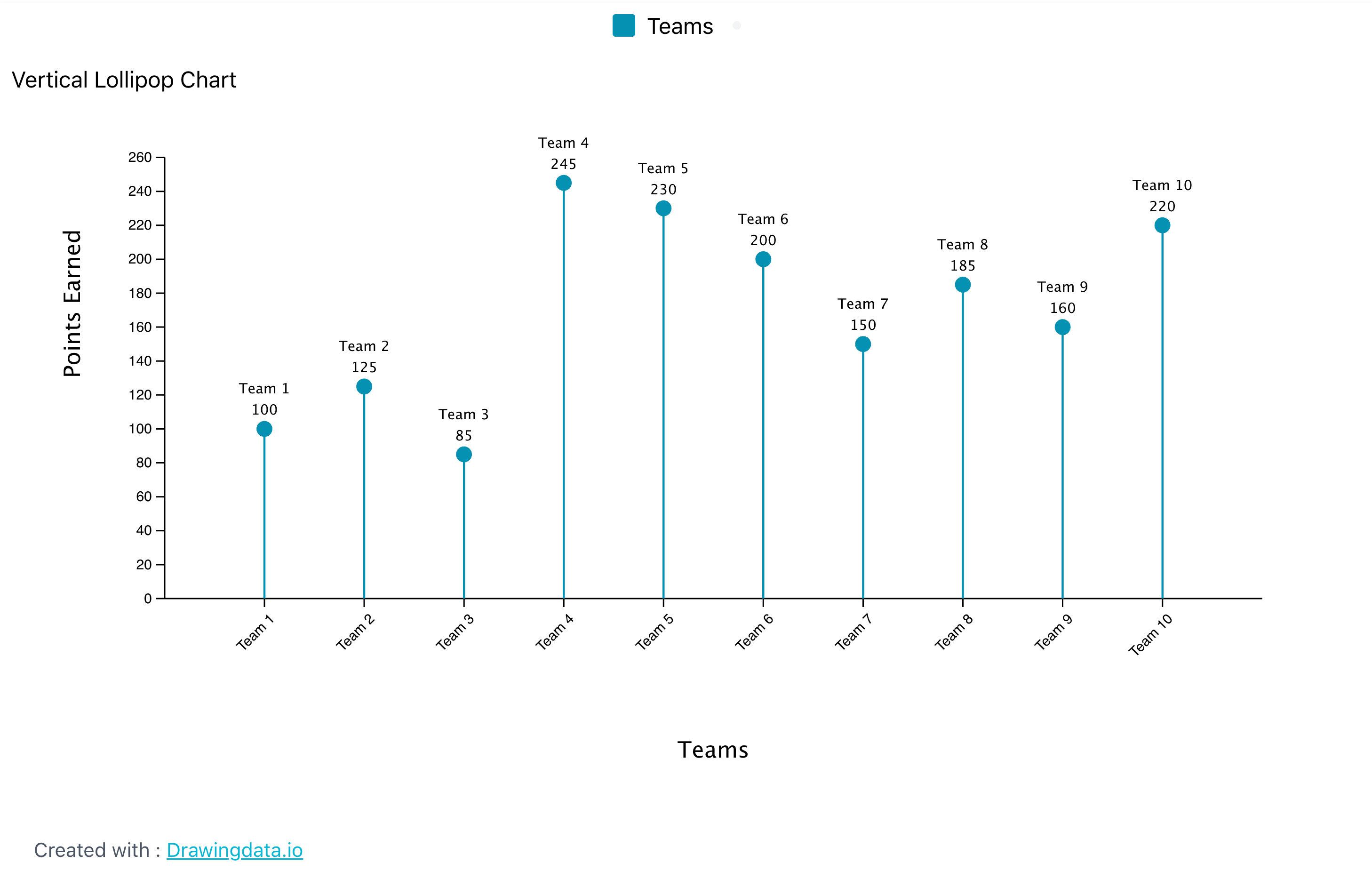
In addition to their visual charm, lollipop charts are also versatile. They can be used to represent various types of data, including categorical data, numerical comparisons, and even time series data when adapted appropriately. This flexibility allows you to tailor the chart to fit the specific needs of your analysis, making it a valuable addition to your data visualization toolkit. When considering the use of a lollipop chart, it is essential to ensure that the data being presented is suitable for this format. The chart works best when there are clear distinctions between categories and when the data points can be easily compared. By selecting the right context and data, you can leverage the strengths of the lollipop chart to convey your message effectively.
In summary, a lollipop chart is an engaging and visually appealing data visualization tool that combines the best features of bar charts and dot plots. It is particularly useful for highlighting specific values and making comparisons between a limited number of categories. By using a lollipop chart, you can enhance the clarity of your presentation, capture your audience’s attention, and facilitate a better understanding of the data being presented.
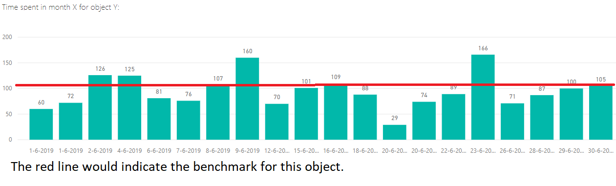
Benchmark Comparisons
Data visualizations play a crucial role in how we interpret and understand information, especially when it comes to making comparisons against a benchmark. One common method is through the use of bar charts, which allow viewers to easily see the differences in values between various categories. For instance, if a company wants to compare its sales figures to industry standards, a bar chart can clearly illustrate how its performance stacks up against competitors. This visual representation makes it easier for people to grasp the data at a glance, highlighting areas of strength and weakness.
Another effective way to showcase comparisons is through line graphs, which are particularly useful for displaying trends over time. By plotting data points on a timeline, viewers can observe how a particular metric, such as revenue or customer satisfaction, changes in relation to a benchmark. This method not only provides a clear visual of the data but also allows for the identification of patterns, such as seasonal fluctuations or long-term growth. Line graphs can be especially powerful when comparing multiple datasets, as they can show how different entities perform relative to one another over the same period.

Additionally, pie charts can be employed to represent parts of a whole, making it easy to see how different segments compare to a benchmark. For example, a pie chart could illustrate the market share of various companies within an industry, with one segment representing the benchmark company. This type of visualization helps to convey proportions and percentages effectively, allowing viewers to quickly understand how each entity contributes to the overall picture.
Lastly, x, highlighting key factors that contribute to the differences observed. By combining qualitative insights with quantitative data, one can create a comprehensive picture that not only shows the comparison but also explains the underlying reasons for any discrepancies. This multifaceted approach ensures that the audience fully understands the context and significance of the comparisons being made.

Data Visualizations for Comparing Numbers
Data visualizations are powerful tools that help convey complex numerical information in a clear and accessible manner. Various types of visualizations can effectively compare numerical data, each serving different purposes and audiences.
Bar charts are one of the most common forms of data visualization used to compare quantities across different categories. Each bar represents a category, and the length or height of the bar corresponds to the value it represents. This makes it easy to see which categories have higher or lower values at a glance.
Line graphs are particularly useful for comparing numerical data over time. By plotting data points on a graph and connecting them with lines, viewers can easily observe trends, patterns, and fluctuations in the data. This is especially effective for time series data, such as stock prices or temperature changes.
Scatter plots display values for two different variables for a set of data. Each point on the plot represents an observation, allowing viewers to see relationships, correlations, or clusters within the data. This type of visualization is particularly useful for identifying trends and outliers. A great video that goes in depth on how to make these plots can be found at https://www.youtube.com/watch?v=Vyg9qmBsgAc&t=2s.
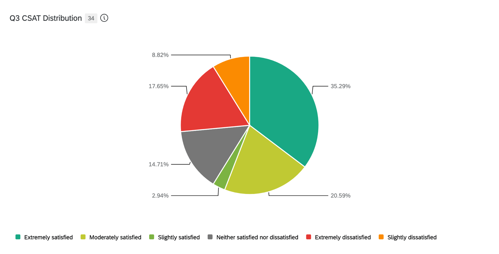
While often criticized for their limitations, pie charts can be effective for showing the proportion of a whole. Each slice of the pie represents a category’s contribution to the total, making it easy to compare relative sizes. However, they are best used when there are a limited number of categories.
In conclusion, the process of selecting the right data visualization is not merely a technical decision; it is a strategic one that requires careful consideration of the data type, the intended message, and the audience’s characteristics. By thoughtfully integrating these elements, you can create visualizations that are not only informative but also compelling and accessible.
Exploring Viz Health
Vizhealth.org is a dedicated platform that specializes in the visualization of health data, aiming to enhance the accessibility and comprehension of complex health-related information. The website offers a variety of tools and resources designed to assist users—ranging from healthcare professionals and researchers to educators and the general public—in creating clear, engaging, and informative visual representations of health data.
By leveraging advanced visualization techniques, Vizhealth.org enables users to transform raw data into intuitive graphics, charts, and interactive dashboards. This not only aids in the interpretation of intricate datasets but also facilitates better communication of health trends, outcomes, and statistics to diverse audiences.
After messing around with their Icon Array tool, I can conclude that I found this tool and whole website in general very helpful. It is an valuable resource for putting information together into a visual. When data is presented in charts or graphs, it becomes clearer and more engaging, allowing viewers to quickly grasp trends and patterns. This visual representation can also make it easier to communicate findings to others, making discussions more effective and informed. For my visual I made, I just used some simple statistics on how many people out of 100 have a cellphone.
Tools for Constructing Infographics
Infographics are powerful visual tools that can significantly enhance our ability to convey complex information in a more digestible and engaging manner. In an age where attention spans are shorter and information overload is common, the use of infographics has become increasingly important. They serve as a bridge between data and understanding, transforming intricate concepts into visually appealing representations that are easier for audiences to grasp.
There are various tools available for creating infographics, each designed to cater to different needs and skill levels. Popular platforms such as Canva, Piktochart, and Adobe Spark offer user-friendly interfaces that make the design process accessible to everyone, from beginners to seasoned graphic designers. These tools come equipped with a wide range of templates, allowing users to choose from pre-designed layouts that suit their specific content and style preferences. This not only saves time but also ensures that the final product is polished and professional. The platform known as Canva actually made a step-by-step video on how to make an infographic on their website, that video can be find at https://www.youtube.com/watch?v=36SIUe_mOZU.
One of the standout features of these infographic creation tools is their ability to easily incorporate various elements such as charts, images, and icons. This flexibility enables users to present data in a visually compelling way, making it simpler to highlight key points and trends. For instance, a complex set of statistics can be transformed into a clear bar graph or pie chart, while relevant images can provide context and enhance the overall narrative. Icons can also be used to symbolize ideas, making the information more relatable and memorable.
By utilizing infographics, we can significantly enhance our communication skills. Infographics not only make our presentations more visually appealing but also serve to clarify and emphasize the information we wish to convey. When information is presented in a structured and visually engaging format, it can lead to better understanding and retention among our audience. This is particularly important in educational settings, business presentations, and marketing campaigns, where the goal is to inform, persuade, or educate.