Pivot Tables
When it comes to analyzing data it is often found that there are large sets of data that are hard to distinguish and compare at once. This can be made simple by inserting a pivot table into excel. A pivot table summarizes thousands of rows at a time in Excel workbook. Using your dataset, Excel creates a report of each table in which you can edit the layout. Below are a few examples of pivot tables being used to help interpret data.

This pivot table displays sample data of office supplies. In this table you can see it provides information on
- Order Date: first column shows when the order was placed,
- Region: geographical area in which the sale was made
- Rep: sales representative’s name
- Item: name of the item sold
- Units: number of units sold
- UnitCost: cost of one unit
- Total: total cost of the order – Units x UnitCost
I then used the data set in Excel where I inserted this into the pivot table option and received the following report.
Another example of a pivot table is one of the most simple ones you can do. I imported this table from the website https://exceljet.net/pivot-tables/pivot-table-basic-count

This data did not have that many rows because the repeating values were removed ahead of time. However, the color tables were not unique. Instead of having to count up each person for each color, you can create a pivot table that can tell you the same data in seconds. Pivot tables provide a flexible way to rearrange and filter data interactively.
SANKEY Data Visualization Review
A Sankey diagram is a type of data visualization that represents the flow of resources or information between multiple entities. This database is for visually representing our energy system and how it works. It is very useful in information as well as visually pleasing. After using the site I found that it was quite easy to navigate through and believe it would be helpful for beginners. The first thing I enjoyed was the way that the website is interactive.
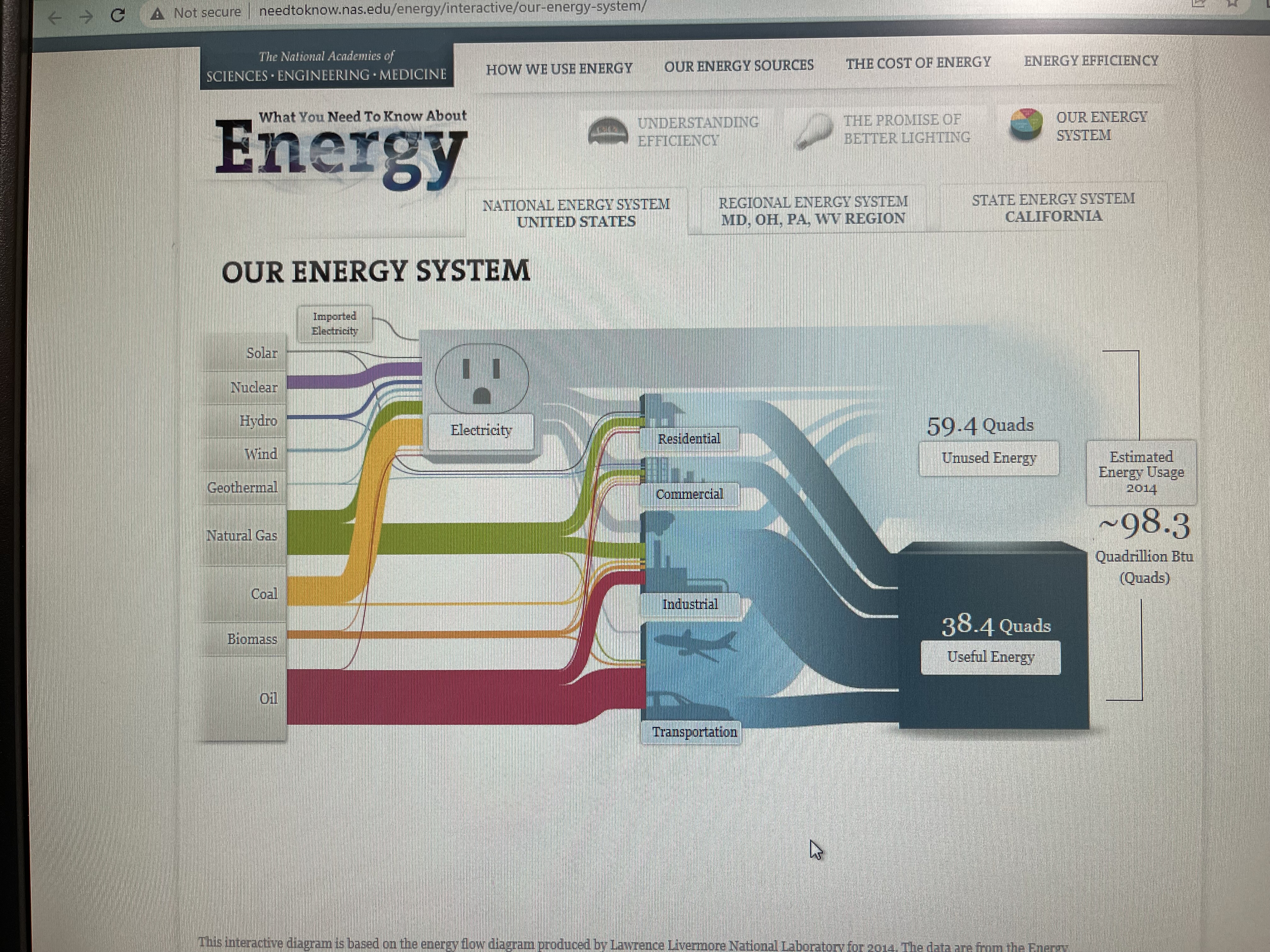
This interactive map helps break up different parts of our energy system and provides information on each section when you click on it. I appreciate the graphics included as well and the captions are simple to understand. This representation is a lot better than just reading paragraphs of text. The side panels are meant to show how it is related and connected to energy. Each one has a different percentage of total U.S. Output and percentage of total U.S. CO2 emissions.
The page above, however, I found to be a bit overwhelming due to the crowding of text. The font, size, and colors do not to a great job of breaking up the information. It is so much data to analyze it over complicates the main idea. To improve this I would add more visuals in between texts and emphasize the most important parts of the text with bigger lettering or a change of font/color. The side panels also are a lot to navigate through in one page.
Lastly, what I would have liked to see in this website would be a comparison of each tab displayed through charts or graphs. In order to analyze the information provided you must search through the text and read what the data says. It would make it easier for the viewer if it was already displayed in a more obvious manner. I would recommend a histogram chart for this kind of data as well. Over all, this website does a great representation of SANKEY and I would recommend it for future projects.
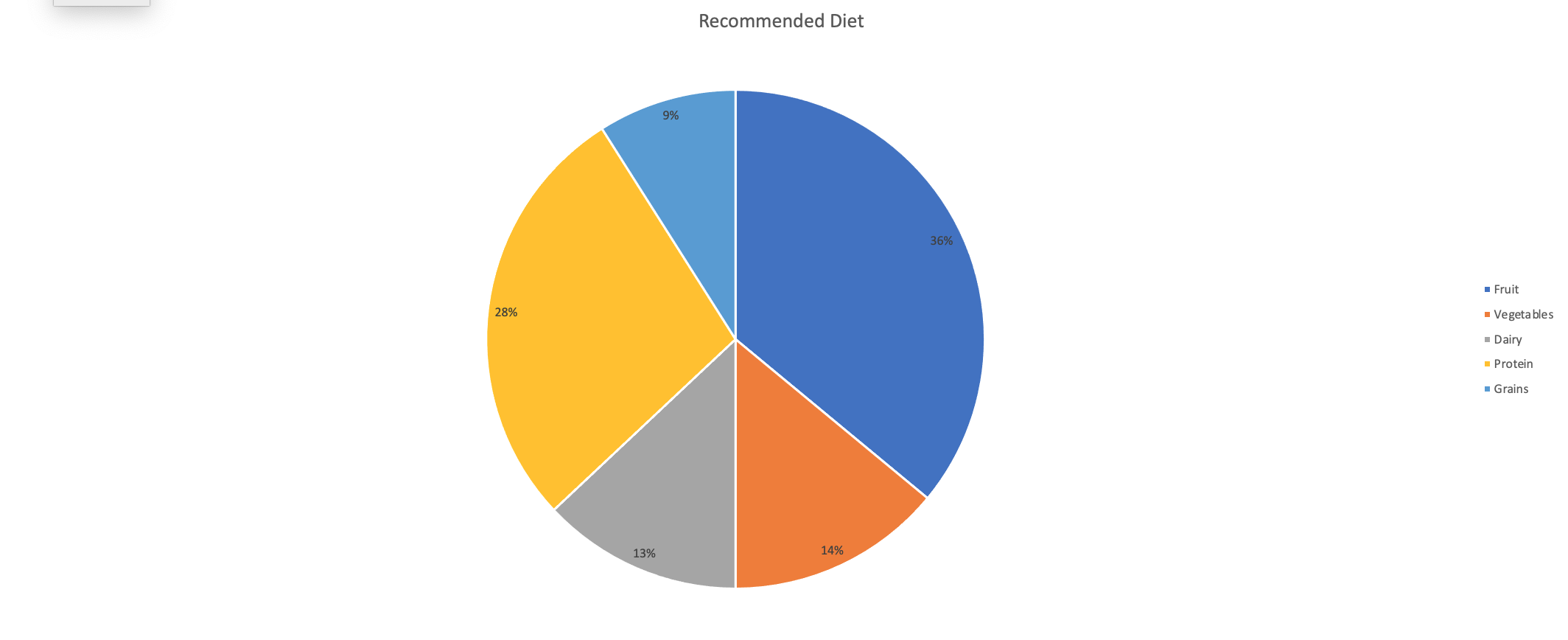
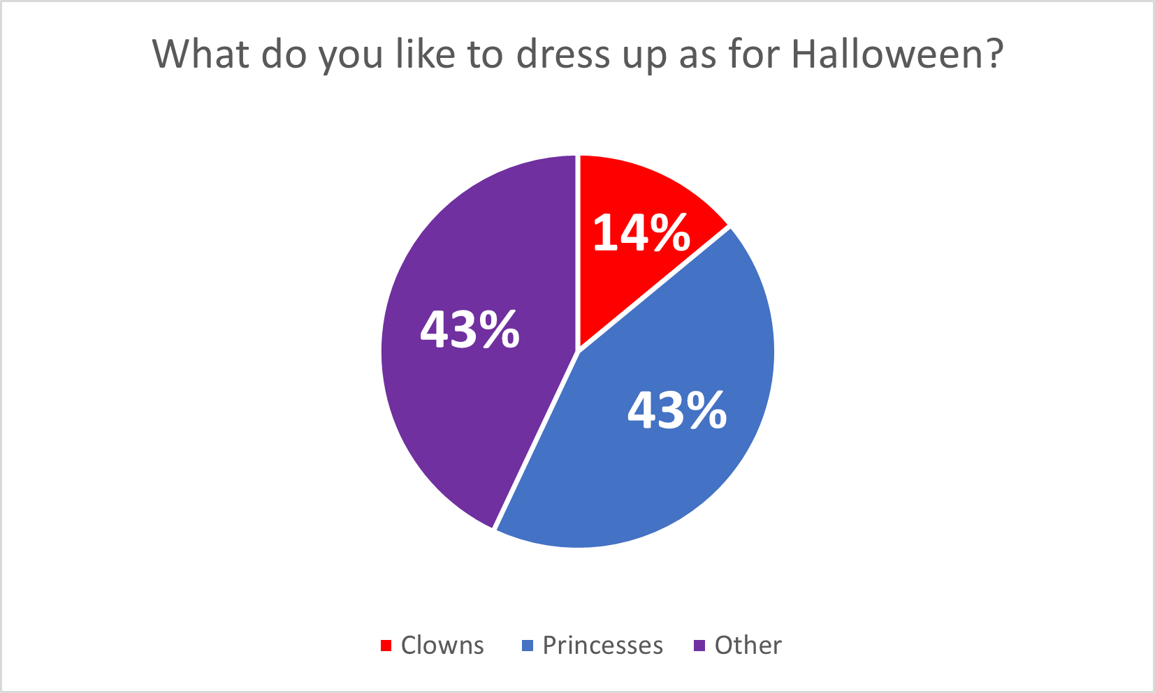
Pie Charts and When to Use Them
Pie charts are a form of data visualization that can be used to compare part-to-whole relationships. They are circular graphs illustrated through different proportions of categories within a whole. It is commonly and best used for percentages because it all adds up to 100%. It makes it easier to understand this way because each segment in the pie chart represents the percentage of the whole that each category represents. However, not all data is best represented through a pie chart.
Pie charts work best with minimal components due to the risk of overcrowding. So, if the data has too many points, it becomes challenging to read. In this case, bar charts might be a better fit. Pie charts are also not made to compare more than one data set and do not work well when comparing small differences. Anything that can not be broken down into minimal slices and easy to distinguish, is not meant to be represented by a pie chart.
An example of a good data set to be represented by a pie chart would be a recommended diet plan divided into sections. I made myself a diet plan to balance out what food groups should be ingested more than others. In the chart, you can clearly see that fruits, vegetables, and protein are the main components that I need to have compared to dairy and grains. All percentages create a whole and each slice is representative of the whole.
Benchmark Comparisons
Data visualizations often are made through comparison of values and the best way to do that is to include a reference point to evaluate data. Based on where the benchmark is located the viewer can analyze if it is above or below that point. This can help provide context to the data or it can be used to mark goals in data. In data visualization, it is important to have these indicators so that the information being presented has meaning.
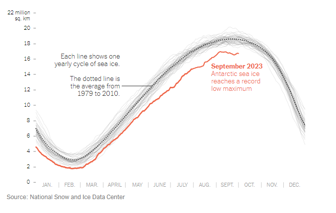
The data above was pulled from an article uploaded to The New York Times called, “Where’s All the Antarctic Sea Ice? Annual Peak Is the Lowest Ever Recorded” by Delger Erdenesanaa and Leanne Abraham. The authors report that the annual peak of Antarctic sea ice has reached its lowest recorded levels. This decline in sea ice extent raises concerns about the implications of climate change for the polar region. What they did to visualize this data was to add in a “benchmark” shown as the dotted line to represent the average from 1979-2010. You can clearly see that where we are in 2023 (shown in red) that the Antarctic sea ice drops below the benchmark by an extensive amount. Based on the data shown, they are able to assess where the level should be and can make the achievement goal to be above that targeted area. https://www.nytimes.com/2023/10/04/climate/antarctic-sea-ice-record-low.html
Comparing Numbers
This blog is about ways we can use insightful data visualizations to compare numbers. Data visualizations can make complex information more comprehensive. At the point when you analyze numbers visually, examples, patterns, and connections become more obvious. Comparing data is an effective way to show similarities or differences between two known subjects. With that being said, it can be very difficult to digest information when it is not presented in a way that speaks to the language of the eye. In order to draw someones attention you have to know how to visualize data in an easy to understand way. However, there are different charts and graph that digest certain types of information and data. Choosing the most effective tool is extremely beneficial.
For example, the author gives different charts for the appropriate data sets in the article “7 Types of Comparison Charts for Effective Data Visualization” by Tanzil Ebad Chowdhury. When comparing numbers, pie charts are the most commonly used technique because they are easy to understand and interpret. This is best used when comparing a part to a whole, like percentages. https://ninjatables.com/types-of-comparison-charts/
Bar charts a great way to incorporate numerical data in a straight forward way. It is commonly displayed with an x axis for categories and the y axis for numerical values. This is good for monitoring changes over time.
Histograms are best used for quantitative data because they are specifically designed to display the frequency distribution of quantitative data. This can visualize the shape of the distribution so that you can analyze whether it is normal, skewed, etc.
Overall, there is a different chart/graph for every form of information, choosing the right one is the most important part. The article linked displays about 7 different ways you can do this and explains the primary approach for each one. It is essential to choose the best type of chart based on the specific characteristics of the data and the information you want to present. Other types of charts, such as line charts and scatterplots can be more suitable for different scenarios, so choosing the most appropriate visualization method is critical for effective data visualizations.


Podcast: Play in new window | Download
Effective Data Visualization
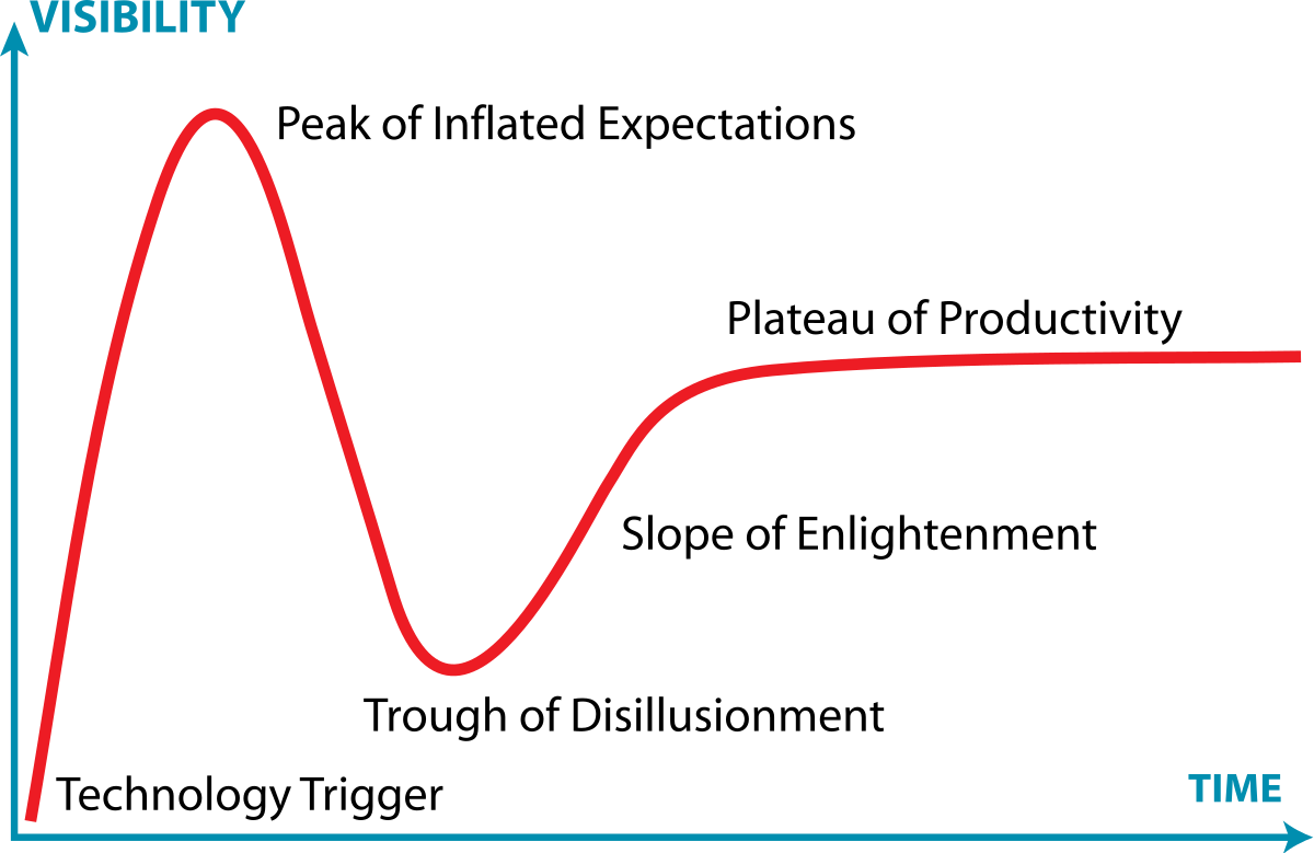
Infographics are visual representations of any information or data that can be displayed through images, charts, or icons. The goal of using these is to summarize or break down concepts more concisely. I researched examples of insightful data visualizations where I found Harvard’s Business review article that covers this topic. The article highlights the importance of storytelling through infographics to engage with observers efficiently. Examples about creating visualizations that are informative is included in the text. One of the topics spoke on the Gartner Hype Cycle, it is “traditionally data-driven form—a line chart—but no actual data” which is a graphical representation used in research to track data. It is done using complete visuals to analyze progression of technology (Harvard Business Review). The circumstances are very business based and are used in real life situations which I found very interesting.
Podcast: Play in new window | Download