Pivot tables
By Robert Fox
What is a pivot table?
A pivot table is a type of visualization that allows the user lay out samples of data into one sheet to easily analyze and a examine. Here is an example of one.
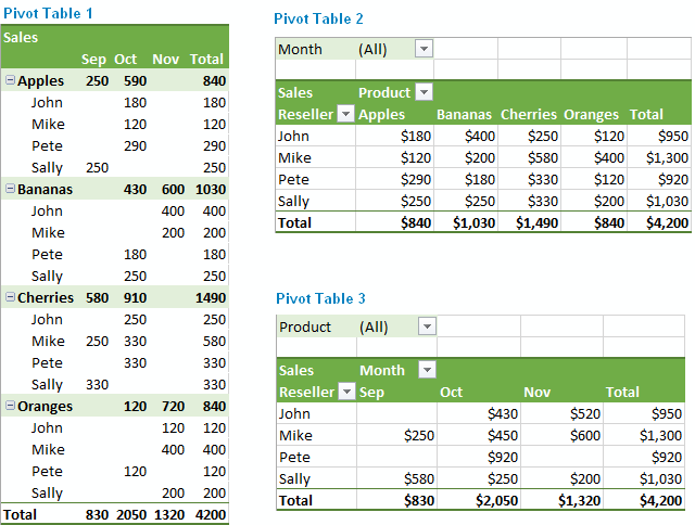
A user can take data and organize or like the name implies, “pivot”, the information to reconstruct and look at the information differently.
That is one reason pivot tables are so handy when dealing with large data sets; being able to organize large complex sets of data and organize them into more digestible forms of data makes it much easier for everyone to examine. Attached I have added a video describing how to create a pivot table of your own.
Sankey
By Robert Fox
Though some analysis of the website, I’ve come to like the format and layout of this blog. It doesn’t have a clear start or finish from the tabs, but i still felt it was organized and had proper visualizations to boot. I liked the features they added upon clicking certain prompt and such, it made it interesting to look at.
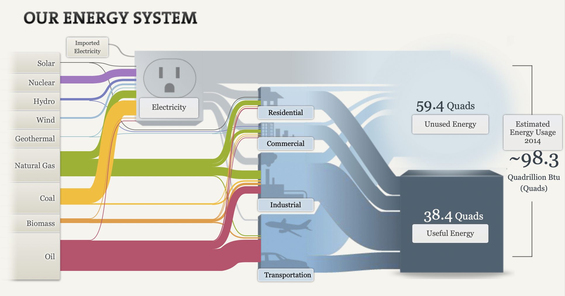
After clicking on the word text, it gives you more opinions to read. More info is also provided upon each click. The manner of making this guide go hand and hand with an electrical outlet was a clever idea as well.
After playing around on it for some time, I found it to be a great asset when it comes to the production of similar graphics. I think I would like to utilize a Sankey visualization on a future assignment as it seems easy to incorporate a easy means of laying out the visualizations.
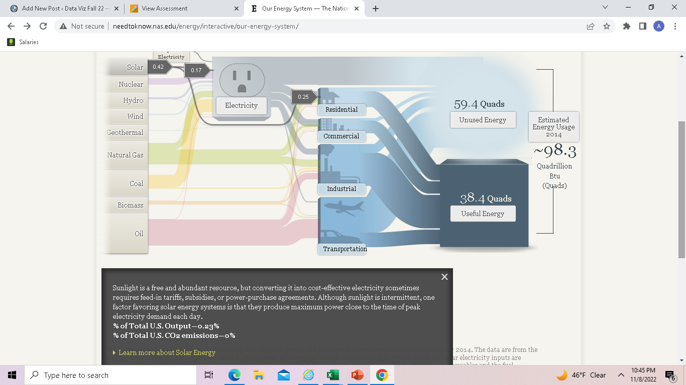
Pie Charts
by Robert Fox
The pie chart that I chose to make depicts the method of learning students were most interested in in the United States, in the year 2021.
I believe this was a good example of data to use in a pie chart because it represents a part for the population out of the whole. In this specific example, the whole is the students who participated in this survey in the U.S and each part is filled with a certain percentage of those citizens based on how they entered said poverty.
As far as design choices I made for this chart, I chose to go with a bright with countered darker colors color in order to make the chart itself more eye catching to the audience. That and making sure each title in the figure had the data variable with it.
Lolipop Chart
By Robert Fox
A lollipop chart is a variation of a column/bar chart. The bars you would normally encounter are instead replaced with a line and a dot at the end of said line. Lollipop charts serve the same purpose as bar charts however, and a simply a different visual. They still compare data values with one another.
When would it be best to utilize a lollipop chart instead of a bar chart?
Lollipop charts tend display data better when there is a large number of values that are close to one another, causing it to visually be hard to read as a bar graph. With a standard bar chart, the infographic would be to be mashed together, and thus making it hard to differentiate between two similar values. The lollipop chart makes these small differences easier to see, and it is also a more clear visualization.
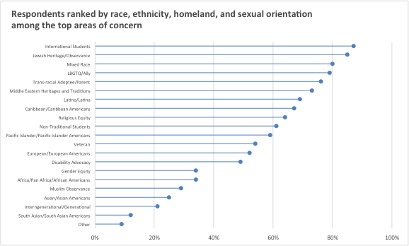
Here is an example of a lollipop chart based of data taken on the overall population percentage of student voters in the New York Area. Here we can see many data points of close value, it being in this format making it able to be understood.