Pivot Table
Pivot tables help provide incredible insight for larger, more complex data sets, where end users are able to vary the functionality of the tables to better suit their needs. For example, a use case for a pivot table would be using it to manage inventory management. By implementing an inventory management system into a pivot table, we are able to see what items are used most frequently, identify less commonly used items that a business may have in stock, and could go a step further and implement a customer analysis pivot table with the data derived from the inventory management system.
In short, a pivot table summarizes large, complex data sets that can then be used to generate insights depending on which way the data leads it. The reason why they are so widely used is because of the simplicity they offer for the end user, allowing the user to know minimal skills but still create a very valuable data-driven tool through excel.
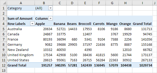
In this example, we can see how end users can manipulate this data set to see which countries have the most fruit, export the most fruit, or even rank them accordingly to biggest producers of each fruit! The possibilities of uses can go on, but the most important takeaway is to learn how to use the functionality within the pivot tables!
Sankey Visualizations
Through this highly-informative presentation, the tools used to create these visualizations were very impactful in the goal of educating people about energy issues throughout the United States. In this visualization, I learned about the amount of energy wasted each year, how it impacts us, and what are the main contributors to creating our energy that is used either for commercial, industrial, or residential lifestyles.

In this screenshot, it is shown what are the main contributors to our total energy supply, and what industries rely on what types of energy. For example, it is shown that roughly 20 percent of the total energy created by oil goes to the industrial industry, and most of oil helps fuel the energy needs of the transportation sector. This visualization is very interactive and helps keep readers engaged throughout.
Something that I had learned by going through this visualization, is how much energy is wasted each year, which is well over half of the total supply! Aside from the environmental impact of this situation, which is all very well known and highly covered through various news sources, I was unable to find the financial burden this leaves the country with. A process this inefficient must be incredibly burdening to the people paying for this, which as South Jersey residents, I think everyone can understand.
I want to further explore how this can relate to continuous price hike that many New Jersey residents are facing right now, specifically South Jersey residents. With Atlantic City Electric increasing electric bills by a mind-boggling 20% just last year, I wonder if the situation we are currently viewing through the Sankey visualization can help explain these egregious price hikes.
Pie Chart

Pie charts are traditionally used to compare numbers and data sets within the chart. This is easily done by comparing the numbers provided by the creator of the chart, or simply by comparing the area of each portion of the pie. This can be highly effective when comparing few data sets against each other, allowing the reader to easily visualize each portion of ‘pie’ a data set may represent.
In my example, I created a pie chart out of the data found through multiple sources on the internet, which display the monopoly held in the smartphone market. In it, we can note that Samsung is the largest individual slice of the global market. The ‘Others’ portion is represented by small companies looking to make a name for themselves. The beauty of simplifying all the small companies into one slice and representing them as a group is that it allows me, the creator of the pie chart, to represent an accurate representation of the global smartphone market, while emphasizing the major stakeholders.
I find that this method of displaying my data is the most effective, given that my goal is to make the viewer compare each companies share in the marketplace. I feel that there is the possibility of there being a better method to display this data, but as to my current knowledge, this is the best method.
By creating a pie chart, there are a variety of ways to demonstrate the data you choose. I found this way to be the most effective at providing a quick and easy understanding of what the viewer will be looking at, while given a small amount of context.
Lollipop Chart
Within my fictitious dataset that I created, I show a possible way to use a lollipop chart. These charts are most commonly found in place of a barplot, where you are comparing multiple data figures against one another. This technique can help to simplify the graph for the reader and make it easier to understand for the viewers. These charts typically work best when comparing a relationship, rather than a trend.
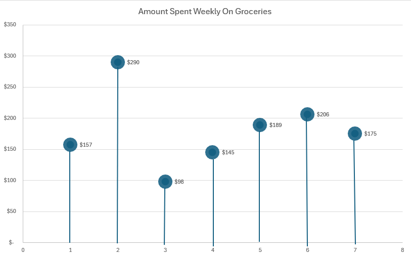
In this example, we can see the x-axis (the customer), and the average amount they spend weekly on groceries. While within this example there is no benchmark to measure against, the data figures still can be seen and measured against each other fairly easily. We can note that customer 2 has an exorbitantly high grocery bill, possibly due to a variety of factors. In contrast, customer 3 has the smallest grocery bill, maybe someone shopping solely for themselves compared to a parent shopping for 3. These scenarios are not the whole truth behind this fictitious dataset, but an interesting note to take away is the insights that these numbers are able to give us. By seeing the average across the chart, it can help us to identify outliers much quicker, and provide possible explanations as to why one customer’s grocery bill can be significantly less to greater than another.
Benchmark Comparisons
There are dozens of ways to refer back to a baseline to compare your data to. But, none are as efficient as using a benchmark to compare an average (or even a group of something), to measure against your own data. For example, if a man or woman were to mention that they were able to do 60 push-ups, you may realize that’s a lot, but you aren’t sure how this person may measure up to others. When adding the additional information that the global average is between 26-35, it drastically changes your perspective and makes you realize where that person fares up against most. This applies to any form of data visualization by adding depth to the topic you cover and also helping to give the reader a better understanding of the strength or severity of something.
Recently, Florida has been hit with an onslaught of catastrophic-level hurricanes, taking the lives of many and wrecking millions of dollars worth of damage. But, when measuring out the strength and magnitude of these hurricanes, how can we understand their true strength?
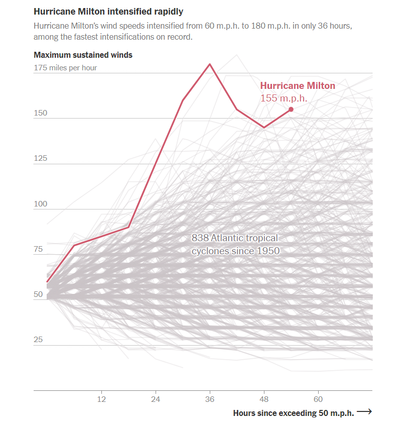
This visualization uses historical data and inserts previously recorded hurricanes as the benchmark to measure up against the new Category 5 hurricane, Hurricane Milton, that will soon make landfall in Florida. As shown in the visualization, and made abundantly apparent to the reader, Hurricane Milton is one of the strongest hurricanes to ever be recorded in modern times. We know this by using the line graph to measure up Hurricane Milton against all the other recorded hurricanes in history.
By using benchmarks, readers are able to quickly determine the scale of a given event and compare it against previously established benchmarks. In the example of Hurricane Milton, we are able to see the horrifying strength of the winds compared to hundreds of other hurricanes, and quickly understand just how severe the force of the hurricane will be in Florida.
Using Data Visualizations to Compare Numbers of Significance!
When trying to disseminate information to a group that doesn’t share the same level of expertise you or others may have, it may be difficult to get them to understand the severity of some statistics. For example, if you do not know anything about hockey, but I told you that Wayne Gretzky scored 92 goals within one season, you may think that sounds great, rather than amazing. But, if I prefaced that information with the fact that many hockey players would be considered of an ‘above-average’ or even ‘great’ skill level if they score above 20 goals in a season, you would begin to realize just how different of a player Wayne Gretzky was from the average superstar. The same concept applies to creating data visualization charts when comparing numbers of significance.
Read More about Gretzky’s Career: Westport Library: Using Data Visualizations to Compare Numbers of Significance!
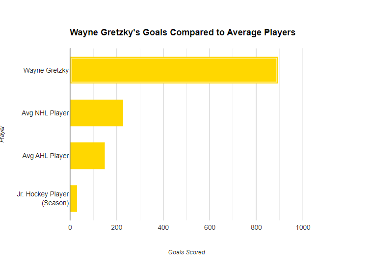
Within this bar chart, we can see the goals scored throughout someone’s career compared to Wayne Gretzky. By translating this information into a visual object, it is much easier for someone to grasp the magnitude of just how good Wayne Gretzky truly was as a hockey player. While my example revolves around just this hockey player, the concept of translating complex numbers and data statistics into data visualizations is the same everywhere!
Something unbeknownst to most people in New Jersey is that our state was responsible for growing 849 acres of eggplant in 2015, which has grown every year! Going off of a data point from 2015, this is what our eggplant production was like compared to the rest of the world at that time:

As you can tell, New Jersey was at one point responsible for well over two-thirds of the world’s eggplant production! Of course, this was taken at a point in time where our state was primarily responsible for supplying the world with the vegetable everyone loves. But, when comparing these two monumental figures side-by-side, the reader can better understand how the numbers fare up against each other. By New Jersey planting 849 acres, we produced an insane amount of eggplant which equated to roughly one million metric tonnes!
Visualizing Health
On the interactive infographic, I found that I have less than a 5% chance of developing heart disease within the coming years. Not only was I fully engaged during my time of inputting all the information, but that same attention carried over into reading the results.
The idea of creating an interactive infographic was incredible! The biggest problem with most static information is establishing the connection and sparking the interest from the author to the reader. By allowing for a dynamic source of information to vary based on the results inputted into it, it allows for the reader’s to stay focused longer and absorb information better!
Not only was the user experience informative and interactive, the infographics themselves would change depending on the information submitted to it, allowing the user to see where they stand against the numbers. While this exact website may only be used for medical purposes, the idea of turning an infographic, into a dynamic piece of information, is a monumental step in the way that information can be disseminated through it.
Additionally, the website allows users to create their own graphics to display information, such as survey counts and icon arrays. The following example is my own:

While it may be very rudimentary, the point of it remains the same. By allowing this information to be created by anyone, and still be accessible for everyone, it can help to usher in a new wave of how information can be disseminated! However, the potential for false information to be spread through this infographics still exist, so it is important to always conduct research or fact-check on whatever it may be that you have read!
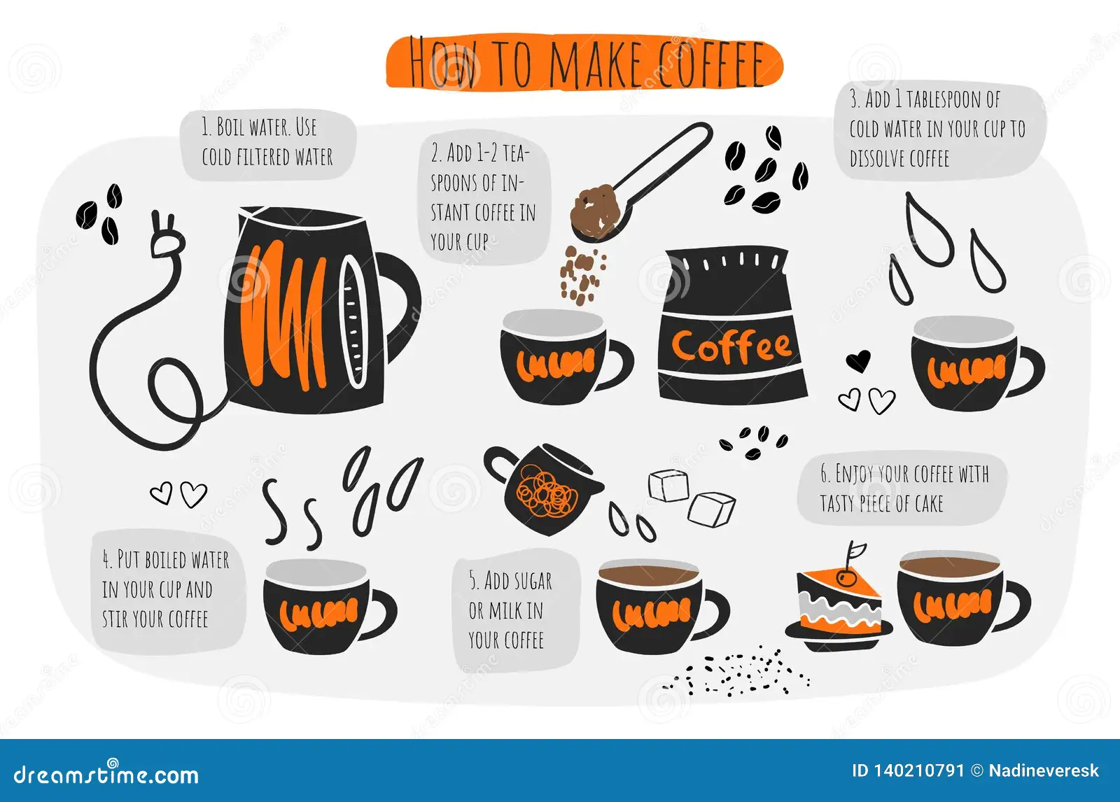
How to make ‘How-to’ Infographics!
Infographics are incredibly useful tools for disseminating information. Whether you are trying to visualize statistical information, creating a fact-orientated infographic, or something geographical (such as a map), an infographic can be made to cater to your needs!
In my infographic, I will be demonstrating how you can make an infographic to visualize a set of instructions to be used for day-to-day processes, such as making a cup of coffee!
This simplistic, yet artistic infographic, it clearly demonstrates the step-by-step process that goes into making a cup of coffee. By using eye-grabbing colors, the artist can maintain the reader’s attention on the infographic, helping the reader to understand their point better.
This form of infographic relies more on the visual effect appealing to the reader, in order to get the author’s/artist’s point across. This infographic is more informative about what measures should be in place when making a cup of coffee. This is slightly different compared to the last one, where you only get the basic amount of information, but it takes you each step to making the final product. Whereas this infographic, assumes you know how to make a cup of coffee, and gives rules on how to hone the final product.
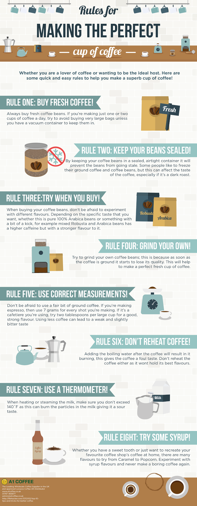
https://coffeeblog.co.uk/rules-making-perfect-cup-coffee-infographic
There are various different ways to present an infographic, but the purpose of being created to further inform remains the same!