Pivot Tables
Pivot tables are an incredibly powerful tool for organizing, analyzing, and summarizing large datasets. They enable users to transform raw data into meaningful insights with minimal effort.
Pivot tables allow you to quickly group, filter, and aggregate data. For example, you can calculate totals, averages, or counts with ease. Users have the ability to customize rows, columns, and values to focus on the specific insights that they need from their data.
The pivot table below shows the sum of sales over several years, broken down by product colors. It aggregates data annually from 2016 to 2019 and provides a grand total for each color across all years.

This layout is useful for identifying trends in sales performance for each color over time, helping businesses to determine which of their products have consistent demand from customers.
This next pivot table displays the sum of sales quantities for various fruits and vegetables across different countries. It also calculates grand totals for each product and country.

The above pivot table provides insights into the regional demand for specific products, supporting decisions on regional marketing strategies or inventory management.
The last pivot table, displayed below, summarizes monthly household spending across different categories for January, February, and March. It shows total amounts per category for each month and overall. This table is great for personal budgeting or financial analysis, offering a clear breakdown of expenses across categories over a defined period.

Pivot tables are indispensable for anyone who needs to make sense of data, whether for work, school, or personal use. They help you organize and summarize large amounts of information in a clear and easy-to-understand way. By grouping and analyzing data, pivot tables can show important patterns or trends, like which products sell best or where most money is being spent.
In short, pivot tables make data simple and actionable, helping you make better decisions with less effort.
Sankey Energy Visualizations
The National Academies’ interactive feature, “Our Energy System,” offers a comprehensive overview of the United States’ energy production, distribution, and consumption. Central to this presentation is a Sankey diagram, which visually represents the flow of energy from its sources through various sectors to its end uses.
Sankey diagrams are effective for illustrating the flow of resources, highlighting the proportions and pathways from origin to destination. In this context, the diagram delineates how energy from sources like coal, natural gas, nuclear, and renewables is allocated across sectors such as residential, commercial, industrial, and transportation. The width of each arrow corresponds to the quantity of energy, providing an immediate sense of scale and distribution.
Displayed below is a screenshot of the Sankey visualization created by The National Academy of Sciences which depicts the different avenues of energy production and use for the nation.
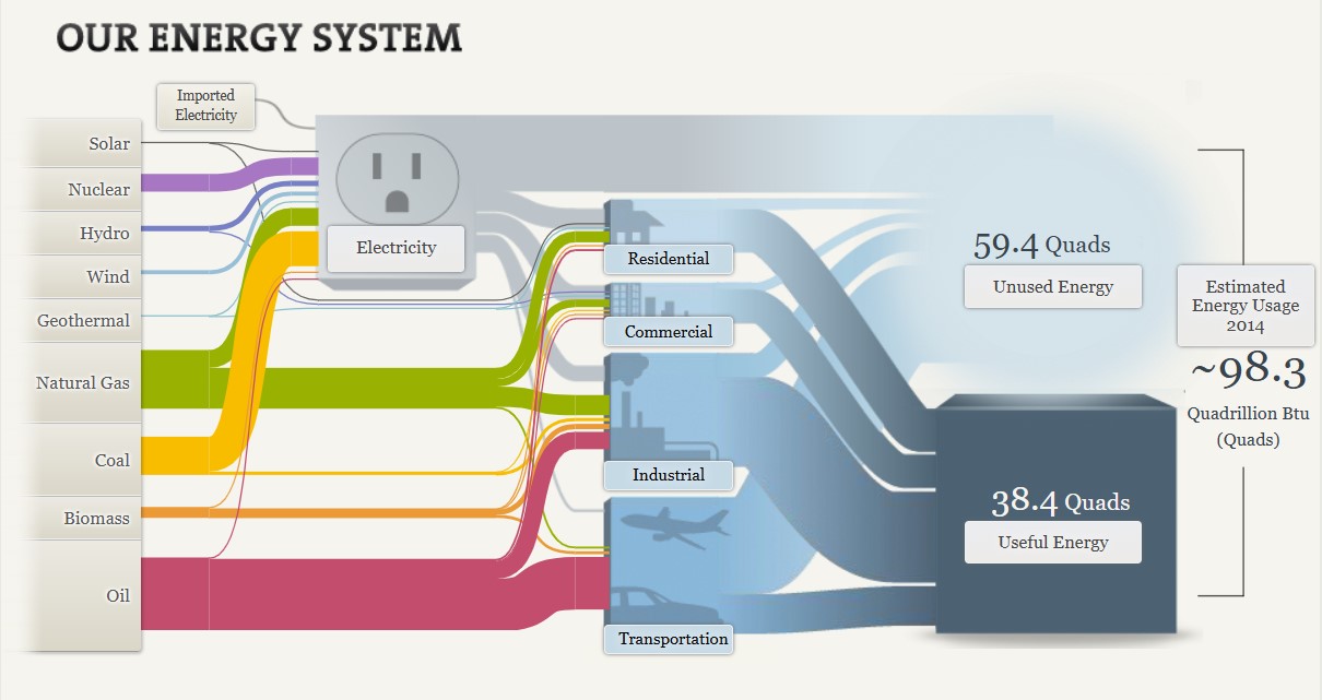
There are many strengths to this visualization. Not only does it provide clarity through succinct conveyance of complex energy flows, it provides both proportional representation and a comprehensive overview. The varying widths of the arrows effectively depict the relative contributions of different energy sources and their utilization, providing a visual proportional representation. By encompassing the entire energy system, the diagram facilitates an understanding of the interconnectedness of energy production and consumption.
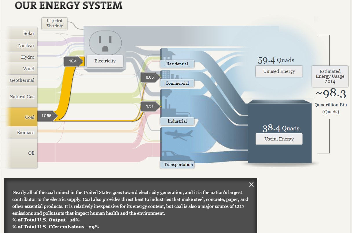
Additionally, the visualization is highly interactive, allowing users to click on different aspects of the graphic to see more information. As seen above, when selecting the coal energy source, it is highlighted in the graph and additional information is provided to the viewer. This capability allows the viewer to focus on one section of the graph at a time, as the visualization as a whole can become overwhelming with all off the details equally highlighted at once.
Interactivity also helps to more clearly explain details of the graph to the viewer. Having already viewed the section on coal, I clicked on the natural gas tab within the graph. Although the width of the coal and natural gas lines are visually similar, when you click on these sections separately you are given information about the output percentages of each of these types of energy. By viewing this information, I learned that while coal makes up 16% of the total U.S. output while natural gas makes up 29%.

The Sankey diagram on the National Academies’ “Our Energy System” page serves as a valuable tool for visualizing the complexities of energy flows in the United States. I believe that while there are multiple benefits to this type of graph when displaying data such as this, the interactivity of the graph is one of the most important aspects.
Pie Charts
Pie charts are a popular, but often misused, tool for displaying data. They are best used when illustrating proportions or parts of a whole. Typically, they are divided into slices to represent numerical values as percentages with each slice corresponding to a category. These characteristics make pie charts ideal for comparing the relative size of different components.
Displaying proportions, categorical data, and non-complex comparisons are all instances in which pie charts are a proper choice for graphical visualization. Pie charts also offer visual simplicity for the audience and can easily be displayed in presentations or reports because of their simple and straightforward appearance.
The pie chart below displays the proportion of streamed Spotify songs for a survey group, organized by decade.
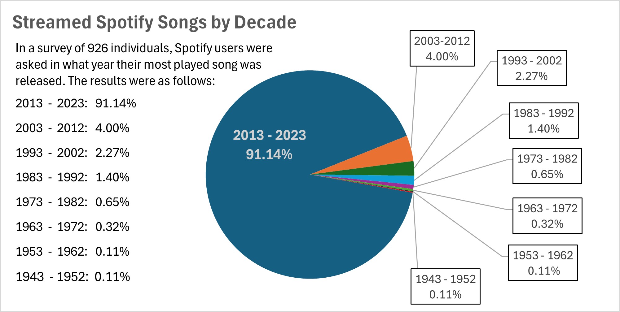
The data in this pie chart, showing the distribution of most played Spotify songs by decade, is a good choice for pie chart representation because it effectively illustrates proportions and highlights significant contrasts.
One of the key strengths of this data set is that a significant majority (91.14%) of the most streamed songs for this survey group were released between 2013 and 2023. The pie chart visually emphasizes this dominance with a large, unmistakable slice. The overwhelming size of the 2013 – 2023 segment makes the dominant trend immediately clear, which is exactly what pie charts are designed to do — highlight proportions.
Although there are several other decades included in the survey, their contributions are relatively small. The remailing decades, such as 2003 – 2012 (4.00%) and 1993 – 2002 (2.27%), have much smaller slices. A pie chart allows for quick, visual comparisons between these smaller values without having to actually read through numbers. For instance, it’s easy to see that the 2003 – 2012 period represents about double the share of 1993 – 2002, but both are much smaller compared to the dominant period shown.
I believe that visualizing data such as this is important because it allows artists and producers to quickly assess whether they should be making new music or if older music should be re-worked and released. If the data showed that Spotify users were more consistently streaming songs from 1983 – 1992, then artists and producers may want to use songs from that time period in their own work in an effort to boost streaming numbers.
Lollipop Charts
Lollipop charts offer a unique and visually engaging way to present data, especially when the focus is on comparing specific data points along a single axis, such as categorical or numerical variables. They are often used as an alternative to bar charts when presenting fewer data points because lollipop charts simplify the visual load while emphasizing individual values effectively.
A lollipop chart typically consists of a line extending from the axis to a circular marker at the end, where the marker highlights the exact value, making the comparison across categories straightforward. Unlike bar charts, where the visual weight can become overwhelming due to the solid fill of the bars, lollipop charts use a minimalistic approach that reduces the visual clutter, making them an excellent choice when clarity is prioritized for a dataset.
Lollipop charts are especially useful in scenarios where the audience may have to compare precise values between data points or observe trends without having to process the bulkiness of bars. For example, in the chart below a dataset of percentages of world populations is shown. The data is categorized by country and is shown in ascending order, displaying lower percentages first. Using a lollipop chart for this dataset emphasizes the relative differences in percentages without drawing the viewer’s eye to the “mass” of the data; rather, the data points themselves become the focal points. A lollipop chart is appropriate for complete datasets, but also for one such as this that is a focused subset of a larger amount of data.
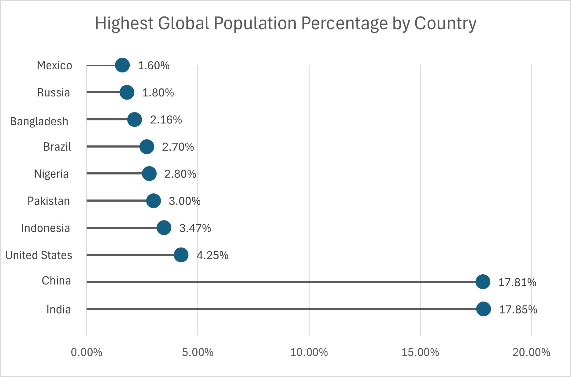
Lollipop charts also have the benefit of versatility, as they can be oriented horizontally or vertically depending on the data context and the layout of the presentation. Horizontal lollipop charts are especially helpful when the category names are long, allowing them to be fully displayed without awkward rotations or abbreviated labels, as seen above. Additionally, their form makes lollipop charts adaptable to visual customization. The color and size of the circular markers, for instance, can represent additional variables or highlight specific data points for emphasis.
Ultimately, lollipop charts are well-suited for audiences that require clear, straightforward representations of categorical data with an emphasis on the individual value of each data point. They can be used for complete or partial data sets, and can be customized to best suit the presenter’s or viewer’s needs.
Benchmark Comparison
Benchmarks in graphs provide a reference point, allowing viewers to quickly assess how data compares to a standard goal or historical average. They help to contextualize values, which highlights trends or performance gaps. By including benchmarks in graphs, data visualizations become more informative, making it easier to interpret progress, identify outliers, and support information assessment at a glance.
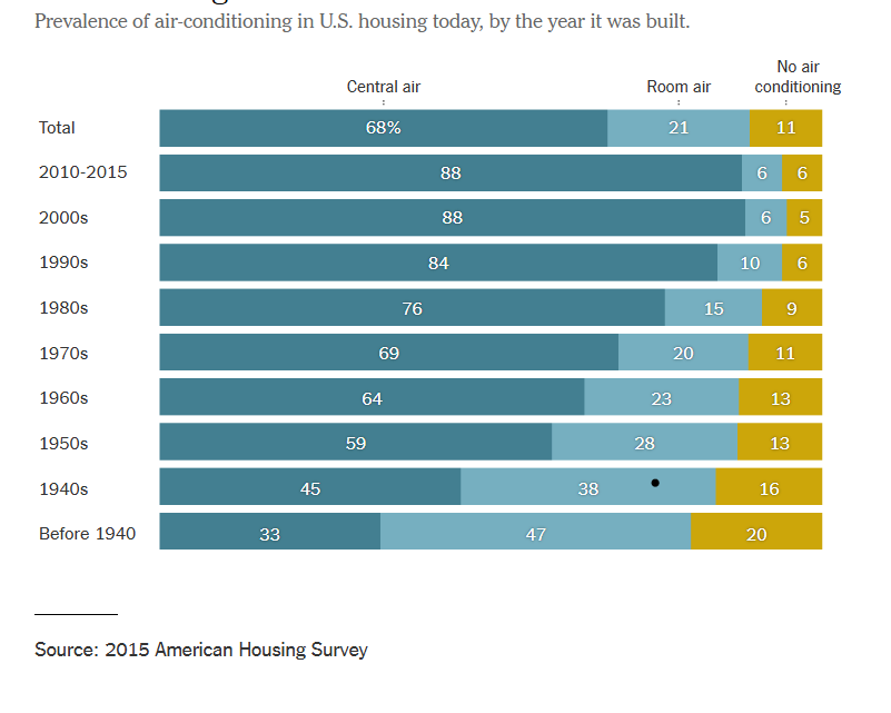
The graph below depicts the change over time of air conditioner use within residential buildings. By constructing this informative graphic using bars, the data can easily be assessed even by those who are not adept at data analysis. The topmost bar shows the benchmark for central air, room air, and no air conditioning while the bars below show a breakdown of each category in 10 year increments. The use of stacked row bars and a clearly separated benchmark lend to an organized, easy to read graphic that allows viewers to clearly determine the difference of each category over time. By visiting this article, you can read more about the changes in air conditioner use over time.
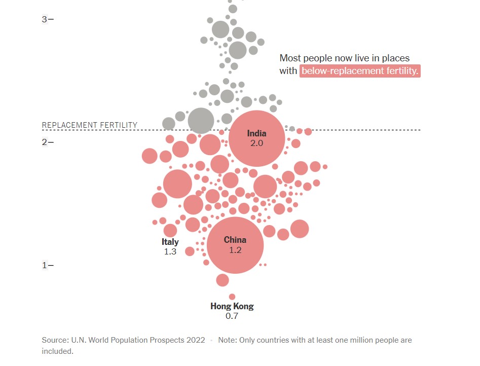
The next graph, found below, shows a comparison of countries (with populations over one million) and their replacement fertility rates. While there are only a few markers that have labels attached to them, population size is indicated by the size of the circle used to represent the country. This is not only a visually pleasing detail in this graph, but it is a simple and effective way to offer knowledge to the viewer without overcomplicating the graph. In this graph, the benchmark is displayed in the form of a dashed line with a label. This shows a clear indication of which countries fall above or below the benchmark for replacement fertility rate. Additionally, the coloration of the country markers help to indicate which countries are below the benchmark, even if it appears that they are touching it. To read more about population growth and decline, follow this link.
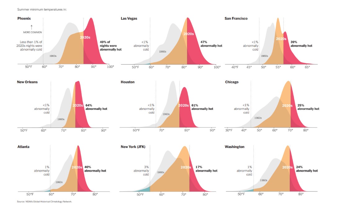
Another use of a line as a benchmark can be seen below in various graphs used to compare summer minimum temperatures in different cities across the United States. By utilizing vertical solid lines to show boundaries of where outlier temperatures are located, density plots are able to be used to properly display the temperature information for each city. Not only are solid vertical lines used, but temperature data from previous years are displayed as a benchmark to show the difference between summer temperatures in the 1960’s compared to 2020’s. There are additional graphs and information to compare climate change over time at this webpage.
Data Visualization & Insightful Comparison
In today’s age data is generated and shared at an unprecedented rate, making the transformation of raw numbers into meaningful (and shareable) displays to be crucial. One of the most effective ways in which this can be achieved is through the use of data visualization. By representing data visually, viewers are more easily able to unlock patterns or trends that may be hidden within spreadsheets or datasets.
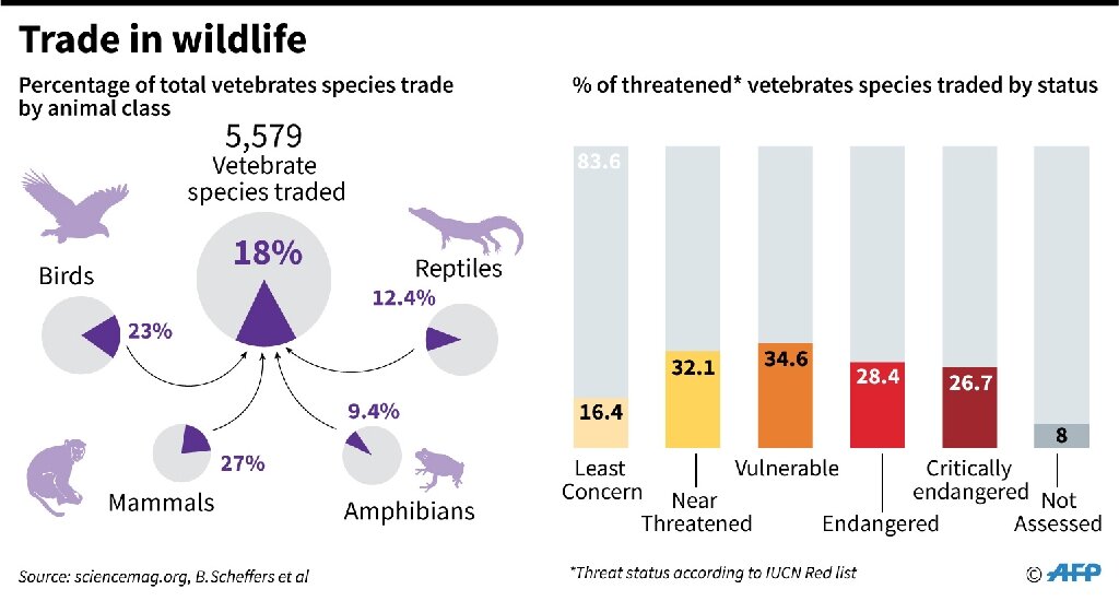
Especially when comparing datasets, or different facets of the same dataset, data visualization enables clearer interpretation and analysis of complex information. By utilizing charts, graphs, and other infographics, complex information can be simplified which encourages informed decision making by presenting insights in an easily digestible format. The infographic below compares the different status classifications for endangered species with the percentage at which they make up the amount of vertebrates that are internationally traded.
Visualizations such as the one seen above help to enhance cognitive understanding by capitalizing on some individual’s ability to process images more quickly than they do text.
They can also be used to display simple comparisons that are effective when displayed in simple ways. The graph below shows a comparison of the E-Commerce sales between different states around the contiguous US.
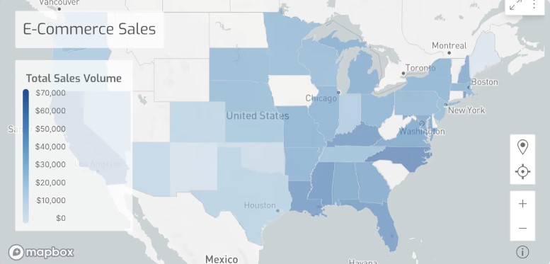
Although this graph is less complicated than the previous visualization, it is concise and includes a legend which allows the comparison that is being shown to be clearly evident to the viewer. While the subject matter that this graph covers may not be a perplexing one, the visualization that is provided gives the viewer an additional resource other than text with which they can assess the data.
VizHealth – The Uses of Infographics for Public Information
It is important for people who know how to read data to understand how privileged they are when assessing public information. Although, luckily, sometimes information is displayed in a way that is easily digestible to the average person, sometimes there are graphics involved that are aimed to convey information, but they are not easily understood by those who are not well-versed in data or graph reading.
Luckily, sites such as VizHealth give users the opportunity to learn in real time the ways that information can be displayed in an infographic. Using the risk calculator, individuals can input their own personal information and get an easily assessable visual of their personal risk for cardiac disease. The additional explanation under the bar graph aids in the user’s understanding of this tool.
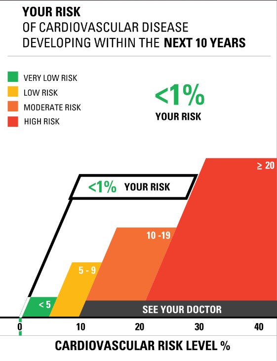
As you can see, the layout of the graph that is displayed above is user-friendly and can be easily understood. Simple coloration is used and the information that is pertinent is magnified and displayed in a bold font, which draws the attention of the viewer.
Icon Array Generator
VizHealth offers an additional service which offers users the chance to visualize statistics. Through multiple google searches, I assessed the prevalence of multiple ailments that plague the American population today. By seeing how many individuals out of 100 were liable of contracting certain diseases, I was able to log this information into the Icon Array Generator of VizHealth’s website. This provided me with a well constructed, easily digestible graph of the statistics that I had previously input. Below you can view the graphs that I (with the help of the icon generator) made to display the prevalence of Alzheimer’s disease (in individuals over 85), prostate cancer in men, and breast cancer in women.
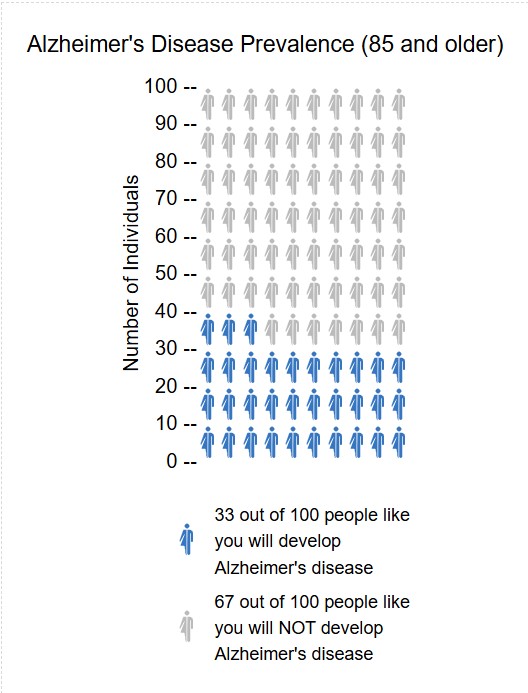
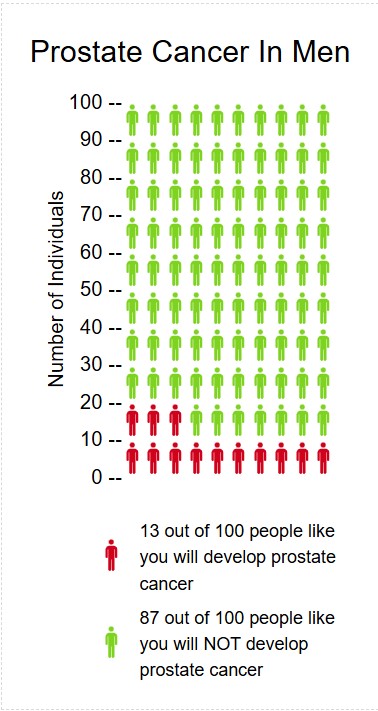
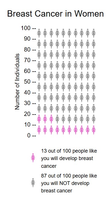
Through using this icon generator, I do believe that it is a useful tool to display variables that have an effect on the public. The ability to display icons in a male, female, or neutral way (with the availability to apply different coloration to the icons) makes VizHealth’s icon generator feature a personally customizable platform for the general public to learn more about how they can assess data.