Sankey Visualizations
The Sankey Energy Data Visualization shows energy systems and it’s flows. It provides additional information on each category and is interactive.

After looking through this visualization for a while, I think that it is very effective for representing a basic knowledge of energy flows. I think anyone could look at this data and understand what it means.
At first, while looking at this data it seemed like a lot of lines that I could not tell where exactly they went. Making this chart interactive was a great decision by the makers because it clarifies where the lines are going, and provides additional information.

The only critique I have for this visualization is that I wish it would have provided more information and visuals on energy losses. Maybe a hyperlink with an additional visualization about energy losses and where or when they occur.
Pie Charts and When to Use Them?
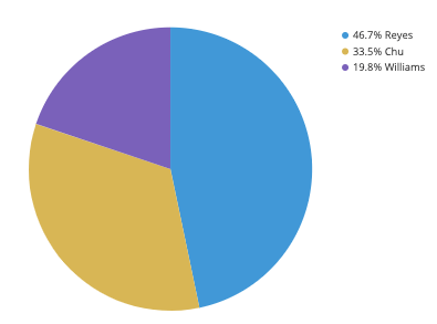
Pie Charts are a great way to visualize data and help convey a message to an audience about a certain dataset. Pie Charts show how a total amount is divided between levels of a categorical variable as a circle divided into slices. A Pie Chart Typically looks like the one below:
Pie Charts are very efficient and effective ways to communicate data, but there are some things you should avoid as well as things you should look out for when creating a pie chart.
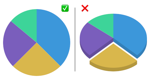
- Avoid distorting effects: Although it may seem beneficial to make a pie chart 3D, it actually can make the information more confusing and potentially skew the data so it becomes inaccurate. The most important thing is to make sure the chart is clear and there is no potential for inaccuracy.
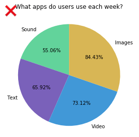
2. Ensure Data is Compatible: When making a pie chart, it must include a parts-to-whole comparison. The sum of the numbers, or percentages must add up to the whole, typically 100, with no more or no less.
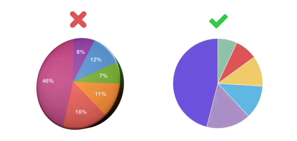
3. Variety of Colors: To ensure that the data is clear, use a variety of colors for the slices and make sure that no too colors are similar.
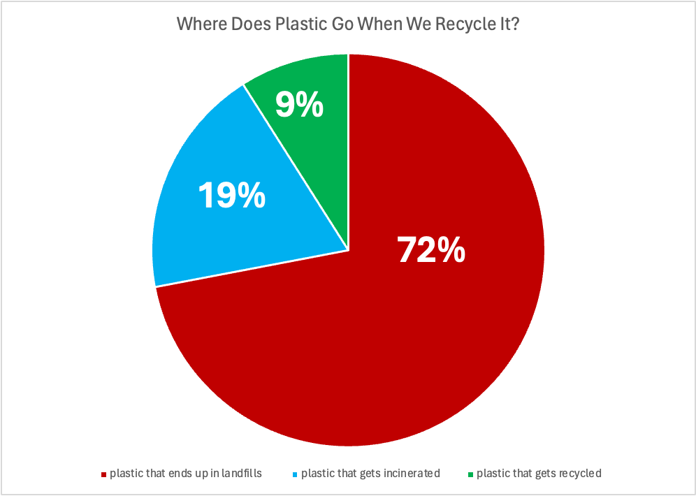
An example of the use of a pie chart is this one that I made to compare the different places where plastic goes after it is recycled by users in the US. I would argue that this is the perfect case for a pie chart, something that is easily understandable, applies to a wide audience of people, and ultimately conveys a message to the audience. This message is about our broken recycling system in the US. A pie chart is the best possible method for this particular dataset. I made sure to make the chart clear and concise and use a variety of colors. I also included a legend instead of writing it in the pie chart to make it even more easily understandable.
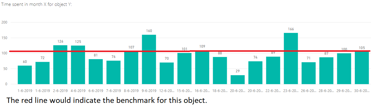
Benchmarks
An important element in any display of data is a benchmark– this can be a target, long-term goal, average, or standard. Oftentimes, benchmarks are written down in memos, but aren’t included in the actual data visualization. This can potentially help an audience visually the data in a more informed and efficient manner. The stories that can be told include:
“Our key indicators met the preestablished targets in three out of seven areas.”
“Regions A and B did not meet quarterly benchmarks”
“Here is how our groups compared to the national norm”
“Students in the Chemistry Department are above average on final exams this year.”
“We did not meet our fundraising goal, but we got very close.”
“Our click rate was 25.6%, while the industry standard is 4.3”
There are many different ways to include benchmarks in data presentations. The most common form is a simple line.
Another example is a bullet chart, which has gray shaded area of comparisons behind a bar of column.

Comparing Numbers
Examples of Insightful Data Visualizations that Compare Numbers
Data visualizations can be a great tool to use when comparing numbers. Comparing numbers can show many different stories, including the following examples:
“Option A is better than Option B”
“Posttest scores are higher than pretest scores in almost all subject areas”
“Group F and Group G disagree on five of the eight measures”
“There were no differences between the treatment and control groups”
“Youth rates are significantly lower than adult rates”
“We have equal participation from boys and girls with the exception of girls ages 10 to 13”
“All sites increased performance, but Site L did so at a faster rate than other sites”
“The performance of Class L is in contrast to Class K”
Results such as these can be shown in various types of charts. Below are some examples of insightful data visualization that compare numbers.
- Pie Chart

2. Bar Chart
3. Histogram

4. Line Chart

5. Doughnut Chart

6. Overlapping Area Chart

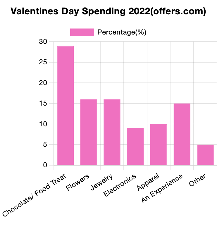
Using the Visualizing Health tool
The website titled “Visualizing Health” is a scientifically vetted tool created by the University of Michigan in order to help healthcare professionals and others alike to communicate data about health. It contains graphic displays of health data through different types of visuals and imaging. It’s goal is to assist audiences in making informed decisions about their health, and also helps aid healthcare professionals in their efforts to seamlessly communicate health risk information to the public.
The website makes it accessible and shares an easy-to-use guide on how to create data visualizations. Below, I have made one as an example based on information from the World Health Organization. This is one of the many ways these tools can be used to communicate data to an audience.
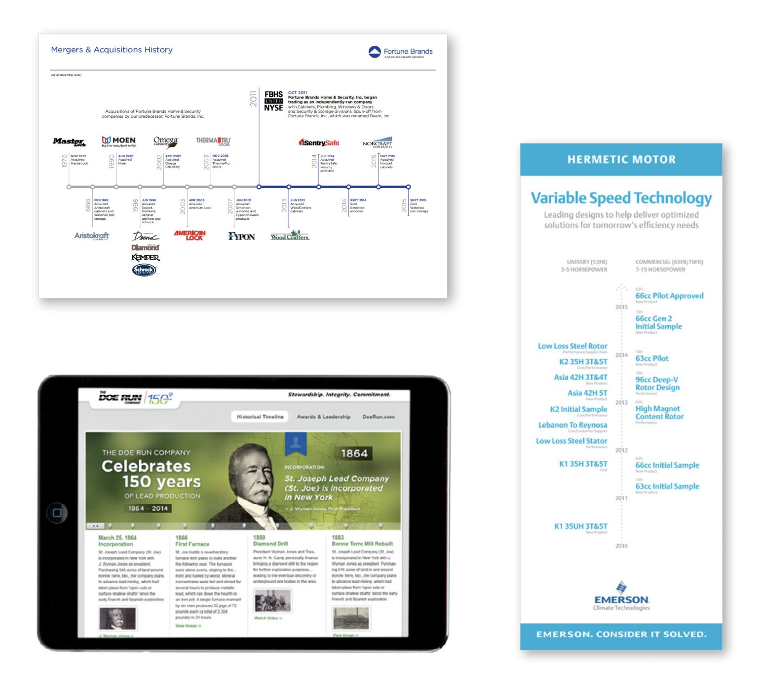
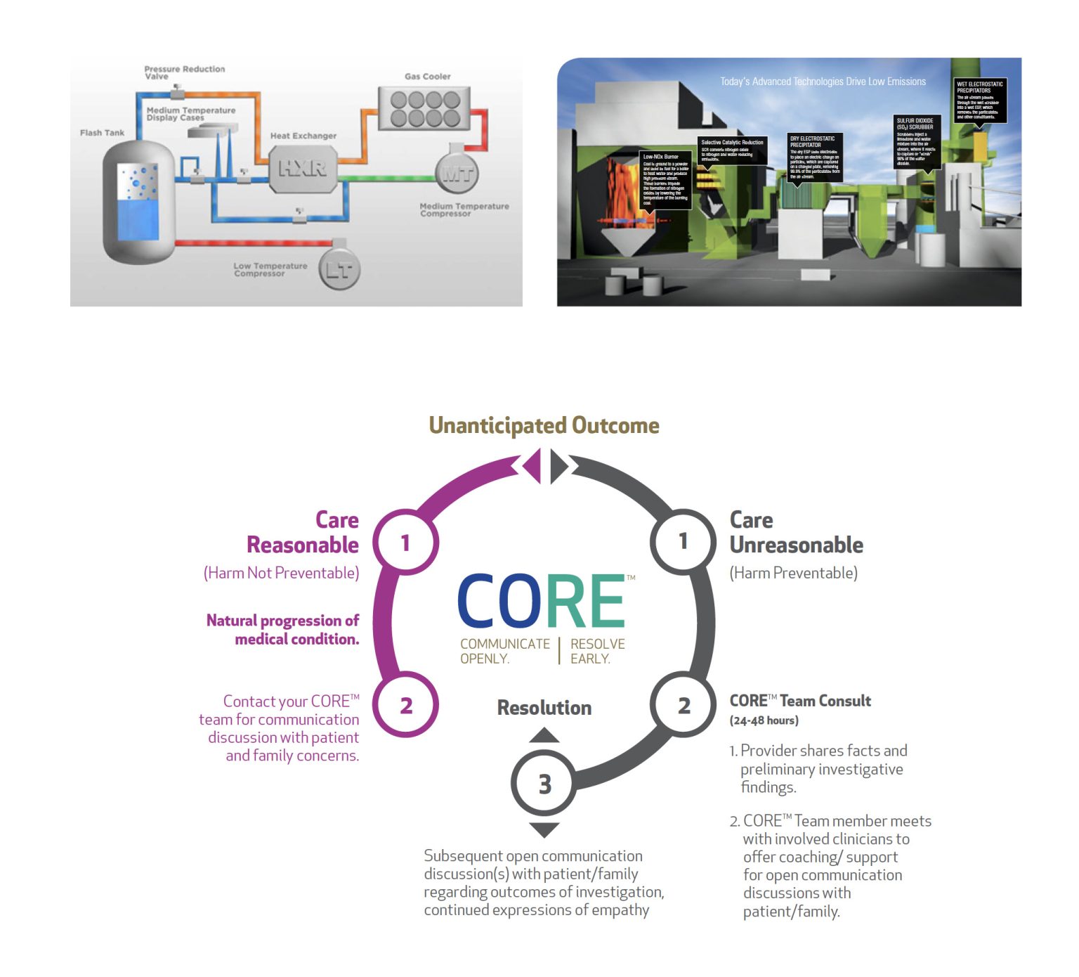
Infographics
Examples of Insightful Infographics
Robert Kosara shares in Visualization Criticism- The Missing Link Between Information Visualization and Art, that there are many different classifications in data visualization. However, the following criteria are a minimal set of requirements for any visualization: information is based on (non-visual) data, it produces an image, and the result is readable and recognizable. There are many different examples of insightful infographics within this general definition, and below I will share a few common types of infographics that can be insightful and help convey a message to an audience efficiently and effectively.
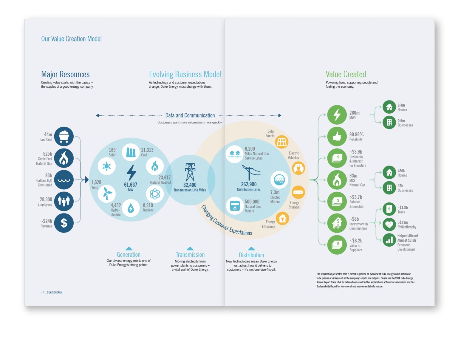
- Mixed Charts Infographics
2. Informational Infographics
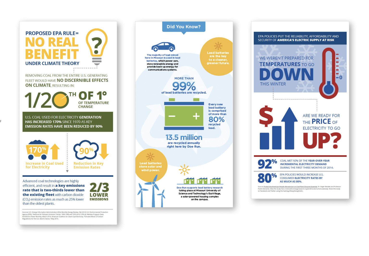
3. Timeline Infographics
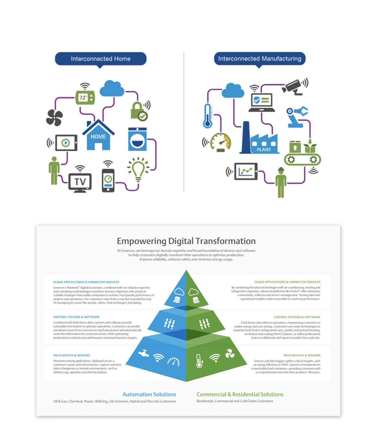
4. Flow Chart Infographics
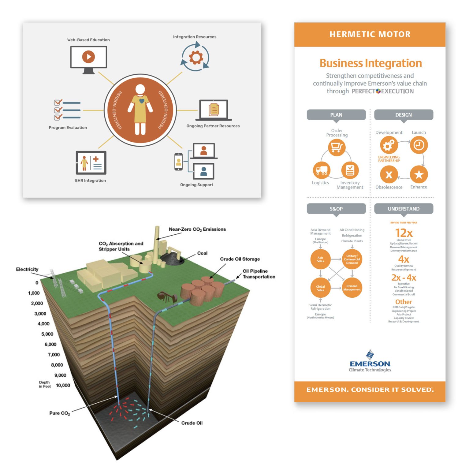
5. Process Infographics
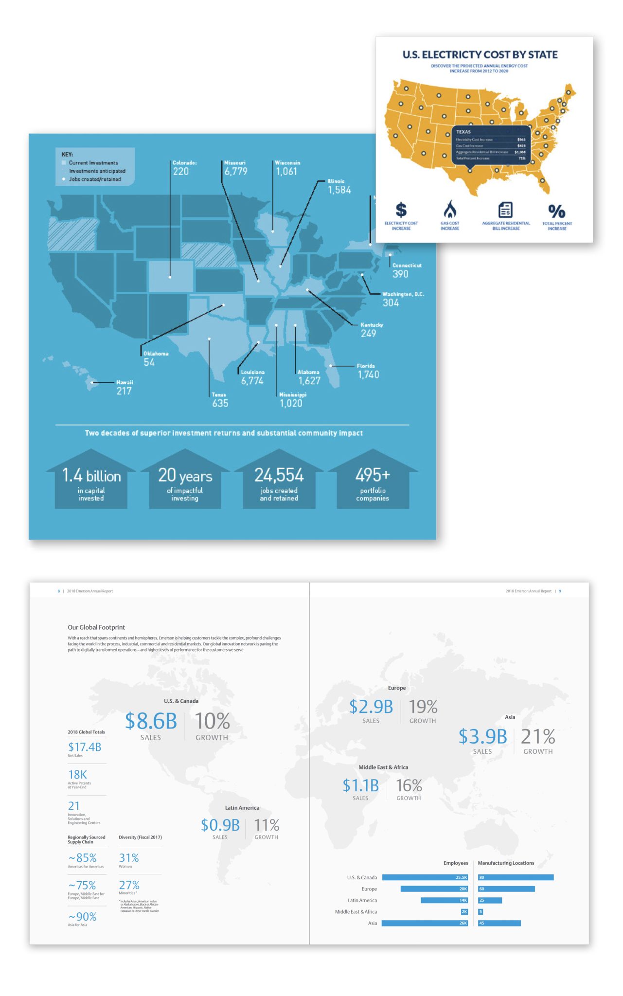
6. Comparison Infographics
7. Location Infographics
8. Photographic Infographics

9. Hierarchical Infographics
10. Interactive Infographics
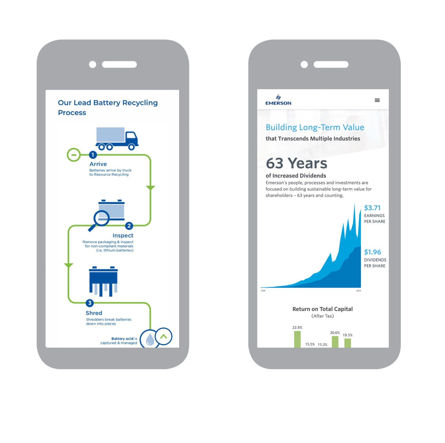
All of the infographics listed above are different types of commonly used infographics. It is important to note that these are all from one website, and there are many other infographics that are commonly used to convey information.
Sources:
R. Kosara, “Visualization Criticism – The Missing Link Between Information Visualization and Art,” 2007 11th International Conference Information Visualization (IV ’07), Zurich, Switzerland, 2007, pp. 631-636, doi: 10.1109/IV.2007.130. keywords: {Art;Data visualization;Bridges;Computer science;Visual communication;Computer graphics;Handicapped aids;Mice;Joining processes;Concrete},
Prow, B. (2024, July 24). Common types of infographics and when to use them. OBATA. https://obata.com/10-types-of-infographics/