The Beauty of PivotTables
PivotTables are a useful type of table within Excel that allow for automatic aggregation and summary of data for easy retrieval. For example, in a spreadsheet filled with people’s favorite choices of food and drink, a PivotTable can be used to automatically count how many people chose Coca-Cola as their favorite drink.

This article showcases ways to use PivotTables on a set of data. By selecting different fields, a PivotTable can be used to automate summation of a column. This is useful so that you don’t have to keep manually updating the sum whenever the data changes or gets added to.
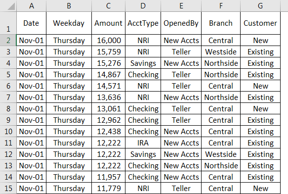
These tables have a lot of have flexibility too. In this example from Medium, a PivotTable is used to add together quantities within regional subsets of data while simultaneously calculating revenue. The usefulness of PivotTables comes from their ability to quickly pull data matching specific conditions and efficiently summarize them in a readable format. I personally foresee PivotTables dramatically reducing the amount of effort it takes for me to summarize my data.
The Sankey Visualization
Long have I seen Sankey visualizations. Long have I liked Sankey visualizations. Long have I never known their name.

Though these graphs can overload you on information at first glance, everything is pretty neatly organized when you inspect it more closely. The big bonus of Sankey graphs is how everything is shown and everything is sized proportionally. For large sets that can be broken down into many constituent parts – like everything that generates or uses energy – a Sankey is the way to go.
Sankey graphs lend themselves well to artistic flavor. You can see the “Electricity” block near the top was large enough to fit a drawing of an outlet. Visuals near the residential/commercial/industrial/transportation categories help as well. We all know what they are, but getting a quick visual along with the name of what it’s representing can make it register in our brains much faster.
The key factor of these charts is how everything is shown proportionally. The important factor of data visualization is creating a visual form of data in order to drive home the point being made. In this graph, you can see that there are about 59.4 quads of unused energy. Lots of this is unusable energy, or energy released through reactions, but this visual drives home one point that wouldn’t be as obvious without a visual: we waste a lot of energy when we try to generate energy.
Lollipop Charts and You
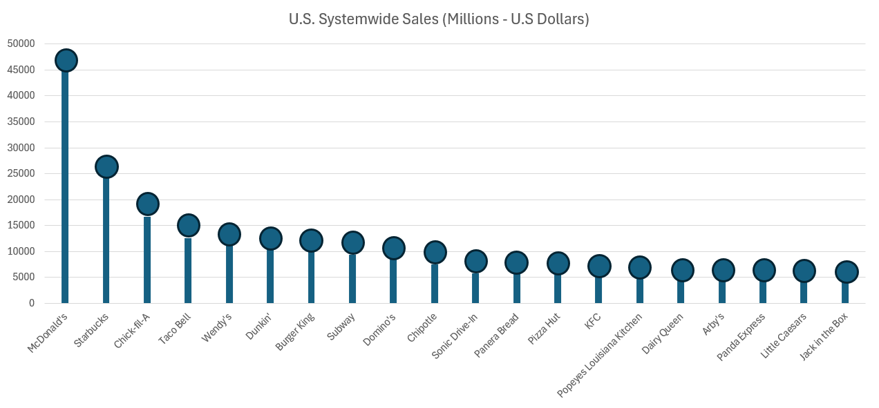
Lollipop charts are a different spin on the classic bar chart. Though they fill the same uses, the lollipop chart has some advantages over the bar graph that might be more useful in some situations.
These types of graphs are very useful in sets of data with many different bars. The lollipops make it easier to focus directly on the data, and notice outliers. The key of the lollipop chart is that it focuses the viewer’s attention at the value of the data itself. A more advanced chart can put data directly into the lollipop itself, or recolor the parts that the presenter isn’t focusing on. An important thing to remember about lollipop charts is that they are applicable to any situation where a column or bar chart would be applicable as well.
I definitely see myself using more lollipop charts in the future. The lollipop enhances an already-existing bar chart, and would be very useful in reducing the amount of ink used for visualizations with lots of data. When the emphasis is on a specific data value, or specific set of data values, a lollipop is the way to go.
Benchmarks and Electric Cars
The graph containing a benchmark that I wanted to look at was this one from the New York Times focusing on electric vehicle sales in the US, excluding Tesla. Tesla has been excluded from this graph since they are far and away in first place, with 140,187 vehicles sold in the first quarter of 2024. For comparison, this is seven times larger than Ford, who is in second place with 20,000 vehicles sold Q1 2024.
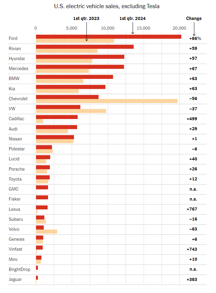
This visualization has a different benchmark for each company. The benchmark is their performance one year prior, in Q1 2023. Benchmarks are commonly represented as a line, but since each company is being compared to a different data value, they opted to represent the benchmarks as lighter colors that do not detract from the current year’s data. Using a dark red for current data catches the eye. It sticks out more than the old data, ensuring that there’s a clear distinction and the bars don’t fight with each other for clarity.
Overlapped bars could have been used as well, but I think I understand why the author opted not to. With 25 companies in this chart, overlapping the bars could lead to a lack of whitespace. All in all, this graph is a wonderful representation of its data. I’d also like to note the fact that this is a horizontal bar graph instead of a vertical one. With so many data points, it becomes hard to label the data in a way that preserves readability. Vertical bar charts such as this one help to alleviate that issue.
Comparing Polio Cases
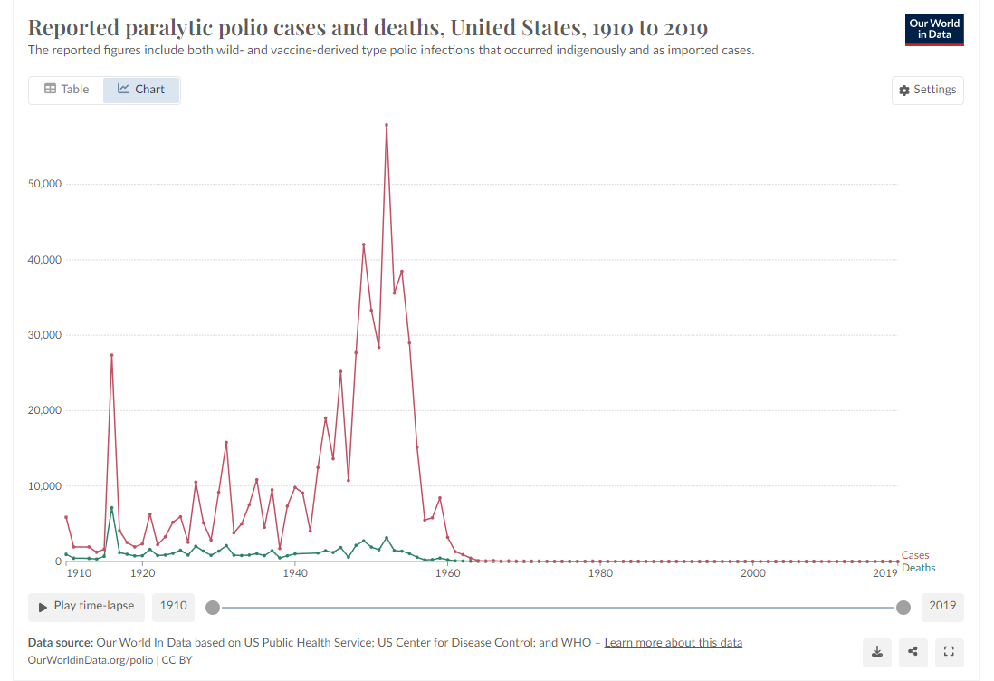
Being one of the few diseases that we’ve effectively eliminated through the usage of vaccines, this dataset of the number of polio cases by year caught my eye. Graphs that focus on a disease’s number of cases aren’t anything new, but the fact that polio has been nearly eradicated turns the dataset into a story with an end. Most disease infection graphs go on forever, no distinct end or beginning due to the continued existence of the disease. Polio had many major outbreaks in the first half of the 20th century, giving a beginning. With the introduction of the polio vaccine, the cases drop off sharply to the point that they reach zero – the graph’s end. This graph really drives home how instrumental vaccines are in eliminating infectious diseases from our world.
Honeybee Infographic
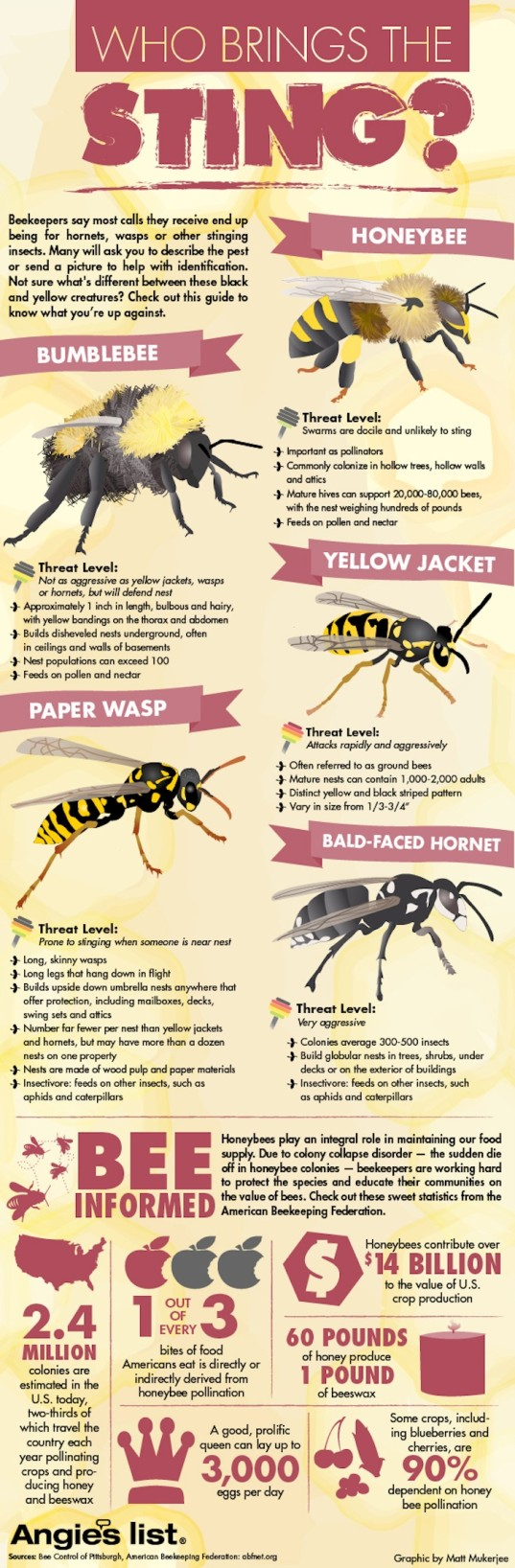
Honeybees are the perfect topic for a striking infographic. These little pollinators are integral to the health of our ecosystems today. In this infographic, you can see a concise presentation of facts on the bottom, with large blocks of text near the bee species. A limited color palette prevents distractions. I feel there is too much text near the species, leading to distractions. The use of symbols helps to drive the infographic’s points home – the colored apples resemble the “1 out of every 3” point underneath it. This graphic is compact, sure, but this compaction takes away some breathing room for the viewer. Adding space could also be used to create more eye-catching visualizations. I’d still consider this a good infographic, but the bottom section focusing on data could maybe use a chart to represent the changes over time.
You can find the infographic here.