Comparing Products to Find the Best Fit
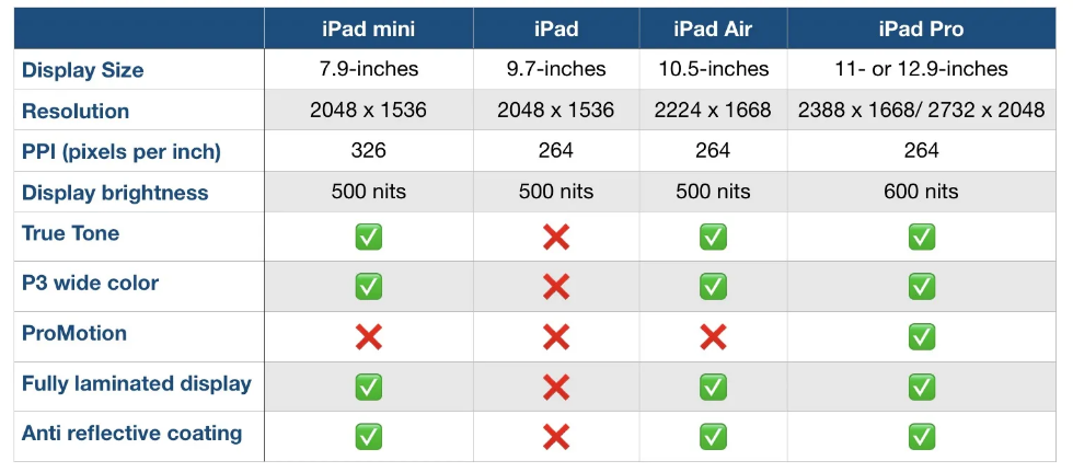
Comparison charts are a great way for consumers to compare multiple products from a company in order to determine which one is right for them. Let’s take the company Apple for instance. They provide many options on buying an IPad, but how do you know which one to get? There are many different charts that you can look at in to determine which one is best for you. First let’s start with the basics. Think about what you are using the IPad for. If you are simply taking notes then a regular IPad will do just fine. However if you plan to use it for editing or designing you might want to look closer at display sizes and resolution options.
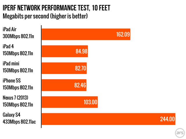
Another way to compare them is how well they perform. Someone who needs this device for high demanding and important work may wanna go with the IPad that has a higher megabit speed.
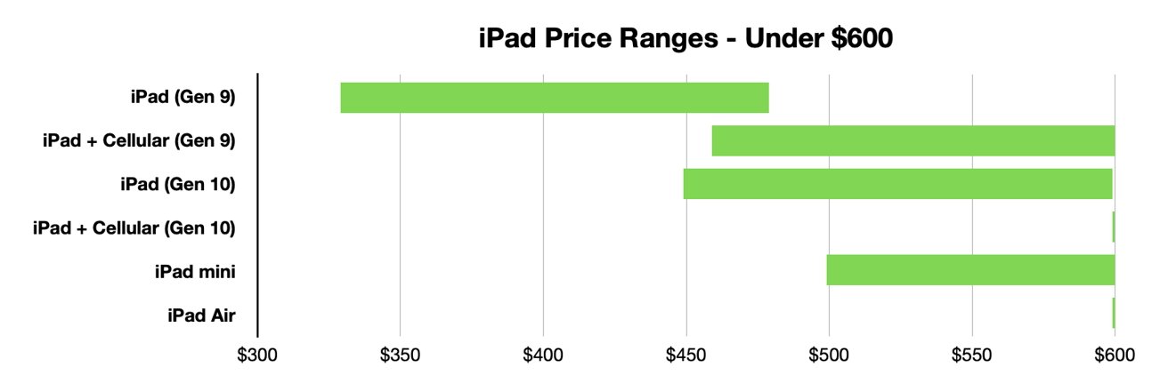
Lastly, and I think the most important to a lot of people, is how much each device costs. Comparison charts like this allow you to gauge how much this investment could cost you. Charts like the one below or the two above can usually be found on the company’s website or online forums for tech users.
Resources and Further Reading
Visualizing Health: Helping People See the Bigger Picture
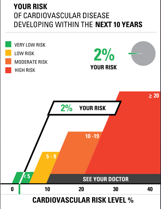
This week I tested out a website called Visualizing Health. I first checked out their risk calculator. While I enjoyed seeing what my risk factors were for cardiovascular disease and using the tools to see what my family members risks are I found it odd that I could not adjust the age any younger than thirty years old. While I believe this is risk calculator is a nice way for people to get a grasp of what their health is I am unsure of how accurate it can be if I am unable to put the correct information in some slots.
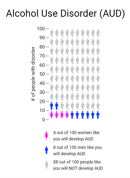
The second thing I tried on the website was the Icon Array feature. This tool allows the user to create an infographic to show the percentages of people (male, female, or both) and their likelihood for developing a disorder or illness. I really liked this tool as it was relatively easy to navigate and is a good visual aid for those who do not learn topics well simply from reading text. My only wish is that they provided other sorts of charts and ways to display data as putting things into a ratio can sometimes make numbers look very small. Twelve out of a hundred seems like a small percentage, but when talking about population that is a large portion of Americans. Overall I think I would use this tool again or something similar.
Tools That May Helps Us Construct Infographics
Infographics are becoming increasingly popular over the years. With most information now being shared online there are some tools that can help you create the best infographic.
- Canva
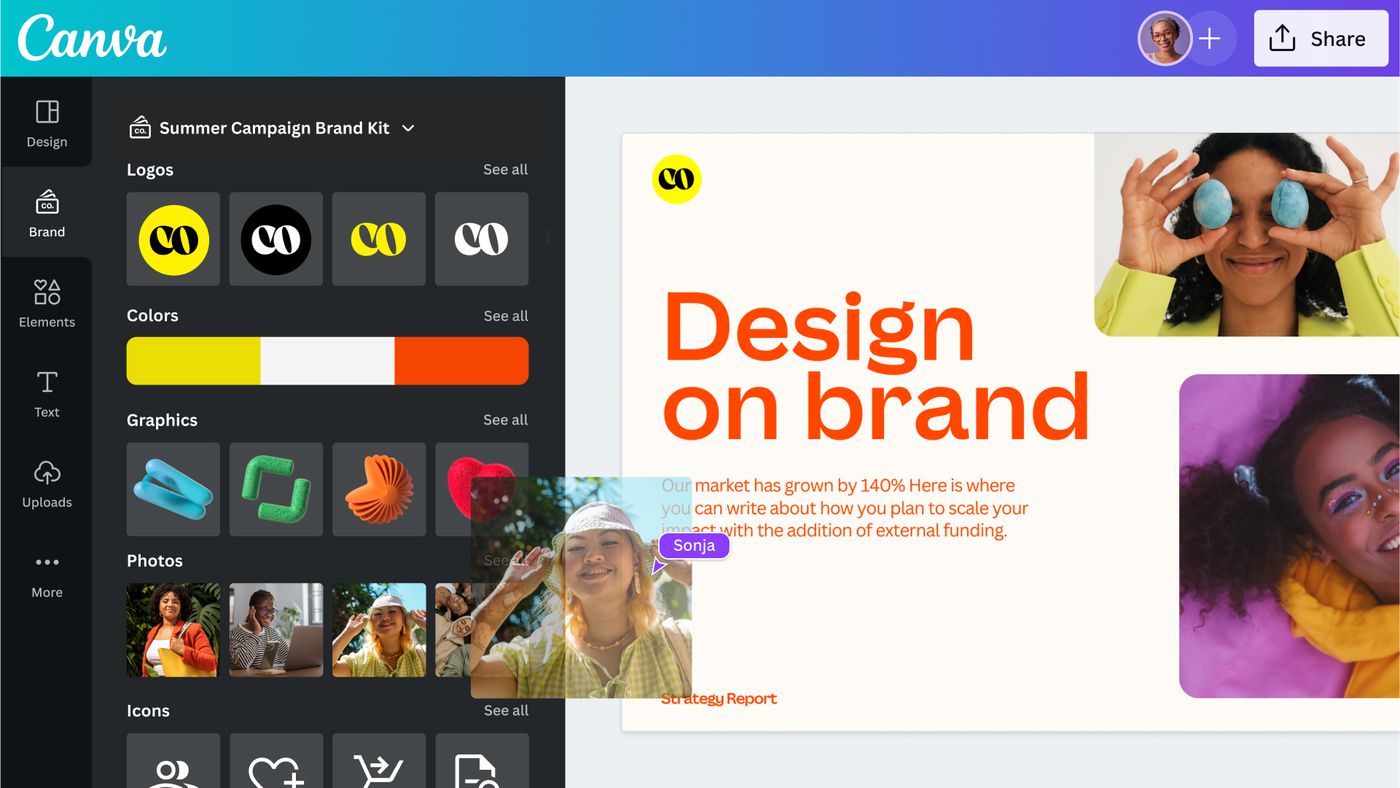
Canva is a free design webpage that provides hundreds of templates for flyers, posters, presentations, and more. If you do not want to use the templates you are still able to create your own work. They offer many options for graphics or you could upload your own. The website also allows you to share your design so multiple people on your team can work together. Students can sign up for CanvaEducation and get access to even more templates and graphics for free.
2. Procreate
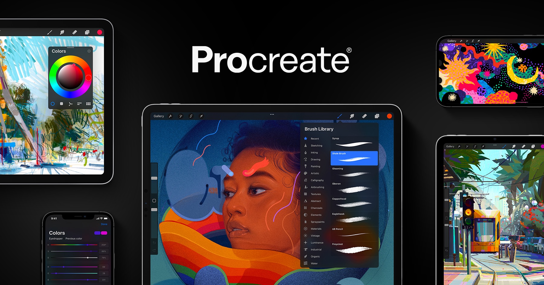
Procreate is an editing and art software that allows users to create artwork and edit images. It can be downloaded in the app store for Apple product users for $10. The app gives you options of multiple tools to draw, write, add images, and crop whatever you want.
3. Adobe Illustrator
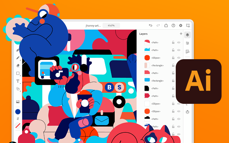
Similar to Procreate, Adobe Illustrator or Ai allows you to create just about anything you want. Ai can be downloaded on any desktop, PC, or tablet. It allows you to draw designs, add text, and upload graphics to your canvas. Adobe Illustrator does require you to have an adobe account and is free to download and use. However to unlock more features and tools it costs a monthly subscription $20.99.