Pivot Tables
Pivot Tables are a highly useful interactive way to quickly summarize large amounts of data. It takes user-specified data fields and converts the headers into a data option that can be easily manipulated. Data can be summarized in numerous ways, including averages and frequencies. Lorman Education published an informative article about pivot tables. They describe 6 benefits of using a pivot table in Excel:
- Simplicity
- Data Analysis
- Data Summaries
- Pattern Recognition
- Quick Reports
- Decision Making
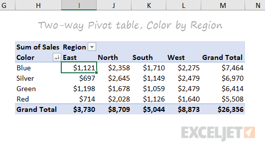
The image above is an example of a pivot table created by ExcelJet. It clearly demonstrates Sum of Sales by color in each region. Colors are sorted by row and regions are sorted by columns. The table also includes a total row according to each color and region, as well as a grand total.

This is another example of a pivot table created by ExcelJet using the same data, just with the rows and columns switched. There is a simple drag-and-drop method that can change the parameters of the table within seconds. ExcelJet also provides a few benefits of pivot tables:
- Simplicity
- Speed
- Flexibility
- Accuracy
- Formatting
- Updates
- Filtering
- Charts
Sankey Visualizations
Needtoknow.nas.edu provides many visualizations about energy usage in the United States. I learned that the flow of energy in the U.S. is complex and comes from numerous different sources. More than half of energy supplied is lost as waste heat or through inefficiencies.

This Sankey visualization breaks down our energy system from the source all the way to its usage. As you can see, Oil is the largest source of energy with a total output of 36% and total CO2 emission of 43% in the U.S. Although this visual is interactive and provides a large amount of information/data, I find Sankey visualizations to be difficult to interpret. There is a lot of data being displayed within a single visual, and it would be more effective to break it down into multiple different visualizations. For example, the data regarding % of Total Output and % of Total CO2 Emissions could be visualized as a Side-by-Side Column Graph. Another example could be the use of a Pie Chart to compare the % of energy used and unused.

This visual of Lumens per Watt for different types of lightbulbs is highly effective. The visualization clearly shows which lightbulb they are talking about and its lm/W. Viewers can interpret the graph efficiently due to its simplicity. This particular chart is a good example of a Large Number With Icons, as we have learned in the textbook.

Another good visualization is this Back-to-Back Bar Graph displaying the efficiency of energy on the road. You can compare energy used, gasoline burned, CO2 vented, and fuel economy between the two different types of vehicles. Again, the simplicity of this chart makes it more effective.
I believe this site would highly benefit from simplifying their visualizations. The data they want to explain would be easier to interpret, therefore, more effective if they were to take a more minimal approach.
Pie Charts
What is a Pie Chart?
A Pie Chart is a common type of visualization that demonstrates parts of a whole. Each section represents a value in relation to the entire composition. The slices should be proportionate to the amount in each data set so that the viewer can compare each section by size to determine its value.
When should I use a Pie Chart?
A Pie Chart is a great visual for a part-to-whole relationship. It should be used when displaying the “percent of…” or “part of…” something. StorytellingWithData provides two primary use cases for a pie chart:
- having a general sense of the part-to-whole relationship is more important than comparing the precise sizes of the slices
- to convey that one segment is relatively small or large in comparison
The percentages should sum to 100% so that the visual is relative in size to its value.
The Perfect Pie
I created the “perfect pie” in Excel using 2024 Coffee Statistics by DriveResearch. I will break down what makes this a perfect use case as well as design tips for creating an effective pie. You can click on the image below to open my Excel spreadsheet.
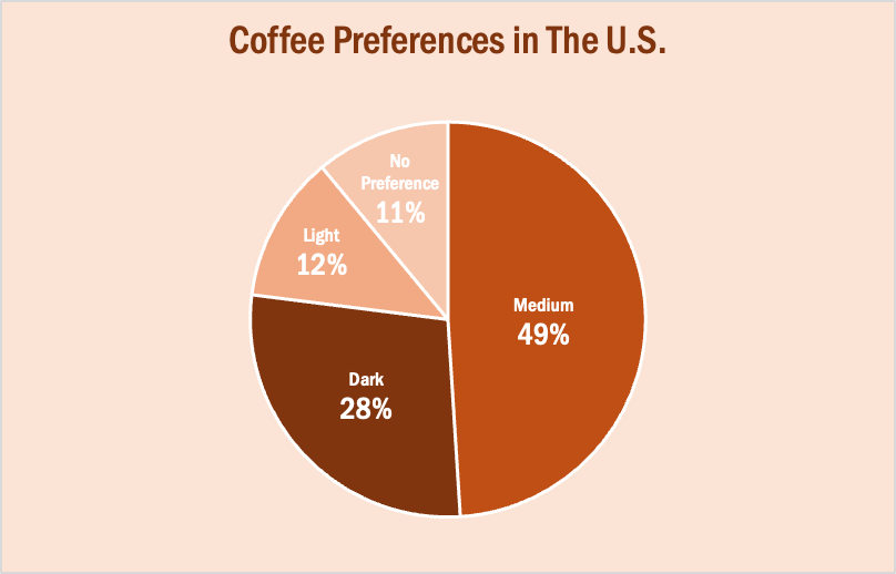
The data in this set is great for a pie chart because it equals 100% and one value is significantly larger than the others. It is also split up into 2-5 categories which is not too overwhelming for the viewer. The coffee preferences are all parts of a whole, making a pie chart the best choice over bar charts and other visualizations. To make it aesthetically pleasing to look at, I used different shades of brown throughout the entire chart which correlates with the coffee theme. I deleted the legend for a more minimalistic appearance, which the author of our textbook reiterates throughout each chapter. Because the values for Light Preference and No Preference are very similar, I added data labels to each segment so it is easy to comprehend. I also increased the font size for the numbers to make them stand out. Stephanie D.H. Evergreen suggests “unwrapping the pie” by making the largest slice start at noon and run clockwise in descending order (as seen above). When creating this chart, I was sure to avoid 3D and exploding effects in order to increase legibility. For more information, I suggest checking out this article on Tableau, which provides more examples of effective and ineffective pie charts.
Lollipop Charts
What is a Lollipop Chart?
A lollipop chart is another way to make lengthy bar charts less visually overwhelming. It is very similar to your standard bar chart, just without the “extra ink.” Instead of using a solid bar, the data is visualized using a lollipop shape (a thin line with a circle on top). After all, the main focus in a bar chart is the endpoint. The lollipop chart allows viewers to easily digest the data by focusing in on the values.
Examples…
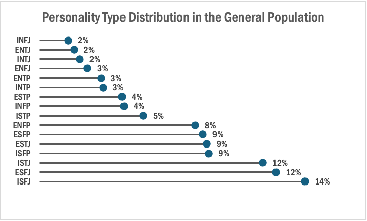
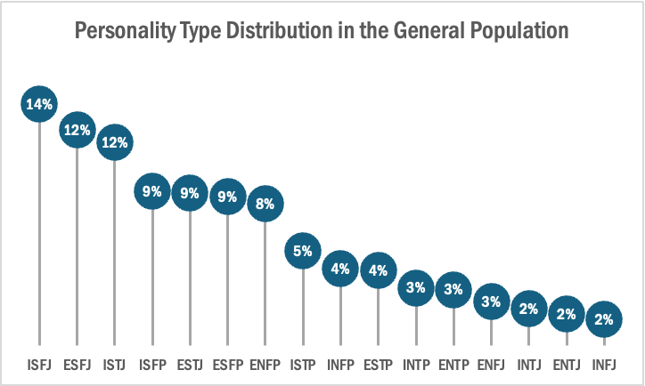
The two images above are examples of lollipop charts that I created. The data shows the percentage of each MBTI personality type within the general population. Lollipop charts can be both horizontal or vertical. The main point of the graph is to focus in on the endpoint values. I created my charts in Excel, and provided hyperlinks to my spreadsheet which includes my data and formatting. The vertical version was definitely easier to create. It only took a couple minutes, while the horizontal version had more steps and precise settings.
How to create a vertical lollipop chart:
- Insert a line graph with markers
- Delete the line
- Add Drop Lines
- Add data labels to center of markers
…and that’s it!
When to use a Lollipop Chart
A lollipop chart can be used for any kind of data that would work in a bar graph. It is simply an alternative that is more simplistic. Its “ink-friendly” design can impact readability of the data and lead to faster response times and greater accuracy (Gillan & Richman, 1994). It is especially useful when the visualization includes many data points that can become overpowering due to the solid bars.
Benchmark Comparisons
This week we review Chapter 4 in our textbook, Effective Data Visualization, which goes over the importance of including a benchmark in our visuals. Benchmarks are extremely important because without that context, we limit the amount of information we can pull from a graph. Adding benchmark information clearly displays what the data is being compared to. This simple detail allows the viewer to easily determine whether performance was good, bad, or close to the mark.

This graph from The New York Times shows the monthly global temperature compared with preindustrial levels. The benchmark on this graph is the data for the year 2023, and the other years since 1940 are what is being compared to the benchmark. Just by quickly looking at this visual we can tell that global temperatures were much lower in previous years than in 2023. This benchmark stands out because the line is a darker color and much bolder than all of the others. This visualization is highly effective because the years prior to 2023 are a lighter opacity and color. The creator also only included data labels for the points in 2023.

Another graph from The New York Times displays the daily average sea surface temperatures. This visualization also includes a benchmark to help viewers easily process the data being shown. The gray dotted line, representing the average temperatures from 1991-2020, is the benchmark in this data. The blue line is the most current information which is being compared to the benchmark. In this graph we see that the temperatures in 2023 are much higher than the average between 1991-2020.

Lastly, this graph of Antarctica’s sea ice mass shows that levels in 2023 are much lower than the average from 1979-2010. The gray dotted line is the benchmark, while the red line is the data being compared. While this visualization is still effective, I believe the previous two were better. This is because the gray dotted line is not as prominent as the benchmarks in the other graphs. It gets lost in the data and takes a second for the viewer to notice it is there. Making the benchmark line a different color would help make it stand out.
Comparing Numbers
This week in Chapter 3 of Effective Data Visualization we learn about how two or more numbers are alike or different. There are several ways to visualize comparisons between two numbers, as well as multiple, which is very important when choosing your visualization. The main question we have to answer is why Option A is better than Option B.
Bar Charts

Bar charts are an extremely popular option, but its ability to convey data works best when comparing just two things. Any more can become difficult to interpret because it is challenging to compare the lengths of nonadjacent columns. The textbook also explains how it helps to have some extra white space between each set of clustered columns. The data visualization shown above is very insightful because you can easily digest the information comparing profits and discounts between products. The colors are distinguishable from one another and the columns are grouped so the viewer can easily decipher between products 1-6. The creator also included data labels above each column which makes it easy to tell the definitive amount and compare the numbers.
Dumbbell Dot Plot
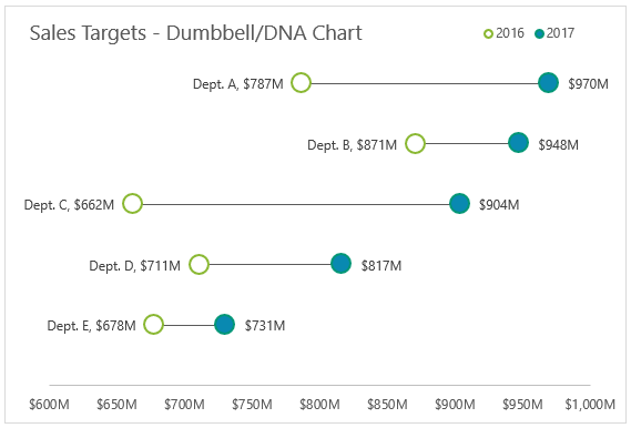
Dumbbell Dot Plots are similar to standard dot plot graphs. The only difference is a line between two dots to emphasize growth between points. The example above is a great data visualization of sales targets for the years 2016 and 2017. The use of empty dots to represent the previous year versus the filled in dot for the more current year is easy to comprehend before really analyzing the data. The line draws your attention from left to right and its length makes it easy to compare the growth between each department. Department C clearly had the most growth within a year, and the data points at the end of each dot helps solidify the viewer’s observation. I believe it is important to have a thin and simple line like above so the chart does not appear too cluttered. I was not aware of dumbbell dot plots until reading Chapter 3 this week, but they have definitely become one of my favorites.
This site provides more valuable insights on how to choose the right data visualization.
Visualizing Health
This week’s chapter in Effective Data Visualization is all about the importance of a single number. Chapter 2 explains that sometimes all we really need is for people to remember one important number because the number itself is impactful.
Risk Calculator
The Risk Calculator on VizHealth.org is a great example of the importance of a single number. It was very easy to input your information, and the calculated results display an effective visualization on your risk of developing cardiovascular disease within the next 10 years. When the results popped up, I immediately looked at the percentage for my risk. The number was big and bold, immediately attracting my attention. I believe this was the creator’s intent, so I would say they were successful in making an effective visualization.

Icon Array Generator
Another useful tool in creating an effective visualization is the Icon Array Generator on VizHealth.org. I was able to quickly input data and easily navigate through the various editing options. This is a great way to display a percentage because it clearly maps out the amount of people out of 100 that are at risk for a certain condition. You can adjust the quantity, gender, and color of each outcome value as well as adjust the labels for the Y-axis, legends, and title.
If I could change one thing about this generator, it would be to have the ability to edit the “default outcome value.” This website is meant to effectively communicate health data and risks, and I believe some data would be more effective out of different numbers such as 10, 20, etc. For example, in my Visualize a Big Number assignment this week I displayed the same data on breast cancer risks in women. Instead of showing 13 out of 100 women (as seen above), I wrote “1 out of 8.” In my opinion, 1 out of 8 seems like a lot more than 13 out of 100. Women may be more apt to get screened if the ratio is more impactful. I believe this minor change would positively help communicate health data.
Tools to Help Construct Infographics
Infographics turn data into an appealing visual that is easily comprehendible. It has become an increasingly popular tool in presenting data. Here are a few online tools to construct a good infographic.
Canva

Canva is a free and easy-to-use design tool. It has an infographic creator where users can choose from hundreds of templates. Each template has many options to add information and customize your own visual. They offer millions of stock photos or you can upload your own. Along with infographics, Canva offers tools to create presentations, logos, videos, business cards, brochures, flyers, and many more.
Piktochart

Piktochart is another great tool for creating infographics. The basic plan is free, and they offer a premium plan that starts at $14 per month. It is a great way to turn complex data into a clear data visualization. They have a gallery of over 230 unique infographic templates to choose from. From charts, graphs, interactive maps, and many more. You are also able to create custom color palettes as well as upload fonts into the editor.
Visme

Visme is a platform for creating infographics, presentations, branded documents, data visualizations, videos, and more. It is an easy and effective way to get data across. Users can choose from an array of templates and mix and match designed content blocks to customize their results. There are thousands of templates and over a million stock photos to choose from. The basic membership is free, and they also offer a premium plan starting at $12.25 per month.


Podcast: Play in new window | Download