Pivot Tables
Using Microsoft Pivot Tables, you can estimate, and interpret data to identify relationships, occurrences, and comparative data. Depending on the tools that you use in your construction process, the building process can differ. Various occupations can benefit from Pivot Tables, but I will be discussing how they are utilized in Health Care.
Pivot Tables: Health Care
According to HealthCare Training Leader , Pivot Tables are of great value in medical practices. They can create a summary table based on a set of data that can be altered and assessed. Medical billing offices are able to use these interactive charts to simplify billing information by breaking it down so that it is easier to understand. They are also interactive
They Offer Different Tools Such As:
- Switch the row/column layout of data sets in order to invert them
- There are endless number of ways to arrange the table
- To reveal or hide details, enlarge or minimize the table
- You can drill down into any value in the able using the “drill-down” feature
Analyzing Multiple Occupational Requirements By Using Pivot Tables
The U.S Bureau of Labor Statistics provides a step-by-step guide for viewing and interpreting a spreadsheet of multiple occupational requirements, a link for downloading this set of information, and instructions for creating a Pivot Table. In truth, for a general overview of how to set up the Pivot Table, I prefer this site over the one we created ours with. This site gave detailed instructions on creating the table as well as step-by-step explanation of how the information is created and manipulated.
Sankey Visualizations
It is true that Sankey Visualizations is an educational site (.edu), which usually indicates that the sources and information are reliable. Despite the interactive visual being well-designed, it contains a great deal of information meaning that while it may be visually appealing, it also contains a lot of text and is difficult to follow if you do not have prior knowledge of the situation.

The Transportation tab, as well as all the other tabs that lead to more information, are heavy on wording and low on visuals in my opinion, which makes it difficult to access reliable information. Using less words and more visuals to simplify this information might be the best soultion. Perhaps taking How We Use Energy and creating an infographic with subtitles such as Transportation, Industry, and Home & Work and discussing the information in less detail and more graphs and data would be a better approach.

This visual contains less graphs and more words which makes it boring and visually unappealing to read all of that information just to get to what it’s trying to explain. By redesigning this information with additional aesthetics, such as graphs, charts, picures, and data, it will become more engaging to read and interact with. I feel that I’m doing something that requires extensive research and is more of an article format. It would be more appealing if it included the following listed above and some infographics or pictographs to give more of an appeal than all the wording since it makes it difficult to be able to sift through all of that information.
Pie Charts
We can use Pie Charts in a variety of ways, and they are one of the most common visual representations of data. The pie chart, according to storytellingwithdata, can display a part-to-whole relationship, in which each slice represents one component of the whole, and all slices taken together equal the whole.
When To Use A Pie Chart
There are two primary uses for a pie chart in this situation:
- An understanding of the whole-part relationship in your data
- A relatively small or large segment of the pie is being represented
When To Not Use A Pie Chart
When analyzing categories, and comparing data across pies, Pie Charts should not be considered.
Share of Children in Primary School Who are in School Pie

I compared the percent of children who attend primary school in four countries using data from ourworldindata: Afghanistan, Belgium, the United Stated, and Africa. It is clear from the chart that the Belgium had the highest percentage of children attending school, with 98.80%, and Afghanistan had the lowest, with 26.80%. It was very interesting to see this visual because even without the numbers and simply displaying the names of the countries you can see how Afghanistan’s share of the pie is much smaller than the other countries.
Lollipop Chart
There are many forms in which data can be presented, such as a column chart or a bar chart, but what happens when there is a wide range of percentage rates, such as 90%? It is often the case that data can be visually distasteful when it is aggressive or overstimulating, and this is when the Lollipop chart is recommended and is visually pleasing. An axis is connected to a dot when the value sits on a stick.
By Analytics Vidhya, Lollipop charts are used for comparing different categories within a category. As a result of this chart, a well-organized comparison between classes can be seen. Here is an example of how a Lollipop chart can look. You can see the unique visualization that differentiates it from other charts by the small circles above the lines. When examining relationships, distributions, etc., this type of chart may not be the best option. Also, it does not work with all data as I discovered when I searched for a data set that would look visually appealing with a Lollipop chart. If you do not have the correct data, your Lollipop chart will not be accurate.
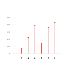
With data from the United States Census, I constructed a Lollipop chart that measured the effectiveness of changing business conditions during COVID-19 using the Small Business Pulse Survey. I selected 10 cities and calculated the percentage of businesses affected by the Corona VIrus Pandemic. As you can see in this visualization below, with the 10 cities I selected, I created a Lollipop chart. Choosing more cities in the data center would have made labeling more complex. I would have had to play around with the numbers and ensure they matched the bar that represented them. As well, it is also imperative to consider what tool you are using to create this chart. Excel will you a more complex method than if you go to a reputable website and follow the steps there.
Benchmark Analyses
By using infographic tools, benchmark analyses are presented in a variety of visual formats. In accordance with the Robert Wood Johnson Foundation’s considerations for selecting a benchmark for health equity. In other words, benchmarking can be used to evaluate health gaps and assess the quality of care to address these disparities. There are advantages and disadvantages when using different approaches to benchmarking health equity. It was concluded that there was no bet method for selecting a benchmark for health equity assessment.
Examining the results of the RAND study reveals how much hospitals are charging private insurers. Two scatter plots are used in New York Times article, to illustrate the most and least expensive hospitals for private insurers, compared to Medicare. In the first scatter plot, the most expensive hospitals are displayed, while in the second plot, the least expensive hospitals are displayed. Among the benchmarks was Michigan, where private sectors are about two and a half times those charged my Medicare. Further details about how prices vary greatly
This is powerful distinction that RAND made to conclude that market forces are not working. This is always important to know and understand, since this involves financial income and it’s everyone’s right to know when they have been taken advantage of. The ability to see these data numerics visually makes all the difference.
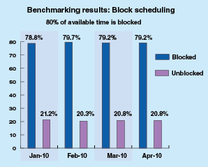
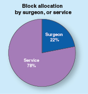
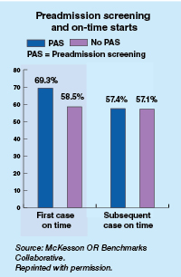
As another example of an infographic benchmark, the ormanager analyst offers benchmarks based on actual data from the sample of hospitals displayed. Comparisons are between two bar and 1 pie charts. As a result these correlations, they can differentiate between hospital productivity, hospital factors, like country (US or Canada), building type, and number of operating rooms. It was found that on average, US hospitals had lower scheduling quality than their Canadian counterparts. The turnaround time for US facilities was 15 minutes longer than expected compared to Canadian facilities.
Final Thoughts
As a result of my research, I have gained a in-depth understanding of infographic benchmark and the many domains and employment that they can be applied to in order to assist with the comparison of analytical data displayed in graphs. These tools have further piqued my interest and I would like to see more visual infographic comparisons in my own research fields and use them to make distinctions and not differences in future research papers.
Insightful Data Visuals: Health Science
When presenting a variety of information, such as comparing numbers, graphs and tables are the most effective means of presenting. The use of visualizations is an excellent method of creating visual representations that are complex to explain verbally. Chart interpretation and design can be challenging, especially when you have to construct imperative information, such as in health-related topics where reliability and validity are of utmost importance.
How to Ensure Self-explanatory Graphics
During my research, I found a resourceful website that provides guidance and further explanations about how we can improve our ability to create visuals. This is especially true when numbers are involved. This is in a manner that our audience can understand. During my research, I found a resourceful website that provides guidance and further explanations about how we can improve our ability to create visuals. This is especially true when numbers are involved. This is in a manner that our audience can understand. Using the website AHRQ, we can create our numbers comparison infographics with in-depth detail and pictures that along with their information.
AHRQ: How To Interpret Bar Charts Effectively
Below are a few tips provided by the Agency for Healthcare Research and Quality AHRQ to assist you in this process.
- Bar charts are examples of visuals easily understood by your audience. This is if you use a tool to make this type of visual more intuitive. Rather than displaying multiple responses in a single barm you can be display the response most meaningful to your audience.
- It is important to provide additional resources. Providing additional labels that correspond with the numbers you are presenting allows the audience to remain focused on the topic you are presenting and the numbers that align with the data being displayed.
- Design plays an important role when color visuals and different shades are involved since you want your audience to be able to identify which numbers correspond to which color. The following image illustrates the use of the patterned bar when comparing more than one type of data.
- As well, it is imperative to ensure that the title or label of the bar chart accurately describers what the bars represent.
There are also several helpful tips provided on the AHRQ website on how to use things like symbols when comparing multiple numbers. The use of graphics as visuals means of displaying information to your audience or reader is highly prevalent in healthcare, therefore I shared tips that have grown most useful to me and can be applied to other professions when designing data visualizations.
VizHealth
Risk Calculator
I entered demographic data into the risk calculator and say how it displayed different images based on the data I provided. Based on the information that I entered into the Risk Calculator, it was interesting to see how the graph and percentage changed. As a I played with the generator, I discovered that if I input higher numbers and the risk factor changed percentage rate, my risk of developing Cardiovascular Disease within the next 10 years increased to 7%.
Icon Array Generator: ASD Prevalence
By utilizing the IconArray, I was able to display the prevalence of children with ASD in comparison to children without ASD. Using the data statistics found here, I was able to create an IconArray. As I was creating my icon array, I discovered that I was not able to use percentage statistics, so I was unable to use the data that I had previously wanted to use. Using this tool, I was guided through the steps of how to construct an icon array and provided with options for how to customize your own, which was a new experience for me since I had never created one before. For learning about Data Visualizations, the Icon Array generator step-by-step instructions on how to create an icon array that visualizes the data. In my field of Health Science, I am always interested in applying different data visuals that I learn to my related field. In general, I felt the site offered some valuable aspects when it comes to learning about data visualizations. It offered gender-specific icons as well as an option to chose a shape to depict a graphical representation of the data. As a result, I was able to change the title and subheadings in order to indicate to audience viewers what data I was discussing rather than just displaying icon arrays with no intended meaning.
Infographic Design Tools: Canva
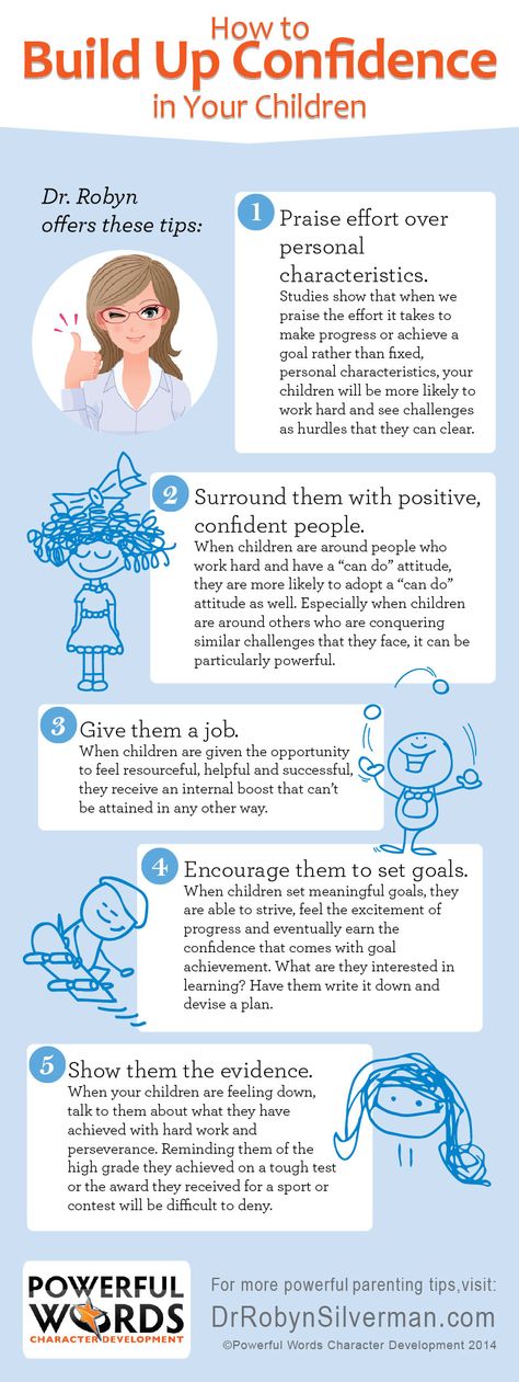
The following is an Informative Infographic that provides insight into how to build confidence in your children. The Infographic is well-designed and set up in an order that’s easy to follow. The design provides a perfect combination of images and color contrast, pleasing the eye.
Here is a link to the Infographic Image https://edmontonfetalalcoholnetwork.org/2015/05/28/confidence-building-in-children/
Sites For Creating Infographics
Sites such as Canva, Venngage, Infogram, Piktochart, Vise, and others provide tips and templates for creating the perfect Infographic for your audience.
Canva
I will discuss Canva in more detail since it is an excellent tool for guiding you through designing your Infographic and offers a variety of templates and designs to choose from. The possibilities with Canva are virtually endless. You can select themes such as medical, mental health, science, health, environmental, etc.
You can even watch a video that demonstrates how to create an infographic by clicking here
Canva Infographic Maker
The Canva website also provides a one-page guide to making an Infographic. In addition, this includes information regarding their photo library, which contains millions of photos that can be used in your Infographic. You also upload your own photos to the graphic if you have your own graphics that you wish to use.