The Importance of Pivot Tables
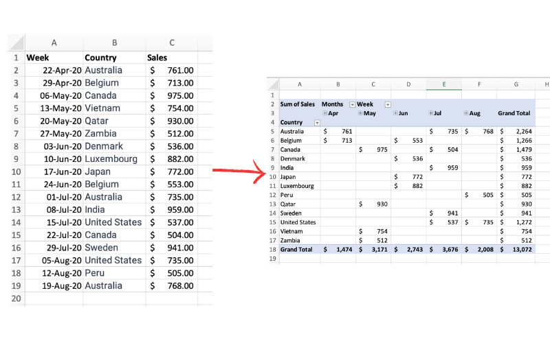
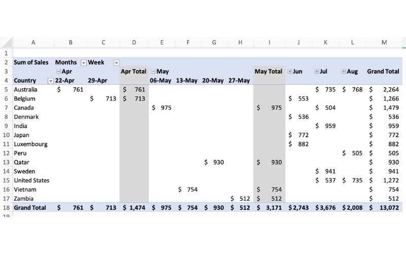
The picture above exemplifies a pivot table and one of the many different ways it can be utilized. One of the main reasons pivot tables can be such amazing tools for representing data is how interactive they can be. The table above shows sales by each country sorted chronologically by week. The table is very easily changed to reinterpret the data to be sorted by country instead of by time. Pivot tables allow the user to represent their total sales by region, or even be specific salespersons. They also can allow the ser to group data into even more specific groups such as other time periods (months, years, etc), or other custom grouping methods. This is shown in the pivot table below.
In terms of efficiency, there is no better table to use than a pivot table. They can save you hours by allowing the user to quickly change how a data set is represented. They also add a sense of flexibility. Pivot tables make it very easy to incorporate any new data that may be found instead of having to create a whole new table/chart.
Sankey Visualizations
Overall, this presentation was highly informative. The goal of educating people about the total amount of energy being used in the United States through different types of visualizations is very effective. I learned about the different types of energy Americans use every year, how much is wasted, and what types of energy go towards what.

This screenshot above shows that 59.4 out of 98.3 quadrillion btu in 2014 was considered unused energy. That’s over 60% of our total energy. This screenshot also shows the main contributors to our energy supply in the United States with Oil being the number one contributor and natural gas and coal falling not too far behind. The oil used as useful energy primarily is used to power our transportation systems, such as cars, planes, and trains, and then the rest goes into the industrial industry such as factories. The chart also shows which type of energy is used the most with industrial energy having a significant lead over residential, commercial, and transportation.
Overall, I think the biggest thing I learned from this interactive chart is how much energy we waste in the United States. I always knew most countries were not as efficient as possible when using energy, but I never would guess over 60% of generated energy goes unused every year.
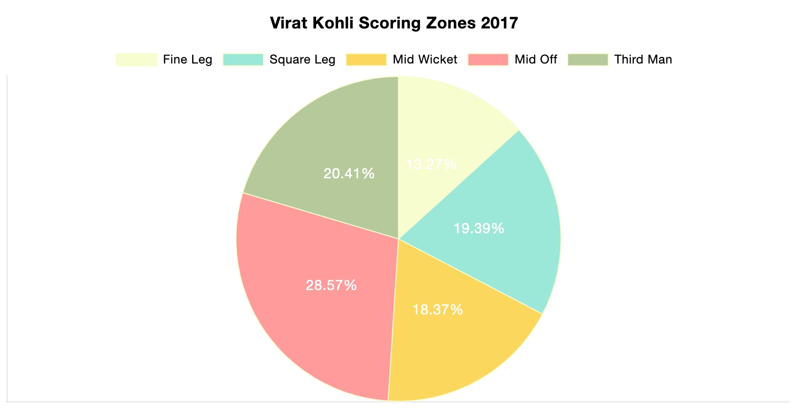
Pie Charts

Shown above is a pie chart I created based on the percentages of total energy use. Knowing when to use a pie chart can be a difficult skill to master. The following link including provides evidence as to why this type of chart is best for this data. The given data set represents different parts of whole adding the percentages of each data variable adds up to 100% as a whole. Additionally, a pie chart shouldn’t be used when you have too many different data points. This infographic only uses 5 which means a pie chart is a perfect fit for this data set. This pie chart has the appropriate amount of data points and data labels to make it effective at relaying this information to the reader.


Podcast: Play in new window | Download
Lollipop Charts

A lollipop chart is a data visualization tool similar to a bar chart but with the shape of a lollipop. It shows data points at the end of a line that attaches to the chart’s baseline. This chart effectively compares values from a small data set where numbers aren’t very far apart. It makes it much easier to understand the differences in these values at a quick glance. These charts are best used when you need something the provides a simple look and wants to highlight the comparability of certain data points. These types of charts are also very good if you want to emphasize a certain data point. This is because you can highlight or change the appearance of each data point to make it stand out more or less. The given example shows different types of devices and how much online data they use. While some data points there are obvious differences. Some with closer values can be hard to distinguish without this chart.
Benchmark Comparisons
This post demonstrates the understanding of different types of graphs and data sets being compared to a benchmark line. By definition, a benchmark is a measure or comparison. The article includes many different graphs demonstrating climate change over the years. This article aims to compare the climate of previous years to the climate of 2023. The two following charts come from the same article on climate change.

The graph above is an example of a line graph. The orange line in this example is the benchmark line. The primary goal of this graph is to compare the climate change cross an entire year to the climate in 2023 which is highlighted.

Similar to the previous graph, this graph conveys a similar message except the creator has used two different benchmark lines instead of one.
Overall a benchmark line can convey a compelling message to a viewer. A benchmark line can allow a viewer with no previous knowledge of a certain topic to be able to follow along with a certain infographic. A viewer having other data to compare something to can help keep an audience engaged for extensive periods of time.
Podcast: Play in new window | Download
Comparing Numbers
The photo above is included in the linked article of this post. The article demonstrates the importance of using the correct infographic when comparing different data sets. It discusses the importance of making comparison charts, the best types of data comparison charts, and when to use each type of chart. One of the most commonly used comparison charts is the pie chart which is shown above. Pie charts are most effectively used when comparing sizes or percentages of numbers within a single data set.
Podcast: Play in new window | Download
Icon Array
After exploring this website for quite some time, I would say it definitely opened up a new perspective on infographics for me. To a beginner, this website can be extremely valuable for learning about infographics. After experimenting with the Icon array feature, I have created an infographic regarding the number of golfers who are likely to hit a hole in 1 in their lifetime.

Podcast: Play in new window | Download
Insightful Infographics

This video demonstrates different types of infographics and when each type should or shouldn’t be used.
Podcast: Play in new window | Download