Global Health and Socioeconomic Indicators Analysis Report
Introduction
The Country Health Trends Dataset sourced from Kaggle provides key indicators such as life expectancy, fertility rate, population, and regional classifications for countries worldwide. This data allows researchers to explore global development trends, perform comparative analysis across regions, and investigate correlations between health and socioeconomic factors. This report provides a statistical overview and analysis of these indicators, uncovering insights into global health disparities and patterns across regions.
Objectives
The main objectives of this analysis are as follows:
- Perform Exploratory Data Analysis (EDA) to understand the distribution and range of key indicators.
- Conduct comparative analysis across regions for life expectancy and fertility rate.
- Explore correlations between life expectancy and fertility rate.
- Visualize global life expectancy using an interactive map.
- Highlight population distribution by region.
Data Overview
The dataset contains the following columns:
- Country: Name of the country or territory.
- Life Expectancy: Average years a newborn is expected to live if current mortality rates continue.
- Fertility Rate: Average number of children a woman would have over her lifetime.
- Population: Total population of the country.
- Region: Geographical region or political classification of each country.
Data Summary:

- Total Entries: 191
- Regions Represented: Six main regions, including America, Europe & Central Asia, East Asia & Pacific, Middle East & North Africa, South Asia, and Sub-Saharan Africa.
Methodology
- Data Cleaning and Preparation:
- Checked and handled missing values.
- Prepared the data for region-wise analysis by grouping and summarizing statistics for each region.
- Summary Statistics by Region:
- Calculated the mean, median, minimum, and maximum for life expectancy and fertility rate across each region.
- Aggregated population data to determine total and average population for each region.
- Exploratory Data Analysis (EDA):
- Visualized the distribution of life expectancy and fertility rates to understand skewness and distribution patterns.
- Created box plots to compare life expectancy and fertility rate across regions.
- Constructed scatter plots to assess relationships between life expectancy, fertility rate, and population size.
- Correlation Analysis:
- Used Pearson correlation to evaluate the relationship between life expectancy and fertility rate.
- Geospatial and Population Visualizations:
- Developed an interactive world map of life expectancy by country.
- Plotted a bar chart showing population distribution by region.
Key Findings
Regional Summary of Life Expectancy and Fertility Rate

- Life Expectancy:
- The highest average life expectancies are observed in America (73.2 years) and Middle East & North Africa (72.8 years), while the lowest is found in Sub-Saharan Africa (56.5 years).
- Fertility Rate:
- Regions such as Sub-Saharan Africa exhibit significantly higher fertility rates (average 5.4), while Europe & Central Asia show the lowest rates (average 1.7).
- Population:
- South Asia leads in total population, suggesting higher resource needs, followed by Sub-Saharan Africa and Europe & Central Asia.
Distribution Analysis
- Life Expectancy Distribution:

- The life expectancy distribution displays a negative skew, indicating that most countries have higher life expectancies, with a few outliers on the lower side.
- Fertility Rate Distribution:

- Fertility rate has a positive skew, with several countries displaying high fertility rates, especially in Sub-Saharan Africa.
Comparative Analysis of Life Expectancy and Fertility Rate by Region
- Life Expectancy:

- A box plot reveals that America and Middle East & North Africa have relatively higher and more consistent life expectancy values.
- Sub-Saharan Africa shows both the lowest median and broader range, indicating variability in healthcare and socioeconomic conditions.
- Fertility Rate:
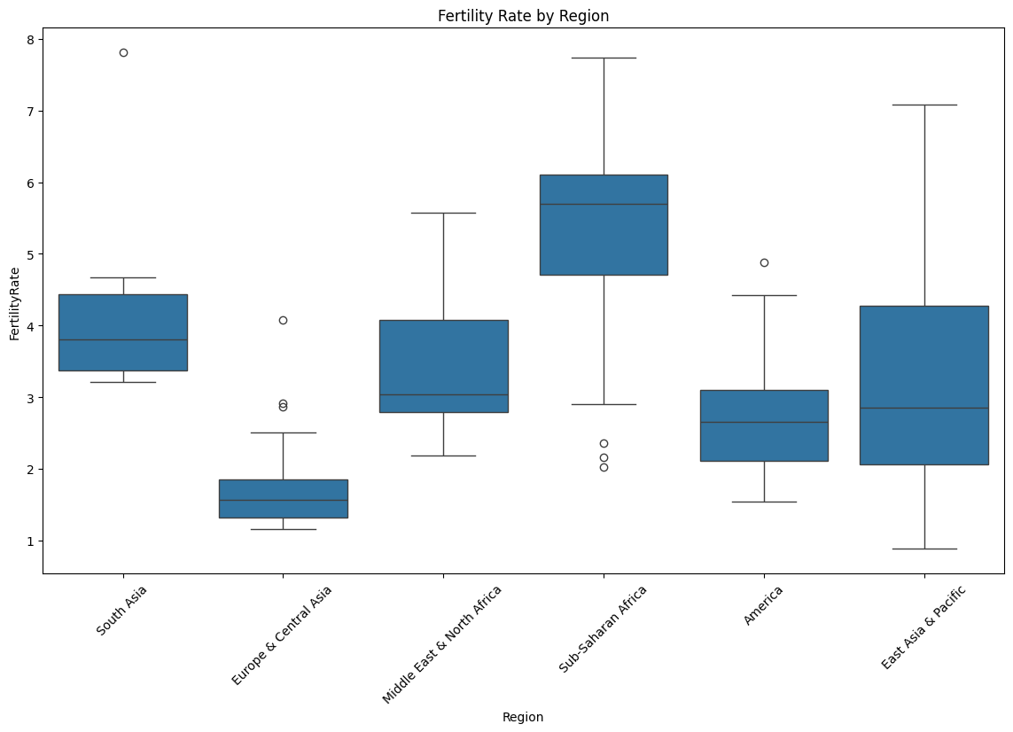
- Fertility rates are notably high in Sub-Saharan Africa, while Europe & Central Asia consistently exhibit low fertility, aligning with trends in more economically developed regions.
Correlation Analysis: Life Expectancy vs. Fertility Rate

- A negative correlation (Pearson’s r = -0.85) was observed between life expectancy and fertility rate, suggesting that higher fertility rates tend to coincide with lower life expectancy. This pattern aligns with demographic transition models, where lower fertility rates are often seen in countries with higher life expectancy due to improved healthcare and economic conditions.
Geospatial Analysis of Life Expectancy

- A map highlights countries with high life expectancies, including Iceland, Sweden, Canada, and Spain. This visualization reveals stark contrasts across regions, particularly between developed nations and regions such as Sub-Saharan Africa.
Population Distribution by Region
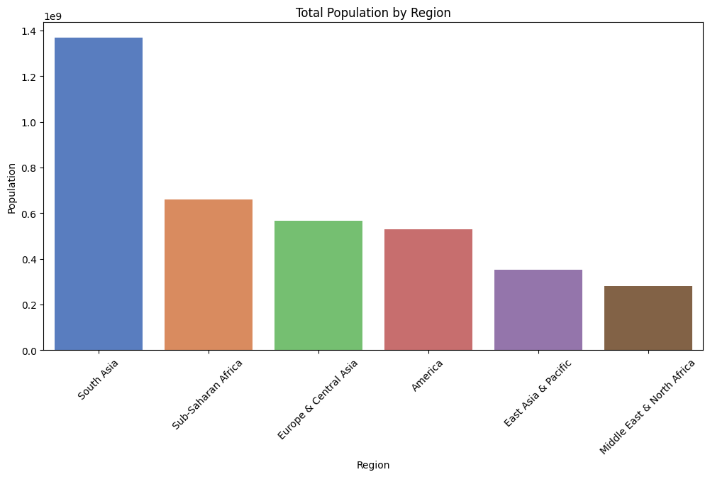
- A bar chart indicates that South Asia holds the largest population, followed by Sub-Saharan Africa and Europe & Central Asia. This regional breakdown emphasizes the need for tailored health policies in densely populated areas to address specific regional health challenges.
Conclusion
This analysis of global health and socioeconomic data reveals significant disparities in life expectancy and fertility rates across regions. A clear inverse relationship exists between life expectancy and fertility rate, aligning with global health and economic development patterns. The regional comparisons underscore the influence of socioeconomic factors, with Sub-Saharan Africa facing unique challenges related to high fertility rates and lower life expectancies, while regions like America and Europe & Central Asia exhibit higher life expectancy and lower fertility rates.
Recommendations for Further Analysis
- Time-Series Analysis: Examining trends over time would allow for tracking progress in life expectancy and fertility rates.
- Income and Education Analysis: Adding these variables could clarify the socioeconomic factors influencing life expectancy and fertility rates.
- Policy Impact Study: Assessing the effect of health policies on life expectancy and fertility rate changes across regions could provide actionable insights for policymakers.
Sankey Diagram
Overview of the Sankey Diagram
The Sankey diagram effectively illustrates the complex relationships between various energy sources and their end-use applications. It shows how energy flows from primary sources (like fossil fuels, nuclear, and renewables) to different sectors, including residential, commercial, industrial, and transportation.
Key Findings
Energy Flow Representation:
The diagram visualizes both useful and unused energy, highlighting that a significant portion (~59.4 Quads) is wasted, primarily as heat. This effectively communicates the inefficiencies in our energy system.
Interactive Features:
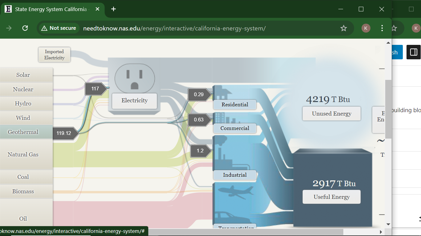
Users can click on different energy sources (e.g., solar, wind, hydro) to see detailed information and visualize their contribution to useful and unused energy. This interactivity enhances engagement and allows users to explore specific data points more thoroughly.
Comparative Analysis:
The representation of renewables alongside traditional fossil fuels on a similar basis helps demystify their efficiency relative to conventional energy sources. This is a strong point of the visualization, as it underscores the role of renewables in a comparable framework.
End-Use Efficiency: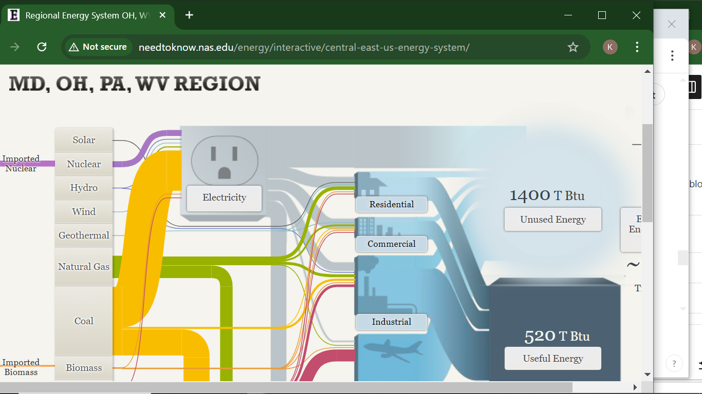
The efficiency metrics provided for various sectors (65% for residential and commercial, 80% for industrial, and 21% for transportation) are crucial for understanding where improvements are needed. However, the stark contrast between the transportation sector and others raises questions about potential reforms.
Critique of the Sankey Visualization
While the Sankey diagram is effective, there are areas for improvement:
Complexity:
For some users, the complexity of the diagram might be overwhelming. Simplifying the design or providing a guided walkthrough could enhance comprehension, especially for those unfamiliar with energy systems.
Static vs. Dynamic Data:
The diagram focuses on 2014 data, which may not reflect current trends. Regular updates or an option to view historical data trends could provide deeper insights into how energy usage patterns have evolved over time.
Alternative Visualizations:
Other visualization methods, such as bar graphs or pie charts, could complement the Sankey diagram by providing quick visual cues about the proportions of different energy sources or waste versus useful energy. This could help in communicating key takeaways at a glance.
Narrative Context:
The addition of narrative context or case studies could help users understand the implications of the data. For example, linking specific energy sources to current policy discussions or technological advancements would enrich the learning experience.
Conclusion
The Sankey diagram on the website serves as a powerful tool for visualizing the energy flow in the U.S. It successfully highlights the interplay between energy sources and their efficiency. However, incorporating user-friendly features, updating data, and using supplementary visualizations could enhance its effectiveness and accessibility. As the energy landscape evolves, such tools will be vital for educating the public about energy use and efficiency.
Perfect Use Case for a Pie Chart
Introduction
Pie charts are an ideal way to display parts of a whole, especially when showing proportional data. In this post, I’ll illustrate why the pie chart is a perfect fit for visualizing the global market share of mobile vendors, where each segment represents a clear percentage of the total market. With clear, distinct categories, a pie chart effectively communicates the dominance of each vendor relative to its competitors.
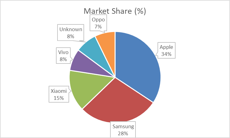
Visual: Mobile Vendor Market Share Worldwide – September 2024
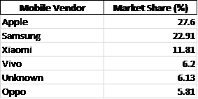
For this data, I’ve created a pie chart that clearly shows Apple, Samsung, and Xiaomi as the top three competitors, with other vendors representing smaller segments. This format enables viewers to quickly assess the relative size of each brand’s market share.
Argument for Using a Pie Chart
The pie chart works well here because:
- Distinct Categories: Each vendor represents a distinct, easily identifiable part of the mobile market.
- Relative Comparison: With Apple leading at 27.6%, the chart’s circular form highlights the gap between top competitors like Samsung (22.91%) and others.
- At-a-Glance Readability: For readers looking to grasp key takeaways on market share distribution quickly, the pie chart’s simplicity and proportional representation make it an excellent choice.
Alternative Visualisations
Though the pie chart serves this data well, a bar chart could be used to show exact values more precisely. However, in this context, the pie chart’s layout emphasises the proportions without requiring precise numeric comparison, which is sufficient for understanding general market dominance.
Design Tips for Effective Pie Charts
Here are some design tips that helped me make an effective pie chart:
- Limit the Number of Slices: Too many slices make pie charts hard to read. Keeping it to significant players (Apple, Samsung, Xiaomi, etc.) helps maintain clarity.
- Use Contrasting Colors: Each segment should stand out visually without overwhelming the chart. For this chart, I used distinct, brand-associated colors for the top brands.
- Label Percentages Directly on the Chart: Avoiding a legend makes it easier for readers to associate values with segments directly.
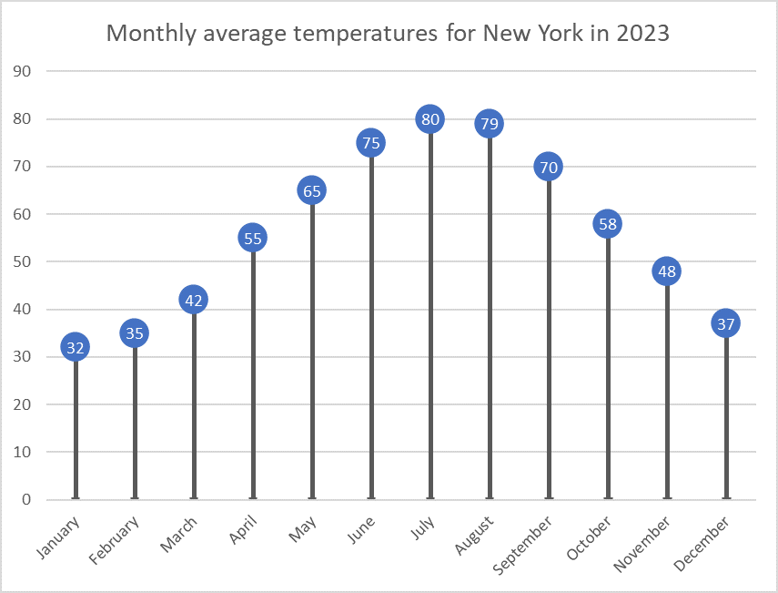
Visualizing New York’s Monthly Temperatures
For this data visualization exercise, I created a lollipop chart using the average monthly temperatures in New York City. This chart type, though lesser-known, provides a clean and effective way to present data. It minimizes visual clutter while maintaining accuracy, focusing on the values at the endpoints of each data series, making it an ideal choice for certain data types.
Why Use a Lollipop Chart?
Lollipop charts are a variation of bar charts that simplify the visual representation of data by removing the bars and retaining just the “lollipop” shape, which consists of a dot at the end of a vertical line. This design emphasizes the most crucial part of the data: the endpoint, where the value is represented. By doing so, it eliminates excess “ink” from the chart (i.e., the visual elements that aren’t necessary), creating a minimalist yet effective graph. Lollipop charts are particularly useful when you have many categories to display but don’t want to overwhelm the viewer with dense visuals.
In this example, I used a dataset of New York’s monthly average temperatures for each month of the year. Lollipop charts are ideal for this type of sequential data because they clearly show fluctuations in temperature without the visual bulk of bars filling up the space. Each lollipop (dot) represents the average temperature for that month, while the connecting lines provide a reference for the range, making it easy to compare temperature changes across months.
The Process of Creating the Chart
To create the lollipop chart, I used Excel, which provided a straightforward way to manipulate the data and customize the chart format. I started by inputting the data for New York’s average monthly temperatures. After inserting a simple line chart, I removed the line connecting the points and increased the size of the markers at each data point to resemble lollipops. This method gave the chart a clean and modern look, perfect for drawing attention to the changes in temperature over the year without unnecessary visual noise.
When Should We Use Lollipop Charts?
Lollipop charts are most effective when you need to compare a single variable across categories or time periods, especially when your goal is to highlight the extremes or focus on specific values rather than trends. They are useful for visualizing survey results, ranking data, or time-series information like the monthly temperatures I used in this example. If you’re presenting a lot of data and want to simplify the display, a lollipop chart is a great alternative to the traditional bar chart.
In conclusion, lollipop charts offer a minimalist and efficient way to convey data while maintaining clarity. My visualization of New York’s monthly temperatures shows how this chart type can be both functional and aesthetically pleasing, helping viewers focus on the most important data points without distraction.
Benchmark Comparisons for Phones
By Kevin Barksdale, in Benchmarks on October 2024
Introduction
In the cutthroat Smartphone market, any major parameter such as performance score, battery backup or market share comparison gives the users or manufacturers an idea of how a particular device fares against the other. These visualizations can be in any form of bar graphs, line graphs or the radar graphs depending on how the various phones are placed in relation to the standards or competitors.
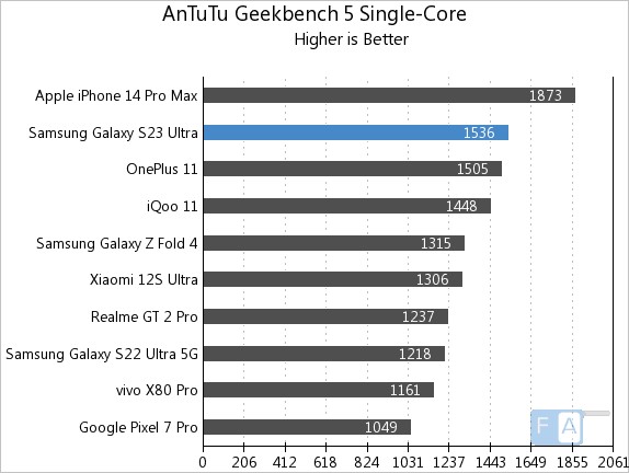
Smartphone Performance Benchmarks
One common way to compare phone performance is through benchmarking software scores such as those from Geekbench or AnTuTu. A bar chart is often used to compare models, with the benchmark score indicated as a horizontal bar across the chart. In the example below, phones like the iPhone 15 and Samsung Galaxy S23 are compared against an industry benchmark score.
Battery Life Comparison
In this line chart from Tom’s Guide, various smartphones are compared based on battery life measured during standard tests. The benchmark is the industry-standard average, indicated by a dotted line. Phones that exceed this benchmark, like the iPhone 14 Pro Max, are shown above the line, while those with below-average battery life fall below it. This visualization allows consumers to easily spot which devices perform better in terms of battery longevity.
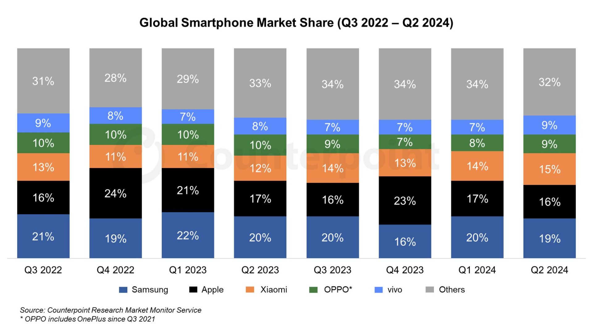
Market Share Comparison
In this stacked area chart, global smartphone market shares for different brands (Apple, Samsung, Xiaomi, etc.) are compared to the benchmark of global market trends. The visualization highlights how each brand’s market share has grown or shrunk over time. A consistent color represents the benchmark (overall market growth), while each company’s share is visually stacked, making it easy to compare how individual brands are performing relative to global trends.
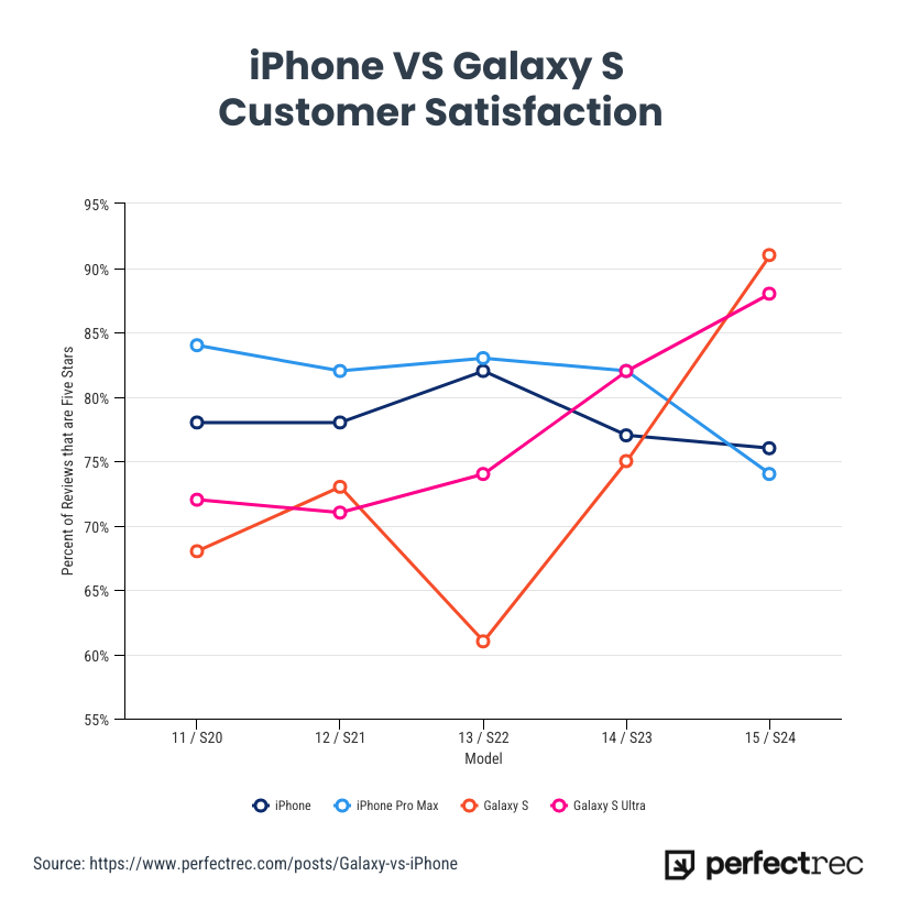
Customer Satisfaction
For the first time, the Samsung S24 line has surpassed the iPhone in customer satisfaction, according to a recent survey. Samsung’s latest flagship models received high praise for their superior battery life, advanced camera features, and customization options in the Android ecosystem, leading to a slight edge over the iPhone in overall user happiness. This marks a notable shift in the ongoing rivalry between the two tech giants, as the iPhone has traditionally dominated in customer satisfaction metrics. Samsung’s focus on user experience and performance appears to have resonated strongly with consumers, setting a new benchmark in the smartphone market.
Conclusion
Comparing smartphones to benchmarks helps consumers understand the strengths and weaknesses of a device, whether it’s performance, battery life, or camera quality. Using visualizations like bar charts, line graphs, and radar charts makes these comparisons clearer, offering valuable insights for buyers.
Comparing Numbers through Data Visualizations: A Look at Global Health and Wealth
Data visualization plays a powerful role in helping us understand and compare numbers. Whether we are examining trends over time, differences across countries, or correlations between variables, visualizations offer a clear and compelling way to interpret complex datasets. One of the most insightful examples of comparing numbers is Hans Rosling’s World Health Chart, which visualizes the relationship between wealth and health across different countries.
Rosling’s World Health Chart is a groundbreaking data visualization that compares average lifespans and incomes of countries over the last 200 years. The chart uses bubble sizes to represent countries, where the horizontal axis (east-west) shows income and the vertical axis (north-south) shows life expectancy. This visualization allows us to easily see patterns and outliers.
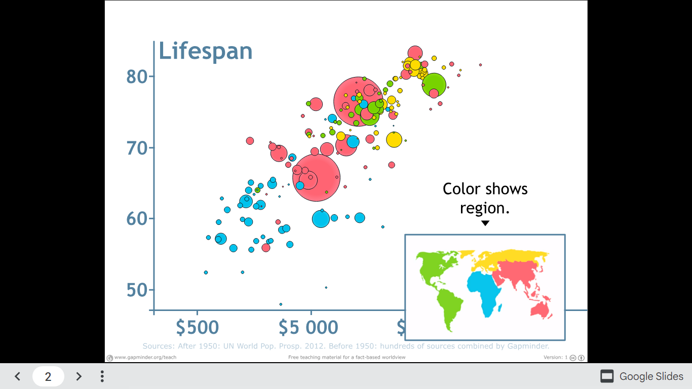
One striking insight is how health and wealth have moved hand in hand over time, with wealthier nations generally enjoying longer life expectancies. This visualization helps us not only compare countries in a specific year but also observe global shifts as we play the animation across centuries.
Watch Hans Rosling explain the chart and explore the full visualization.
Infographics


This is a great infographic of one of my favorite vegan restaurants to go to whenever I’m in Atlanta, Georgia. This restaurant promotes a healthy lifestyle of eating a plant-based diet that is not only good for the body, but good for the earth as well! Lol, TRY to be MATURE and MOVE PAST THE NAME, the name of its menu items, and what it might imply, and moreover FOCUS on its TRUE MESSAGE!!! https://sluttyveganatl.com/


Podcast: Play in new window | Download