Home » Articles posted by Tameka Ball
Author Archives: Tameka Ball
Pivot Tables
A pivot table is a data analysis tool that can be used to organize and summarize large data sets. Large data sets can be cumbersome and include extraneous data that does not pertain to the use case. A pivot table can create an organized chart that functions to create a subset of data that can be explored in a more dynamic way.
Pivot tables are great for interactive dashboards that aid in data analysis. They can simplify very large and complex data sets. Pivot tables can be simple or more advanced using techniques like slicers and calculated fields. Slicers are great for dashboards because they allow users to select different groups of data to view. Users have a more granular view of the dataset that is relevant to specific information they may be looking for. Slicers also allow users to navigate dashboards like the example in the textbook. I’ve tried creating pivot tables multiple software and have found that Excel is the best application and Numbers is also easy to use.
Myexcelonline.com has a great tutorial to create a pivot table. They also have a picture of the final table showing the different elements of a pivot table.
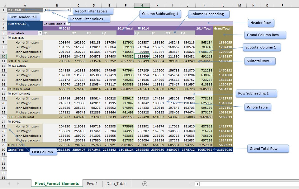
https://www.myexcelonline.com/blog/customising-pivot-table-styles/
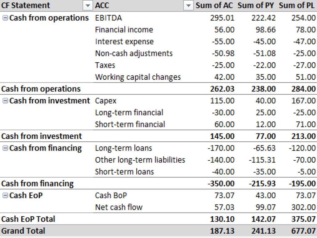
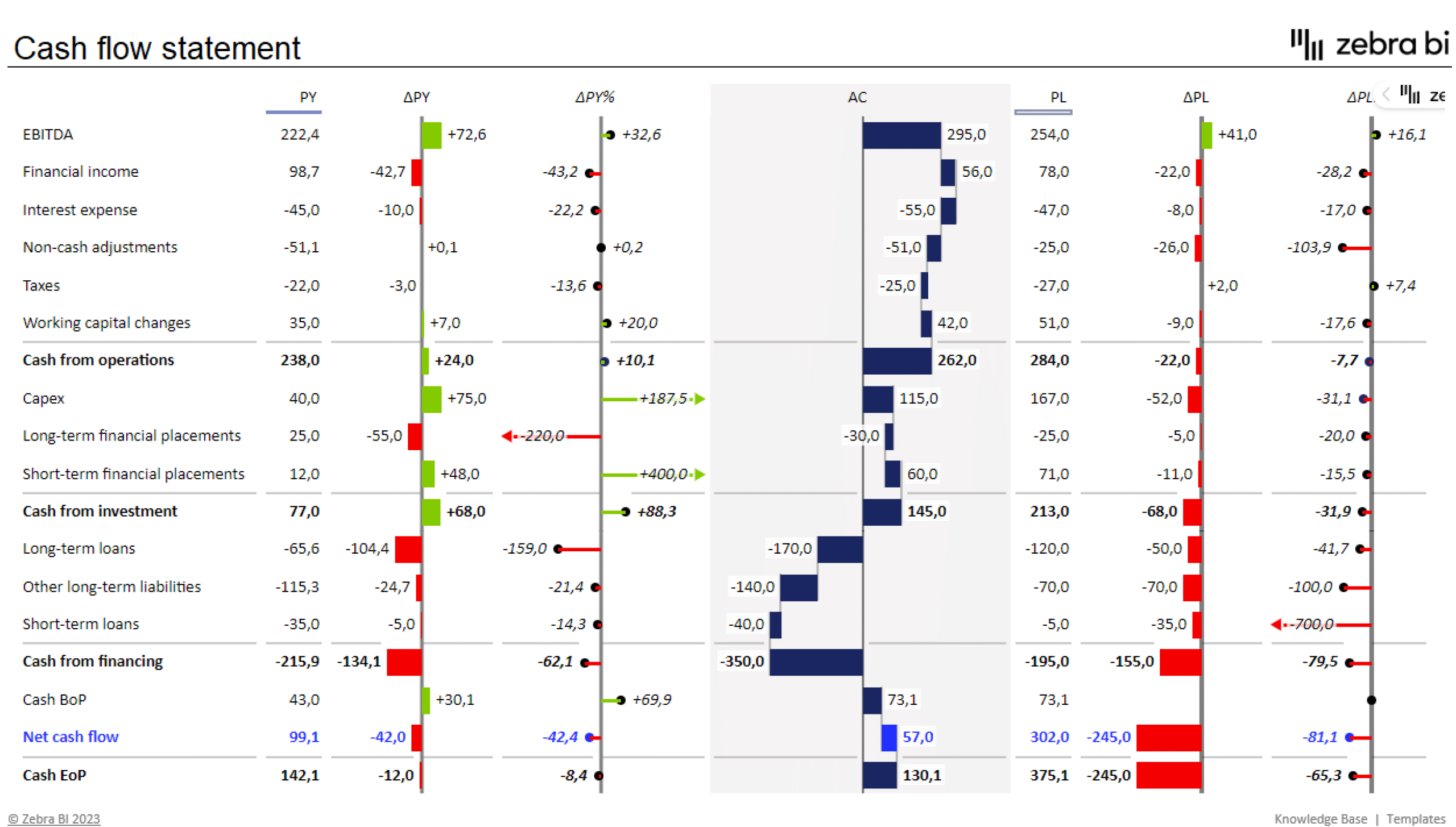
I would actually like to master pivot tables because I know that they are ideal for use in financial reporting. Financial datasets tend to be overwhelmingly large and difficult to summarize. Zebrabi.com suggests using a tabular hierarchy pivot table as shown below along with visuals for financial reporting.
Sankey Diagram
The Sankey Diagram originated in 1898 to show the energy efficiency of a steam engine. This makes it the perfect choice of visualization to depict the efficiency and usage of our energy systems in the United States. I appreciate that the diagrams show how different states aggregate their energy to show that the United States is not a monolith in energy production and consumption. Our energy use is nuanced and these diagrams show that our energy production and usage is very inefficient. This first screenshot shows the amount of energy that solar contributes to our total power usage. It is very low at 0.23%. I was actually shocked that less than ¼ of a percent of our energy is produced by solar. When you click on solar it also shows that most of our solar usage is going directly to residential homes and very little is going into the grid.

The second screenshot shows the MD/OH/PA/WV region, who are major exporters of coal energy. The diagram shows that the region has much lower energy efficiency than the nation due to the use of coal. 73% of energy is unused in this region because the region is heavily reliant on the coal, biomass, and oil.

The last slide shows energy production and import in California. California is one of the most energy efficient states in the country and this diagram shows why. The top 6 sources of energy listed: solar, nuclear, hydro, wind, geothermal, and natural gas are much more efficient than the bottom three. This results in 41% of California’s energy produced being usable.

I would say that this is one of the best use cases for a Sankey Diagram. It allows the user to easily follow the flow of information (energy) and understand more about the topic than many other types of charts. All of the relevant information was able to captured in three different versions of the same diagram, so when users move on to the second and third charts they are expert users and it makes analysis more streamlined. This was a great way to show inefficiencies and areas of opportunity in a simple and easy to understand way. My mind works in percentages so the only thing I would have done differently is include percentages in the useful and unused energy labels or tooltips. Lastly, the only thing that I don’t really like about this Sankey Diagram is that all of the numbers are not visible without clicking around. Many people prefer to be able to see all of the information and just be able to explore visually without interaction.
Pie Charts
Pie charts are used to show portions of a whole. An amount is divided into categories by percentage and the slice sizes are relative to the percentage of the category. Pie charts are great to use in showing the results of polls if there are a limited number of categories. If you have too many categories the chart becomes difficult to read. Below I have created two pie charts based on data from Pew Research regarding Americans’ views on money in politics.
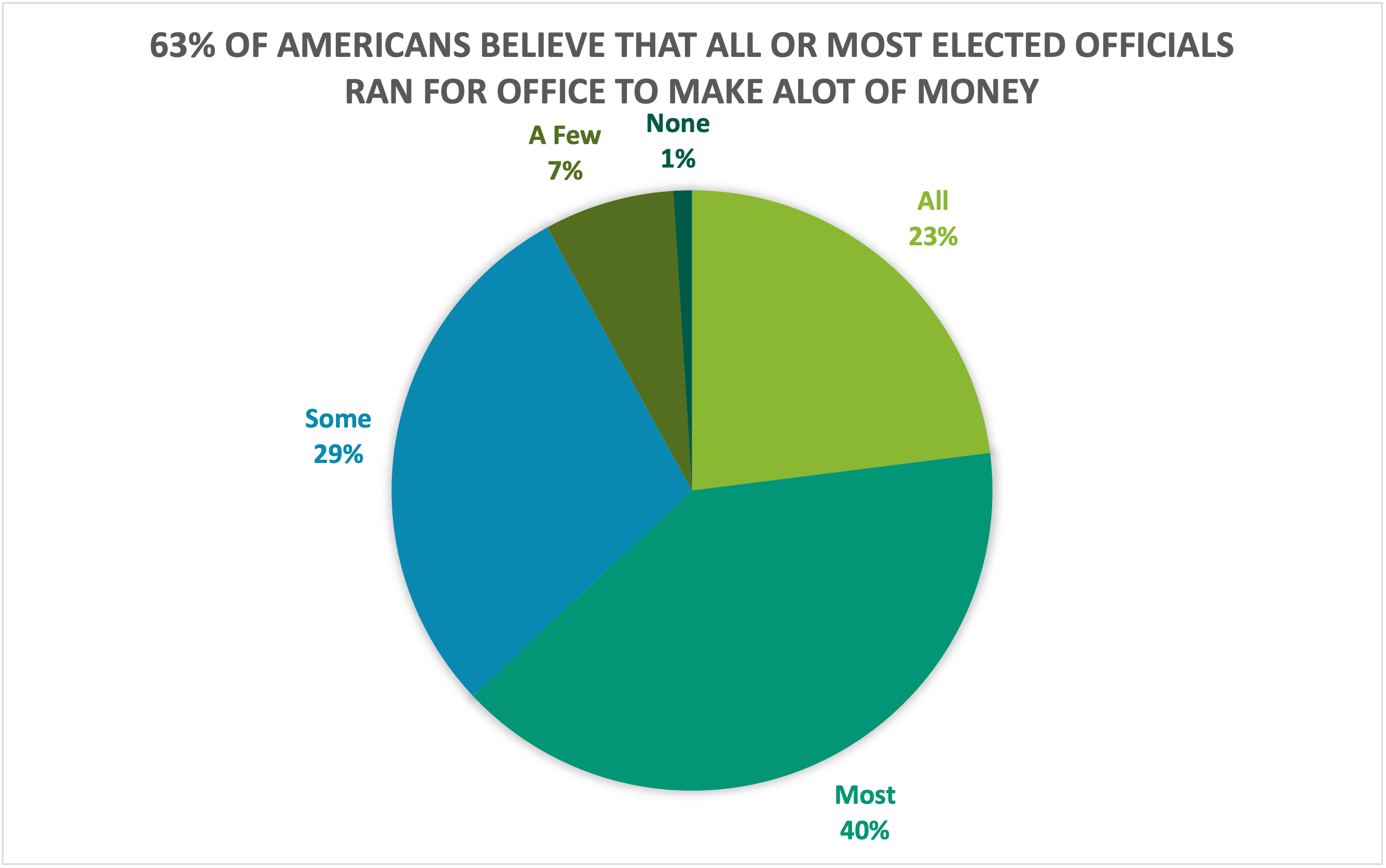
The above chart highlights what a higher proportion of respondents believe while the chart below highlights what a lower proportion of respondents believe. Choosing the right chart but also a good title for the chart is key for letting viewers know what information is important.
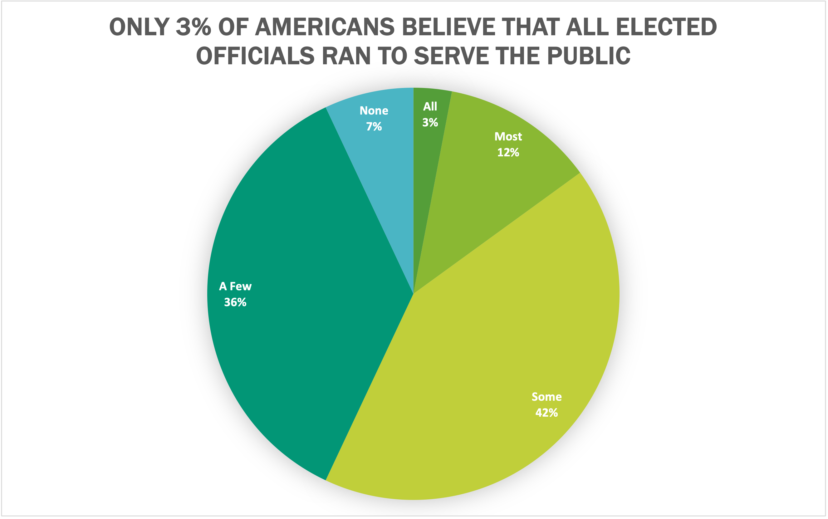
I believe that both of these datasets are great use cases for pie charts because they show what portion of respondents. Other good uses of pie charts is in finance. Household budgets are well represented by pie charts. Pie charts are also a great tool to use when visualizing portfolio allocations. One of the most important things to avoid with pie charts is using incompatible data. If the proportions do not sum to 100%, the data is not a good use case for a pie chart. There are many different options for visualizations and a pie chart is great for a simple and quick way to represent proportional data effectively to viewers.
Lollipop Chart
A lollipop chart is basically a combination of a bar chart and a dot plot or scatterplot. It can be used anywhere that a bar/column chart would be appropriate. Lollipop charts are great for reducing visual clutter and making use of white space, which can make important data stand out more and make the differences between data points more apparent. Numpy Ninja makes the point that one strength of lollipop charts are that they are highly customizable. One of the weaknesses is that the circular markers can create some ambiguity in where the actual datapoint lies, making it more difficult to discern scale. This type of chart actually works best when there is a large discrepancy between datapoints such as in the below. The second chart I made has much less deviation between data points so the chart overall is less impactful. This is one of those things that you have to see for yourself to understand that there really is a best chart for different types of datasets.
I was recently at Disney and got the sales pitch for DVC timeshares. I thought a fun lollipop chart would be to show how many one bedroom villas each different resort has. This can be important information for a family looking into which resort to purchase if they need a specific room type. This chart clearly shows that a family that requires a one bedroom villa to be comfortable should stay away from purchasing at certain resorts or they may not be able to book the room they desire due to low availability. This lollipop chart was created in Excel.
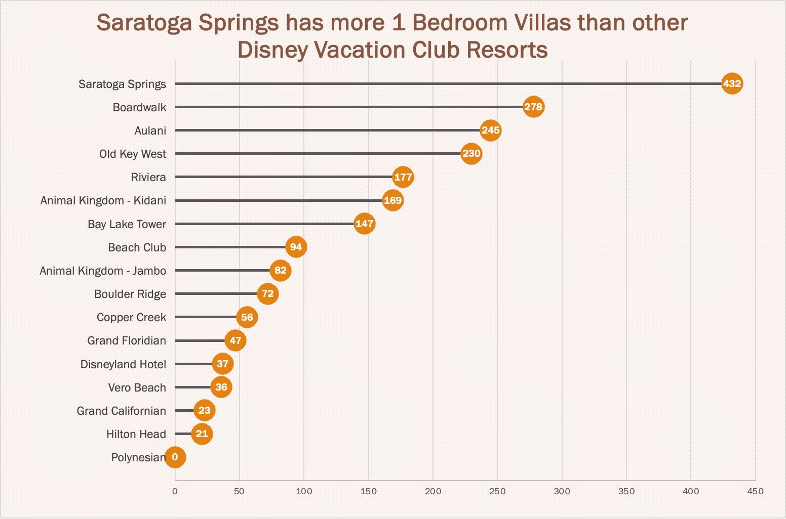
https://www.dvcfieldguide.com/blog/disney-vacation-club-1-bedrooms
I tried to create a lollipop chart in Tableau using data on consumer spending. I found some information on what categories of purchases consumers intend to splurge on in 2023. This application can be tricky to figure out, but I love that I can export my charts with tooltips for readers to interact with. 37 percent of consumers intend to splurge on something in 2023 and this chart breaks it down into categories. We can see that most people intend to splurge on restaurants and groceries and the fewest people intend to splurge on fitness and household essentials.
Benchmark Comparisons
When I look at data one of the most important concepts for me is relativity. What does that data mean relative to other data? When we look at relative data, we begin to really see the story of that data in the context that defines it. Benchmarking is a standard or point of reference by which data can be compared. Benchmarks represent a significant portion of data representation in many fields and can assist in the application of productivity concepts such as performance and service.
One of the most common benchmarks that we see often is financial benchmarks, specifically related to the stock market. People go to many different news sources to check on their investments but you will see charts that look very similar on every site. This graph shows the performance of Home Depot stock in the past year.

https://www.wsj.com/market-data/quotes/hd
This graph shows the performance of Home Depot stock compared to the benchmark set by the S&P 500:

https://www.wsj.com/market-data/quotes/hd
While HD is up 2.99% in the past year, it is not doing great when compared to the benchmark performance of the S&P 500, which is up 18.99%.
A New York Times article exploring the effects of pandemic school closures on the math scores of students showed some interesting results. In 2019 there was a distinct pattern between the students in wealthier districts scoring above average on math tests.


In 2012 there was a shift in all scores across the board. This change happened amongst all income levels and racial groups.

I enjoyed this article and the benchmarks showed that even though the researchers did not find the results that they had expected, they presented the data because it was quite remarkable. They had assumed that the children in poorer districts and minorities would have been even further behind benchmarks but the data showed otherwise. When data is presented that is the opposite of initial assumptions I find it more interesting because it shows the importance of data science and visualization. Without data we are left with assumptions…which are sorely lacking.
Insightful Visualizations that Compare Numbers
There are many different factors that contribute to quality of life for people around the world. One of those factors tends to be leisure. How do we spend our “time off?” Many people work through their weeks and dream about weekend plans or where they are going for their holiday in the summer. The difference in that dream can be what country you live in. Some countries have statutory paid vacation, while some countries, including the United States, leaves paid time off rules up to employers. The graphic below shows guaranteed vacation time in several countries. It is shocking to see that most U.S. workers are guaranteed only 10 days off for public holidays, while Austrian citizens have 38 days between annual leave and holidays. Many U.S. workers are not even guaranteed the public holidays off because many services continue during those days.
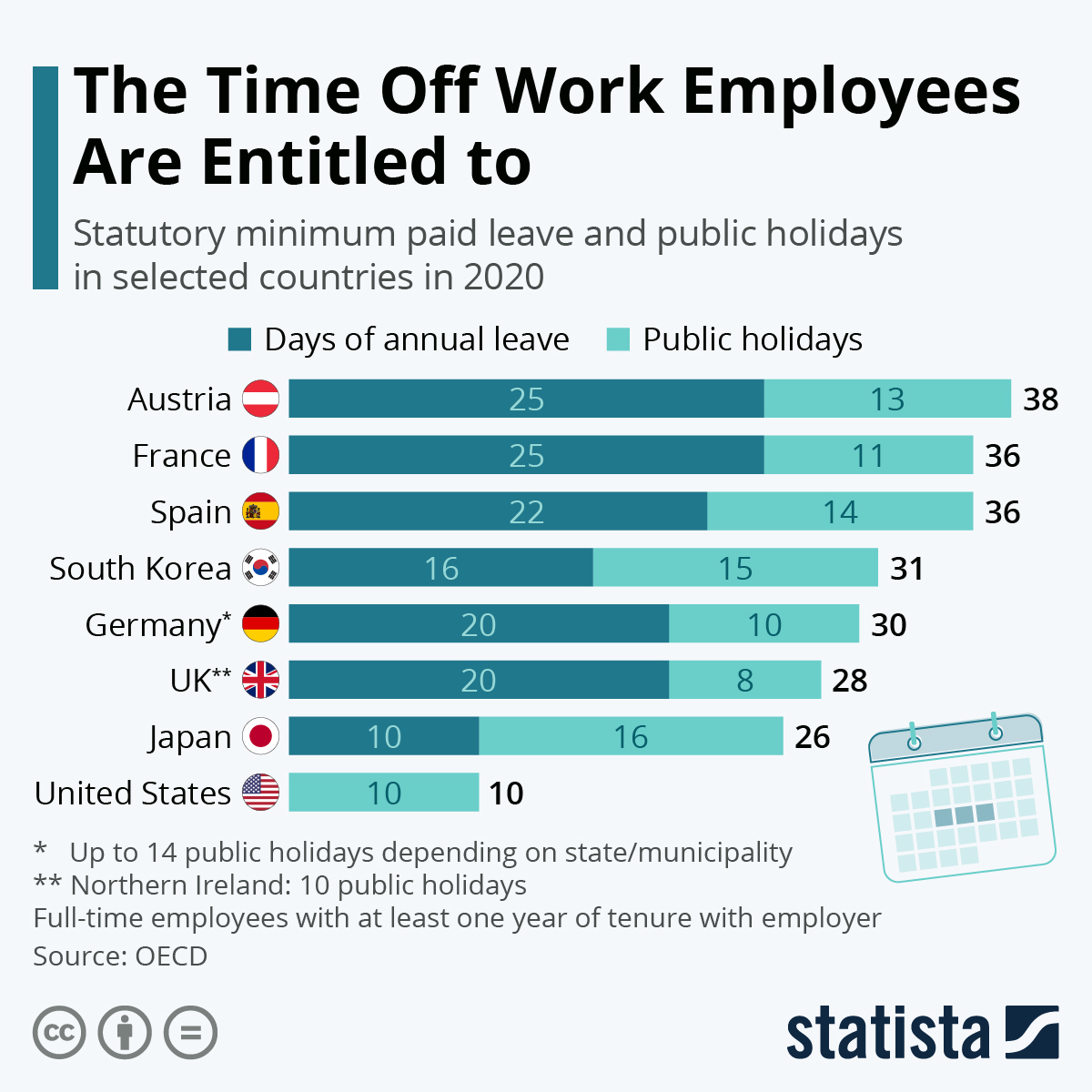
https://www.statista.com/chart/15005/statutory-minimum-paid-leave-and-public-holidays/
Paid leave can affect more parts of life than leisure. There are huge discrepancies in different countries on both paid sick leave and family or maternity leave. Again, some countries mandatory minimums for maternity leave. This graphic from Capital and Main shows the how much maternity leave is mandated by the United States versus other countries.
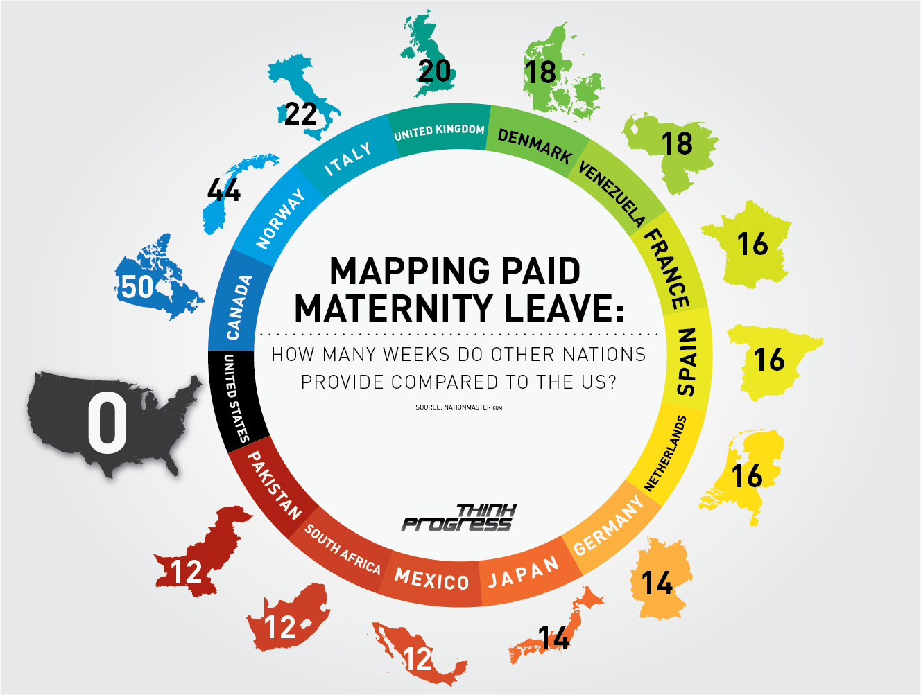
https://capitalandmain.com/the-right-to-care-states-paid-family-leave-turns-10
Graphics like these, that show how one country compares to other countries around the world can paint a picture the differences. Why those differences exist and how they affect populations are questions that we can research further to understand, but these graphics give us a great starting point.
Visualizing Health Data With VizHealth
This weeks chapter in Effective Data Visualization was about the importance of a single number. Sometimes the impact of an important data point is obscured by too much other information. The icon array seemed to be difficult to create in excel but the VizHealth website has a great tool that health care professionals can use to convey complicated data in a simple and concise way to patients and other interested parties.
The risk calculator tool on the site was extremely easy to use and I can see the application for health care professionals to input a few data points while speaking with a patient and being able to give the visualization with the patient summary at the end of the visit. This cardiovascular risk data can be especially useful with people who are tracking lifestyle changes recommended by their provider. Visualizations of progress can be very motivating. This infographic is very well designed and highlights the important facts in a way that is easy to read for most people.

Smoking is a large contributor to negative cardiovascular health outcomes so I checked the CDC website for some statistics on how many adults in the United States currently smoke. The number was quite higher than I imagined at approximately 12 percent.
While I chose to show two different types of information in the graphics, I think both types of visualization are great for multiple applications. The visualization has a great deal of potential and is much more sophisticated in design. Tracking metrics and benchmarking would be great with the first type of visualization.
The icon array is great because it is a simple way to convey a percentage. You can imagine each one of the icons as a person in a room. It can be used for so many different applications and is more universal and probably easier to understand for most viewers. I also appreciated that the icon generator had options for gender neutral because it allowed for me to use data that was aggregated to adults vs. mens’ data vs. womens’ data.
https://www.cdc.gov/nchs/data/nhis/earlyrelease/earlyrelease202304.pdf
These images are based on original research and designs from Visualizing Health, a collaborative project between the University of Michigan and the Robert Wood Johnson Foundation made publicly available via Creative Commons license. Our use of this image should not be considered an endorsement from Visualizing Health. For more information, visit www.vizhealth.org.
Insightful Data Visualizations
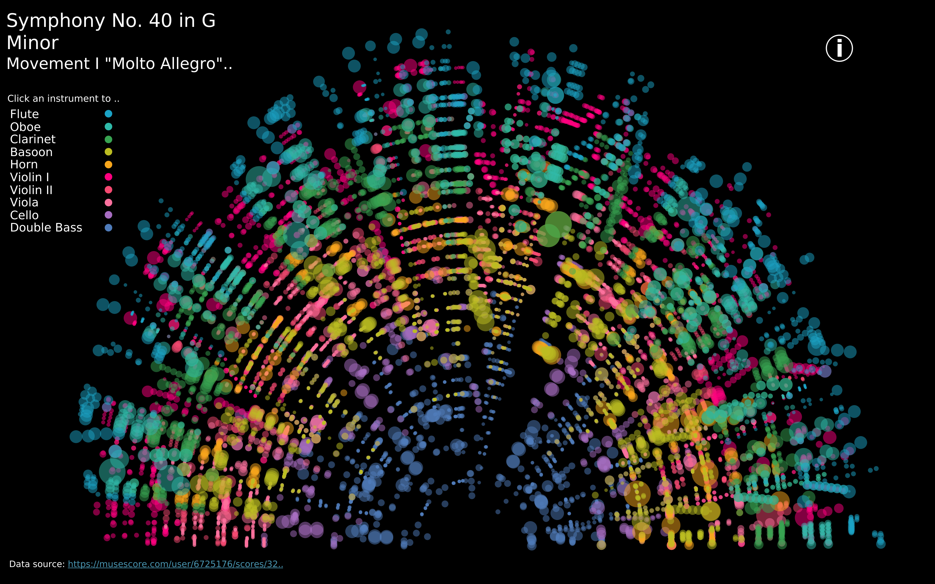
https://public.tableau.com/app/profile/louise.shorten/viz/BeautifulMusic/1_Mozart-SymphonyNo40
We live in such an information rich world that visualizations are everywhere. When we interact with our phones to get directions to our next location, we are met with a visualization that displays travel time, route, traffic, and other helpful data to help us choose how to navigate to our destination. This creates a data rich landscape that helps us understand more of what is going on in the world around us. Navigation and mapping visualizations have given us more efficient ways to commute, travel, and explore.
Other maps can be created using data that is not traditionally geographical. Pictured above is a visualization of Mozart’s Symphony 40 created by Louise Shorten using Tableau. This is basically a map of the sound. Different colors represent different instruments. The musical scale moves from the inside of the arc (lowest notes) to the outside of the arc (highest notes) with the size of each circle being the length of time each note is played. The song moves in time from left to right along the arc and each note has a position on that line. This type of visualization is very powerful because it allows us to interpret something we already interact with in a whole new way.
Click the link above to interact with this visualization.