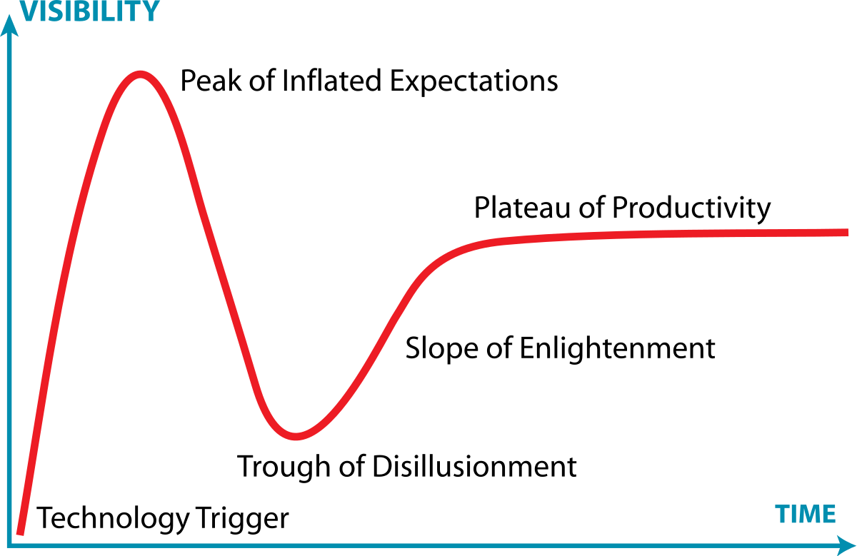
Infographics are visual representations of any information or data that can be displayed through images, charts, or icons. The goal of using these is to summarize or break down concepts more concisely. I researched examples of insightful data visualizations where I found Harvard’s Business review article that covers this topic. The article highlights the importance of storytelling through infographics to engage with observers efficiently. Examples about creating visualizations that are informative is included in the text. One of the topics spoke on the Gartner Hype Cycle, it is “traditionally data-driven form—a line chart—but no actual data” which is a graphical representation used in research to track data. It is done using complete visuals to analyze progression of technology (Harvard Business Review). The circumstances are very business based and are used in real life situations which I found very interesting.


Podcast: Play in new window | Download