By Shaun Sneddon
- Examples of insightful data visualizations:
- First example I found that very interesting because I do love Star Wars was a graph of all the characters (over 20,000) are connected.

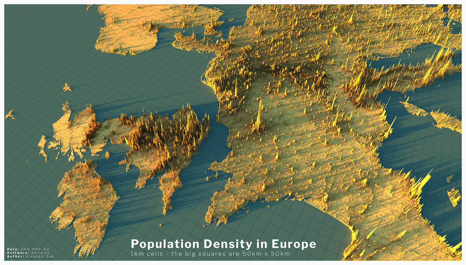
- The second example I found intriguing was a 3D data visual of where higher populations are located in Europe. When you look at a map of Europe you see the cities and can think that’s where a lot of people live but with this 3D visual you can see where people are vastly located.
- Example datasets for potential project use:
- Airline Safety
- Traffic accidents in a community
- Fatal Car accidents by country
- Stress at universities
- Tools that may help us construct Infographics:
- There is many websites that can help students construct Infographics such as Infogram, Adobe Express, and many more.
- Tools such as accessing data and images on the Internet.
- Website used for the images https://careerfoundry.com/en/blog/data-analytics/data-visualization-examples/
This is a great blog, Shaun. The picture you included in your first heading was very contrasted and I really enjoyed looking at all the colors in this post. The second heading was also interesting, and it appeared to be quite different from a traditional map. In the Infographic, I am curious to know what the figures represent. Infogram is an excellent tool for designing an Infograpihc. Another resource is Canva. You have access to a variety of templates, millions of photos, and even themes specific to the Infographic you are designing.