I have found that pivot tables are good ways to summarize a lot of data. I think they work particularly well with data that involves a large quantity of numbers. They are very useful because they are great visual and interactive ways for readers to conceptualize numbers within the data set and clearly see what is being portrayed in the overall data story.
Here are some great examples of pivot charts and why they are so helpful:
Example #1
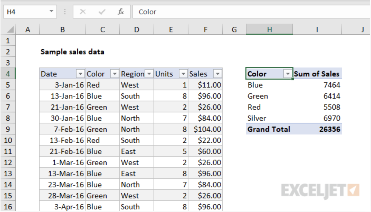
This is an example of a pivot table I got from a very helpful website that shows how to create great tables! On the left is their source data and on the right is their pivot table. It is much easier to see the data within the pivot table because it is much more condensed and only has the information that is important to the reader. Instead of being overwhelmed with numbers and data, it is way more digestible in this form.
Example #2
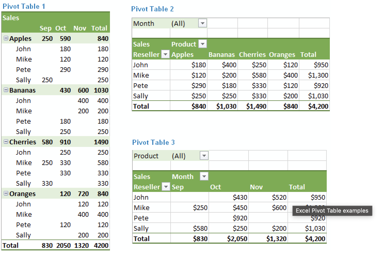
This next example also comes from a really helpful website to aid in creating pivot tables. What I really like about this particular example is that it highlights all the different ways the same information can be laid out. Excel does a really good job at offering the creator choices in layouts to make the creation of an effective pivot chart much easier. As seen here in this example, the layout of a pivot chart can really change the goals of what you want the chart to do.
All in all, I think pivot charts are great ways to display numerical information. There are plenty of websites to help in the aid of creating them and using tools like Excel also makes it very easy!