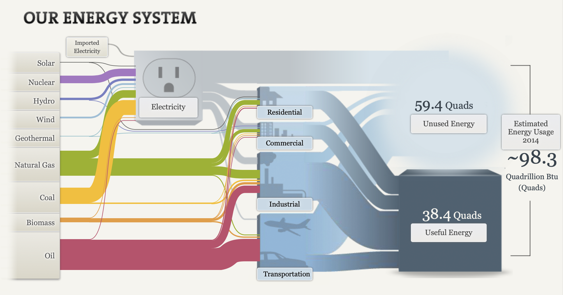
The picture above is an example of a snaky visualization. It is typically used to show the flow of the information being discussed. In this example, it is being used to show the flow of energy and how it is used.
Originally, I was extremely overwhelmed when looking at this chart. I had no idea where to look or where to start. After the initial shock, I just started reading from left to right like I would any other chart. I began clicking around on all the headings and reading what they said. I ended up finding this chart very helpful and interesting!
First, I really like the creativity behind it. It is about electricity and I could tell that right off the bat without actually reading anything on it. Second, I like that the information is hidden within the chart. I think it makes it look a lot more clean than it would if all the paragraphs were jumbled all over the screen. Lastly, I really like how it ties everything together. It starts out with the different kinds of ways we get electric and ends with how much we use.
Overall, while it can be a little overwhelming, I think it is a great way to show data because there are a lot of different facts that can be rolled up in one visualization that is easy to navigate.
Website: http://needtoknow.nas.edu/energy/interactive/our-energy-system/