by Robert Fox
The pie chart that I chose to make depicts the method of learning students were most interested in in the United States, in the year 2021.
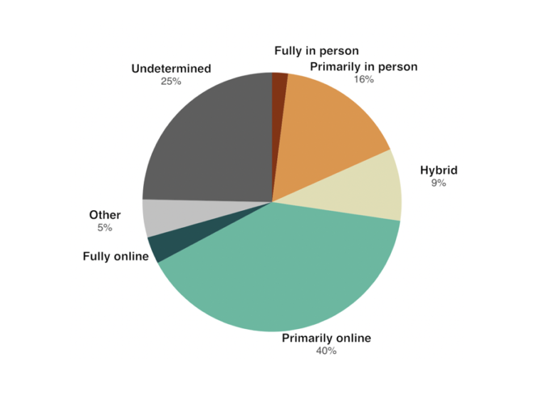
I believe this was a good example of data to use in a pie chart because it represents a part for the population out of the whole. In this specific example, the whole is the students who participated in this survey in the U.S and each part is filled with a certain percentage of those citizens based on how they entered said poverty.
As far as design choices I made for this chart, I chose to go with a bright with countered darker colors color in order to make the chart itself more eye catching to the audience. That and making sure each title in the figure had the data variable with it.