
I decided to use “Favorite Ice Cream Flavors” as my data set for this Pie Chart.
Why is this a “Perfect Case”?
Pie Charts are appropriate for parts-to-whole relationship data. Percentages and proportional data are great for pie charts. Here, I am showing vanilla, chocolate, and strawberry flavors. These are the three most popular ice cream flavors. When you take a count of how many people like each flavor, this is the normal outcome. The majority likes chocolate and vanilla flavor. The least amount of people like strawberry. This is the perfect case because it is showing a proportionate amount of data with a percentage and it is simple yet effective. I chose those colors for obvious reasons, they match the flavor of ice cream!
—————————————————————————-
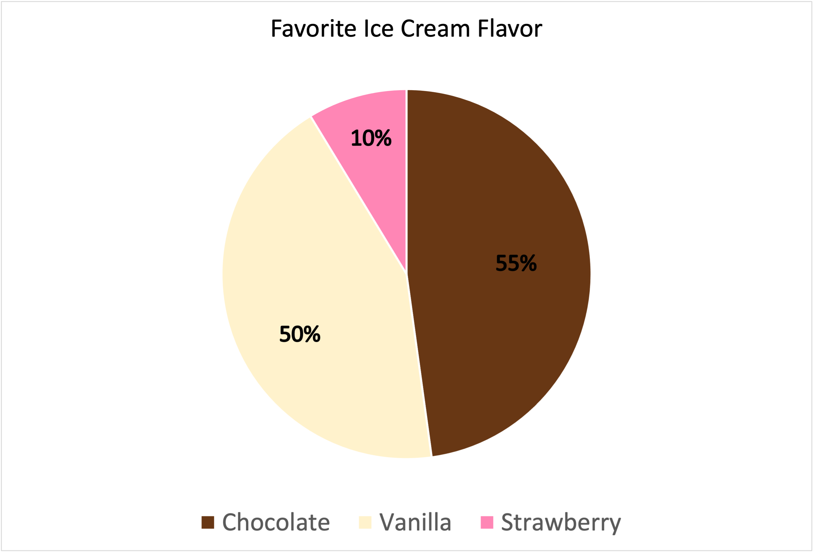
Data is based out of 115%.