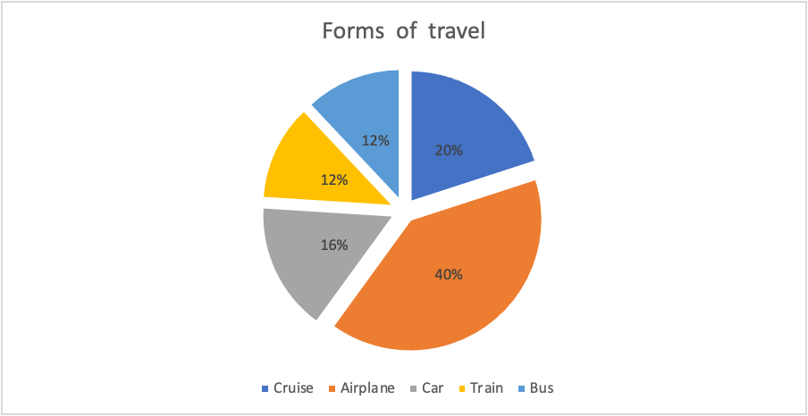
For my data set I chose to show people’s favorite ways of traveling for vacation. I think using a pie for this because it visually breaks up the surveyed population into sections. Doing this allows for someone to easily see which sections were more in favor.