I decided to create a pie chart based on the types of pools within the U.S.
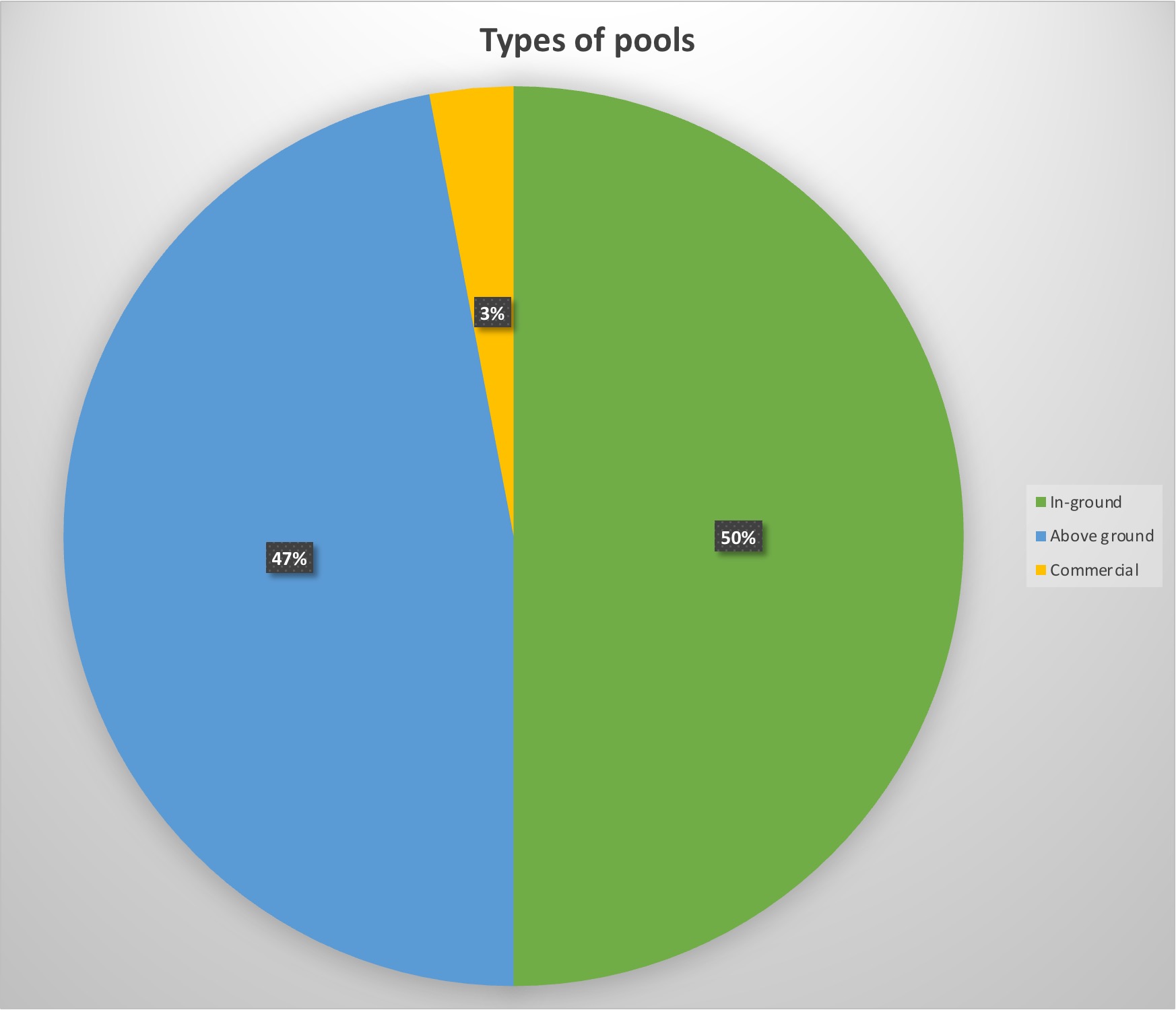
For my data, I decided to use data of the 10 million pools within the country to see what was America’s favorite set-up for their pool.
The reason this data is served best as a pie chart is the simple fact that percentages are perfect for pie charts. Not only do they look visually appealing, but they show exactly in visual terms what America prefers best, which looks split between above and in-ground pools. It’s a simple and visually pleasing way to show percentage data without being too complicated.
Pro-tips for creating a pie chart is to include the percentages within the graph. That way the reader does not have to search long for the data but instead focus on the graph data with ease.