When it comes to the decision on whether or not to use a lollipop chart or a regular bar chart there are some advantages that the lollipop graph has in it’s favor.
One of these advantages being that the columns of the lollipop chart are very skinny so when dealing with charts that use high value numbers it will make the chart more appealing to the reader compared to long thick bars.
This is an example of a lollipop chart used to represent the percentage of different streaming services used among the 34% of streaming viewers.
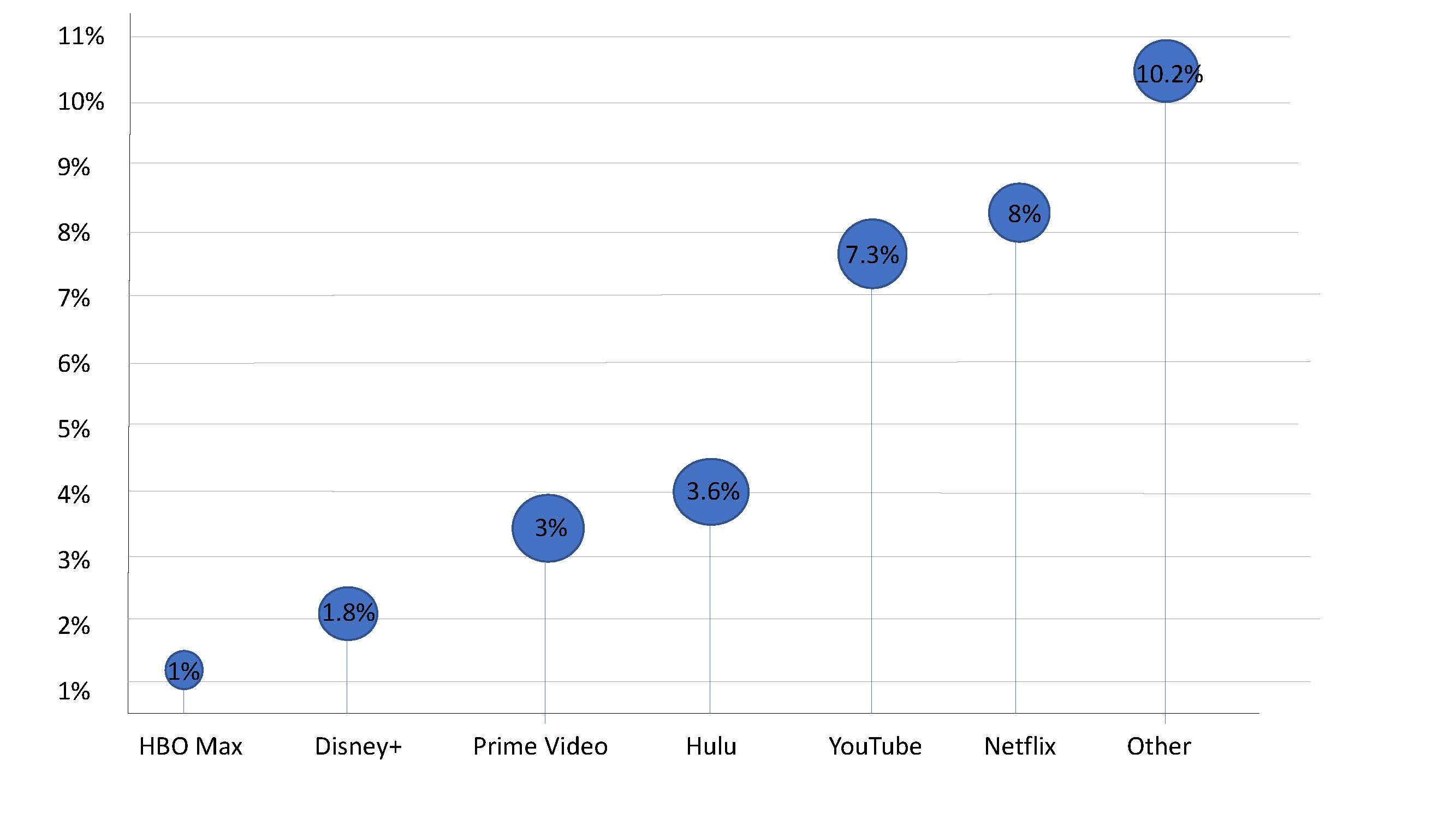
As you can see the stick of the lollipop chart takes up very little room and makes it easier to highlight the top of the lollipop that displays the exact percentages.
For more information on lollipop charts visit here.
I agree with your reasons on why to use a lollipop over a bar chart. The skinny lines take up much less space on the graph, and this makes the graph less cluttered and much more visually appealing. I like how you provided additional information about lollipop charts at the bottom in the form of a hyperlink. One suggestion would be to keep the dots above the lines all the same size. Other than that, great job!