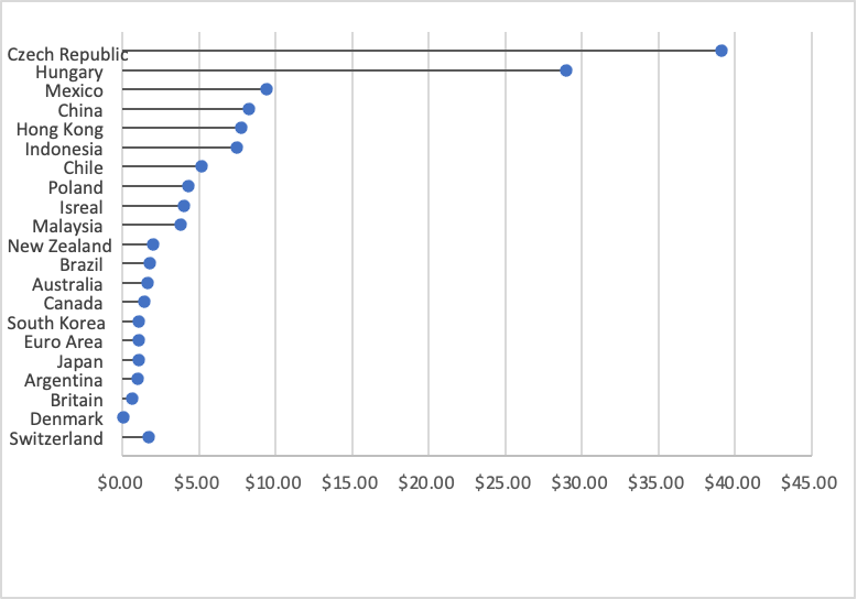
Lollipop Charts are a type of visualization that assist in a form of a scatterplot. This scatterplot involves comparing different variations of possibly something in the same category. For the scatterplot, I compared the prices of a BigMac all over the world, with U.S Conversions. Lollipop charts should be used when comparing similarities in data.
here is my data
Switzerland $1.70 Denmark $0.04 Britain $0.63 Argentina $1.00 Japan $1.06 Euro Area $1.07 South Korea $1.08 Canada $1.47 Australia $1.68 Brazil $1.79 New Zealand $2.01 Malaysia $3.80 Isreal $4.05 Poland $4.30 Chile $5.14 Indonesia $7.45 Hong Kong $7.79 China $8.28 Mexico $9.41 Hungary $29.00 Czech Republic $39.10
Hi!
I like that you compared BigMac prices around the world I think that was a cool choice of data. I also agree that this is helpful when comparing similarities
Hi, I thought it was very unique to use the data set of Big Mac prices around the world. It is something everyone can relate to. I agree that this should be used when comparing similarities within a data set.
I like how you prefaced the graph with noting the US conversion from each of the other currencies of the original country. I think it is interesting that Switzerland’s line seems to be out of order with the rest, going from largest to smallest. I wonder if it would be more impactful if that line was in between the next biggest and smallest in the series. Great graph though, and very interesting to see the huge differences internationally.