Lollipop charts can be both vertical and horizontal. This is similar to a scatterplot and a bar chart. It has both x and y values. Using a lollipop chart is good for when you have a large value of numbers and when your number values are high . These are usually used for high percentages such as test grades and more. You can use this chart when you are making a comparison between categories and/or items. It can also be used for ranking. You can use color for the categories and the length of the bar can measure the magnitude. The circle at the end of the line represents the end of the data value and matches up to the number on the y axis.
My example:
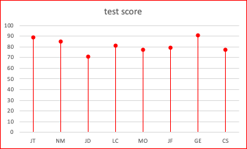
| Initials | Test Score |
| JT | 89 |
| NM | 85 |
| JD | 71 |
| LC | 81 |
| MO | 77 |
| JF | 79 |
| GE | 91 |
| CS | 77 |
I like that you mentioned this type of graph can be used for ranking. I agree with that and think it would be a good way to display a data set comparing similar things.