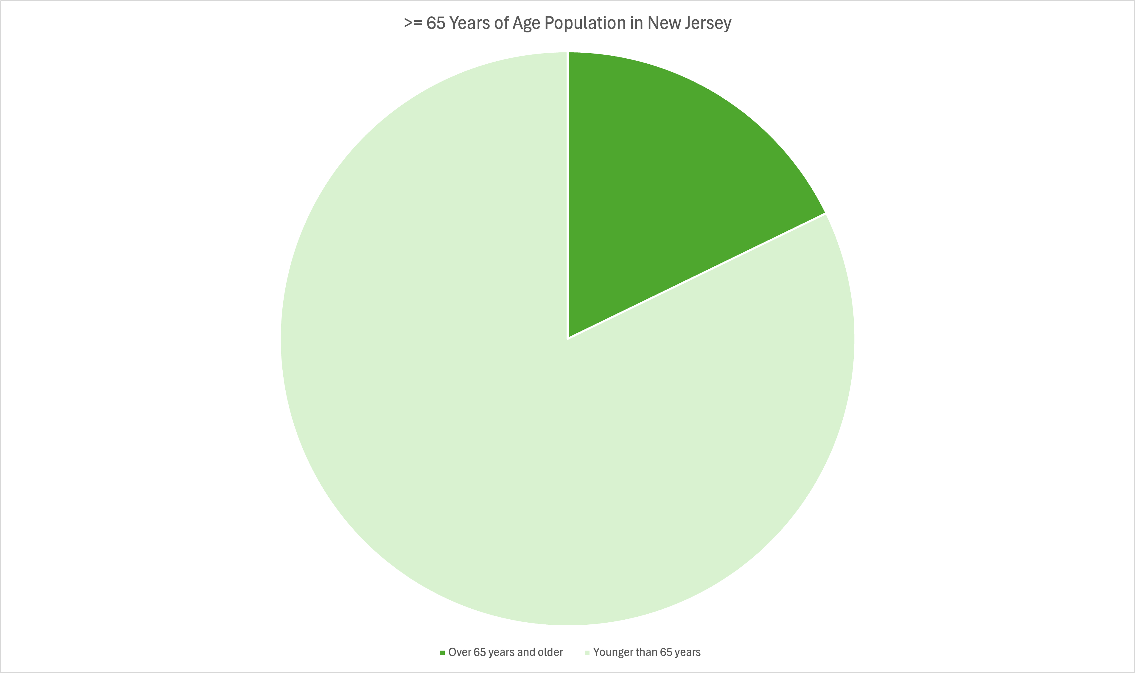
Pie Charts are a great way to show different pieces of a whole. In other words, as long as your data can be represented as 100% it can be represented as a Pie Graph. Pie Graphs are the easiest to understand at a glance and require little to no in depth explanation. When your data can be represented as 100% as a whole, the only reason where you wouldn’t use a pie graph is when most of the separate values are so similar that they can not be differentiated at a glance. In those cases the best graph to use would be a bar graph.