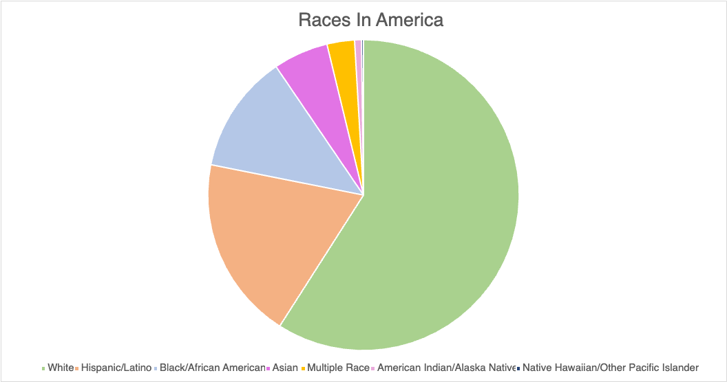
A pie chart can effectively illustrate the distribution of various racial groups in America by visually representing the percentage of each demographic. This graphical representation allows for a clear understanding of the diversity within the population, highlighting the proportions of different races in a manner that is easily digestible for the audience. Utilizing a pie chart not only enhances comprehension but also emphasizes the significance of each group in the broader societal context.

When constructing a pie chart to depict racial demographics, it is crucial to ensure that the data is accurate and sourced from reputable studies or census data. For instance, the U.S. Census Bureau provides comprehensive statistics that can be utilized to create a reliable chart. Additionally, incorporating color coding for each racial category can enhance the visual appeal and clarity of the chart, making it easier for the audience to differentiate between the various groups. It is also beneficial to include a legend that clearly labels each segment, as this aids in the immediate recognition of the data being presented.
In terms of design tips for creating an effective pie chart, simplicity is key. Avoid cluttering the chart with excessive text or overly complex designs that may distract from the data itself. Instead, focus on using contrasting colors that are visually distinct to represent each racial group, ensuring that the chart remains accessible to all viewers, including those with color vision deficiencies. Furthermore, consider incorporating a brief narrative or context alongside the chart to provide additional insights into the significance of the data, thereby enriching the viewer’s understanding and engagement with the information presented.
When deciding between a bar graph and a pie chart for data representation, one must consider the nature of the data and the specific insights one aims to convey. A bar graph is particularly advantageous when comparing discrete categories or groups, as it allows for a clear visual comparison of the values associated with each category. The length of the bars provides an immediate visual cue regarding the magnitude of each category, making it easier for the audience to discern differences in size and to identify trends across the data set. In contrast, pie charts are often less effective for this purpose, especially when there are numerous categories or when the differences between the values are subtle. The human eye is generally better at comparing lengths than angles or areas, which can lead to misinterpretation when using pie charts. Furthermore, bar graphs can accommodate a wider range of data types, including negative values, which pie charts cannot represent. This versatility makes bar graphs a more suitable choice for comprehensive data analysis. Despite using a pie chart for this data, I feel that a bar graph would better show the smaller values.