Lamar Miller
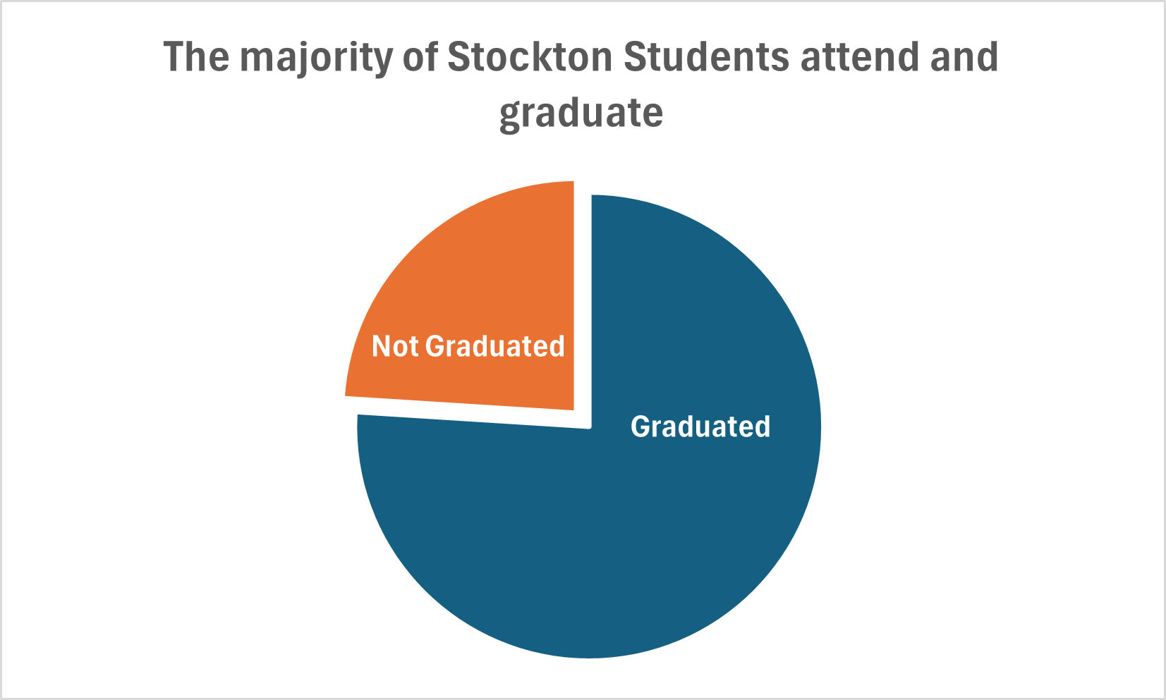
Here you will find data used to construct a simple pie chart with two data comparisons. The data I used was comparing Stockton University’s average student graduation rate vs those not graduated (out of 100% of students). It is discussed in our text that the best use cases for pie charts are when comparing a part to a whole. In addition, it is also recommended to begin the largest portion of data at 12 o’clock as most viewers begin there and view clockwise. It is recommended to use pie charts when we are showing four or less parts of a complete whole or 100%.
It’s stated in the text that most audiences relate well to circles as they are universally accepted as a whole. I believe this chart is the best example to display this data because we are simply comparing two parts of a whole. If we were comparing a larger data set, it may not be the best use case as viewers tend to have opportunity when viewing angles.
I believe Excel is sufficient to create this graphic and is easy to use for this particular example. The explosion option allows you to segment a part of the pie in order to highlight a particular piece of data and provide emphasis on the story you wish to tell.
