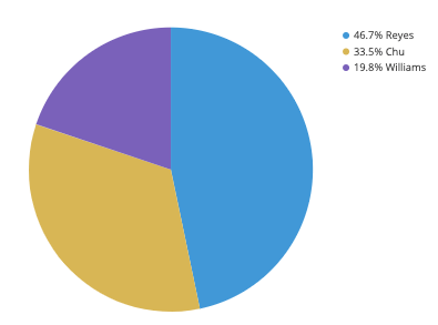
Pie Charts are a great way to visualize data and help convey a message to an audience about a certain dataset. Pie Charts show how a total amount is divided between levels of a categorical variable as a circle divided into slices. A Pie Chart Typically looks like the one below:
Pie Charts are very efficient and effective ways to communicate data, but there are some things you should avoid as well as things you should look out for when creating a pie chart.
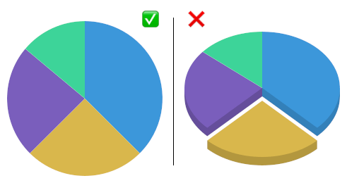
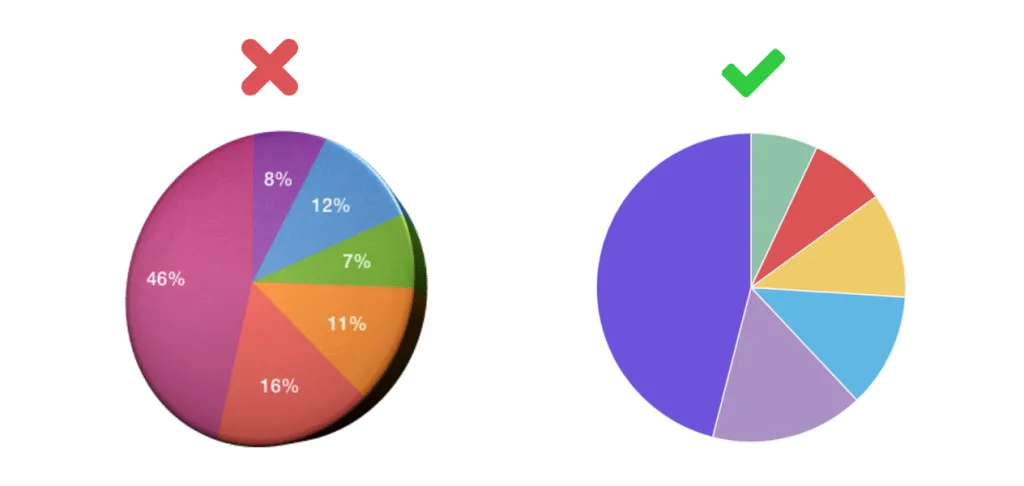
- Avoid distorting effects: Although it may seem beneficial to make a pie chart 3D, it actually can make the information more confusing and potentially skew the data so it becomes inaccurate. The most important thing is to make sure the chart is clear and there is no potential for inaccuracy.
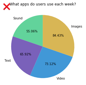
2. Ensure Data is Compatible: When making a pie chart, it must include a parts-to-whole comparison. The sum of the numbers, or percentages must add up to the whole, typically 100, with no more or no less.
3. Variety of Colors: To ensure that the data is clear, use a variety of colors for the slices and make sure that no too colors are similar.
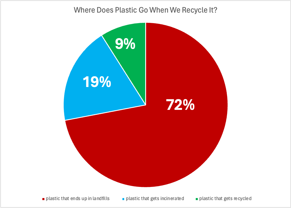
An example of the use of a pie chart is this one that I made to compare the different places where plastic goes after it is recycled by users in the US. I would argue that this is the perfect case for a pie chart, something that is easily understandable, applies to a wide audience of people, and ultimately conveys a message to the audience. This message is about our broken recycling system in the US. A pie chart is the best possible method for this particular dataset. I made sure to make the chart clear and concise and use a variety of colors. I also included a legend instead of writing it in the pie chart to make it even more easily understandable.
