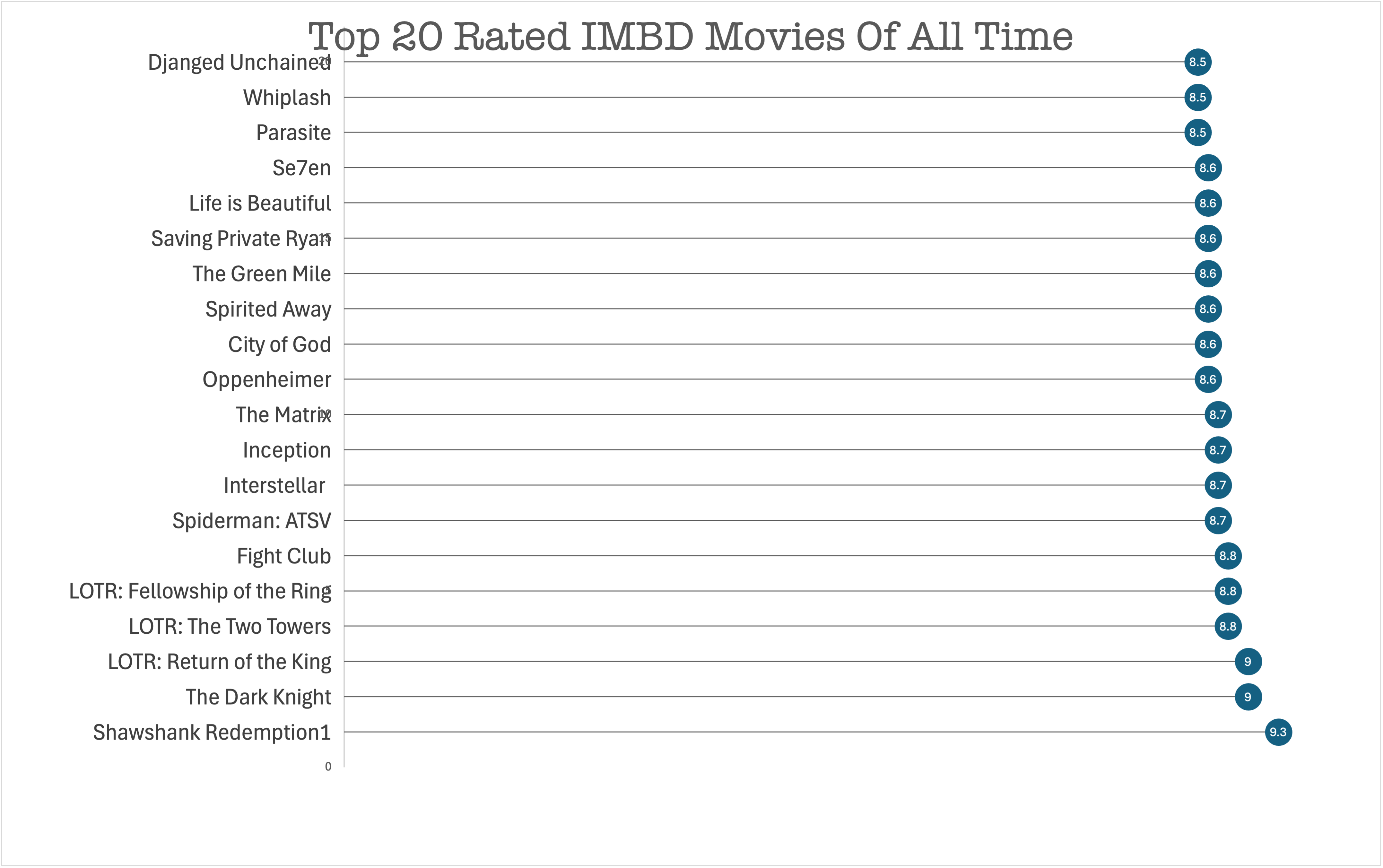
Lollipop charts are a type of bar chart that put a unique twist on your average column or bar chart. This type of chart is particularly useful for highlighting data points and their values and making it easily accessible for the reader to compare data. Lollipop charts are most useful when comparing data, emphasizing data points, and making aesthetically appealing graphs. Lollipop charts do the same job as bar graphs, however, they are more fun and highly the numerical values. I decided to make a lollipop chart in excel using a data set regarding the top 20 rated IMBD movies of all time. In this particular dataset the exact rating of these movies could be lost if the numerical data point isn’t clearly visible, therefore, a lollipop chart is perfect for higgling each individual rating.
I like the view from the horizontal angle as I have only been seeing the vertical charts while doing my research. I like how you specifies the top 20 all time so there is no confusion on time constraints or other movies that were not included.