What is a Lollipop Chart?
A lollipop chart is another way to make lengthy bar charts less visually overwhelming. It is very similar to your standard bar chart, just without the “extra ink.” Instead of using a solid bar, the data is visualized using a lollipop shape (a thin line with a circle on top). After all, the main focus in a bar chart is the endpoint. The lollipop chart allows viewers to easily digest the data by focusing in on the values.
Examples…
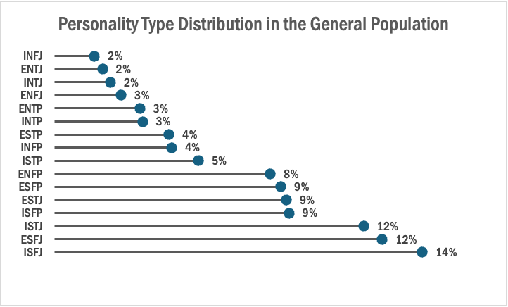
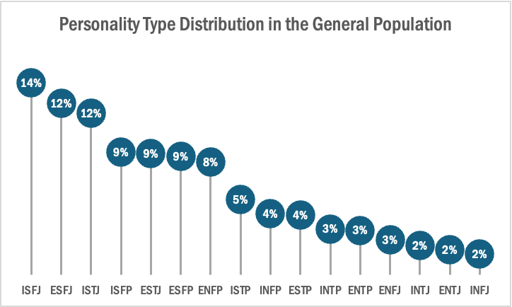
The two images above are examples of lollipop charts that I created. The data shows the percentage of each MBTI personality type within the general population. Lollipop charts can be both horizontal or vertical. The main point of the graph is to focus in on the endpoint values. I created my charts in Excel, and provided hyperlinks to my spreadsheet which includes my data and formatting. The vertical version was definitely easier to create. It only took a couple minutes, while the horizontal version had more steps and precise settings.
How to create a vertical lollipop chart:
- Insert a line graph with markers
- Delete the line
- Add Drop Lines
- Add data labels to center of markers
…and that’s it!
When to use a Lollipop Chart
A lollipop chart can be used for any kind of data that would work in a bar graph. It is simply an alternative that is more simplistic. Its “ink-friendly” design can impact readability of the data and lead to faster response times and greater accuracy (Gillan & Richman, 1994). It is especially useful when the visualization includes many data points that can become overpowering due to the solid bars.
I really like that you included instructions on how to make your own lollipop chart as well as that you included not only one but 2 charts. it can be very helpful for whoever is reading!
I like your example of a horizontal lollipop chart! I hadn’t even considered making one that wasn’t vertical. Putting the data near the lollipop itself is great, and skips having to check the other axis to find the data.