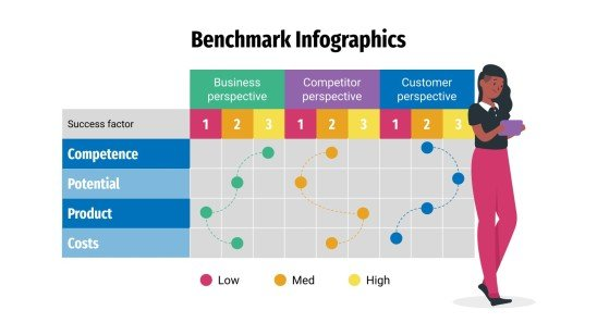
Visual components are used in comparison infographics to compare two or more objects, such as ideas or products. They may be a useful tool for assisting individuals in the comprehension of difficult facts and making reasonable choices. By comparing a company’s operations to other businesses’, benchmarking infographics can help find areas for growth. Benchmark graphs illustrate how various groups, like nations or businesses, perform against one another by comparing statistics. For example in the image shown below, benchmark comparisons assist in evaluating the performance and quality of products, goods, and industries as well. As shown below through a series of procedures and tests, you can find out if your system is operating at peak efficiency or whether there are issues that need to be fixed.
Infographics may be used in a variety of ways to display comparisons to a benchmark. Comparison infographics are frequently used by marketers when comparing a competitor’s product against their own. A great way to compare two items directly is by using comparison infographics. Utilizing a range of charts while choosing the appropriate chart and including visual features are some strategies for using infographics to display comparisons to a benchmark. To illustrate how a topic performs when compared to several groups, use a scatter plot with a solid benchmark line, a stacked bar chart, or a pie chart to compare portions of a whole. An infographic may display several kinds of information using a variety of chart formats. A table can be used to arrange information so that readers can look it up, or a numbered list can be used to indicate rank or order. Infographics demonstrate relationships between data, procedures, or individuals through the use of visual components.
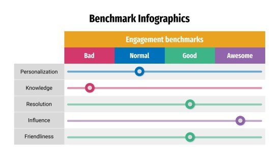
Hello! I enjoyed the visuals you used for your post, they are not your typical line graphs that are used for benchmark comparisons so I thought it was interesting that you went a different route graphing wise. However, I do feel that your standard benchmark graph should be shown as an example to better the viewer’s understanding. What is the purpose of the second example you provided? I suggest replacing that second example with your standard benchmark graph. Other than that, great post!
Eusticem, I thoroughly enjoyed reading your blog post about Benchmark Comparisons. Both visuals you included are very engaging, and I like how they had a similar look. The graphs were easy to digest, although I am confused about what the benchmark is in both visuals. It is unclear what the data is being compared to. I would recommend using a different graph to display benchmark data. In your post you wrote about “scatter plots with a solid benchmark line, a stacked bar chart, or a pie chart to compare portions of a whole,” so I would suggest using one of those charts in your blog post instead. Also, a hyperlink with more resources about the topic would be useful to readers who would like to learn more about the topic. Thank you for the very informative post!