Examples of Insightful Data Visualizations that Compare Numbers
Data visualizations can be a great tool to use when comparing numbers. Comparing numbers can show many different stories, including the following examples:
“Option A is better than Option B”
“Posttest scores are higher than pretest scores in almost all subject areas”
“Group F and Group G disagree on five of the eight measures”
“There were no differences between the treatment and control groups”
“Youth rates are significantly lower than adult rates”
“We have equal participation from boys and girls with the exception of girls ages 10 to 13”
“All sites increased performance, but Site L did so at a faster rate than other sites”
“The performance of Class L is in contrast to Class K”
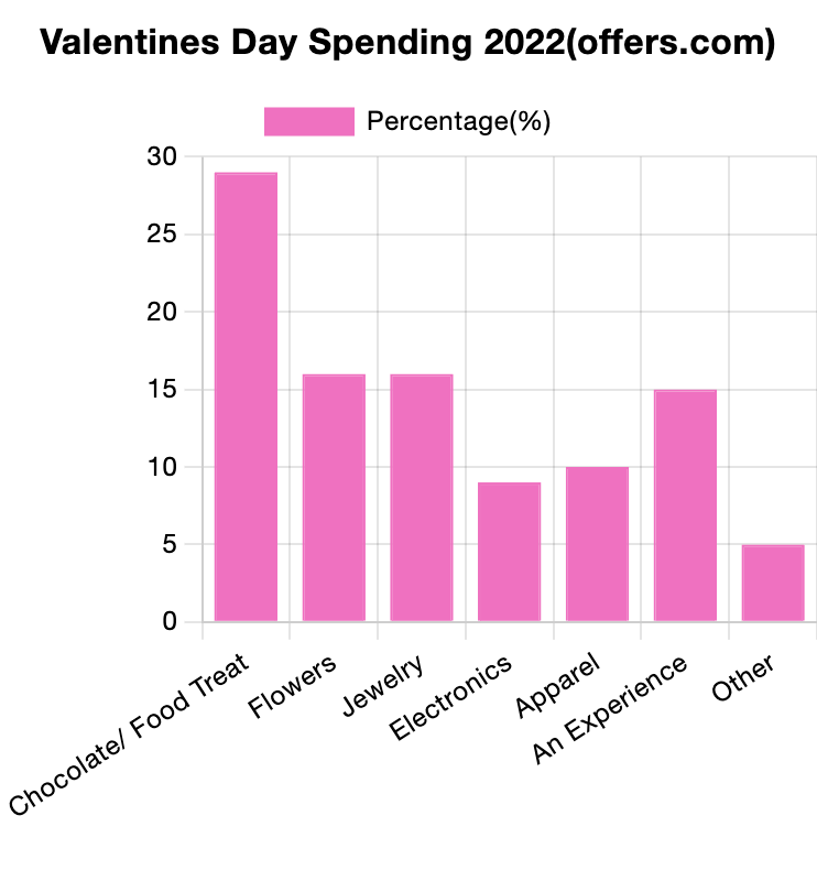
Results such as these can be shown in various types of charts. Below are some examples of insightful data visualization that compare numbers.
- Pie Chart

2. Bar Chart
3. Histogram

4. Line Chart

5. Doughnut Chart

6. Overlapping Area Chart
