This week in Chapter 3 of Effective Data Visualization we learn about how two or more numbers are alike or different. There are several ways to visualize comparisons between two numbers, as well as multiple, which is very important when choosing your visualization. The main question we have to answer is why Option A is better than Option B.
Bar Charts

Bar charts are an extremely popular option, but its ability to convey data works best when comparing just two things. Any more can become difficult to interpret because it is challenging to compare the lengths of nonadjacent columns. The textbook also explains how it helps to have some extra white space between each set of clustered columns. The data visualization shown above is very insightful because you can easily digest the information comparing profits and discounts between products. The colors are distinguishable from one another and the columns are grouped so the viewer can easily decipher between products 1-6. The creator also included data labels above each column which makes it easy to tell the definitive amount and compare the numbers.
Dumbbell Dot Plot
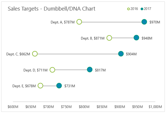
Dumbbell Dot Plots are similar to standard dot plot graphs. The only difference is a line between two dots to emphasize growth between points. The example above is a great data visualization of sales targets for the years 2016 and 2017. The use of empty dots to represent the previous year versus the filled in dot for the more current year is easy to comprehend before really analyzing the data. The line draws your attention from left to right and its length makes it easy to compare the growth between each department. Department C clearly had the most growth within a year, and the data points at the end of each dot helps solidify the viewer’s observation. I believe it is important to have a thin and simple line like above so the chart does not appear too cluttered. I was not aware of dumbbell dot plots until reading Chapter 3 this week, but they have definitely become one of my favorites.
This site provides more valuable insights on how to choose the right data visualization.