Data visualization is a powerful way to compare numbers and identify trends. There are so many different ways in which to do this. You can use Bar Graphs, Pie charts, Donut Graph, even line graph. It is important to FIRST thing about what exactly you’re comparing. If you’re trying to compare a significant amount of data maybe a Bar Graph is best so it doesn’t come off too congested. If you only have say 3 or 4 values to compare maybe a Pie or Donut Graph would be the way to go. If you are displaying data density change in data over a specific time a line graph might be best used.

It is SUPER important to always make sure you are presenting your numbers with clarity though. Adding in the use of colors and labels can make a big difference to the human eye and mind in deciphering what item is represented by what value. The legend on the side of the bar graph for example clearly uses “green for boys” and “yellow for girls” when comparing their hobbies versus the percentages.
check out this link below for a more thorough breakdown on data visualizations and which ones are best used for comparing certain types of data and numbers.
18 Best Types of Charts and Graphs for Data Visualization [+ Guide] (hubspot.com)
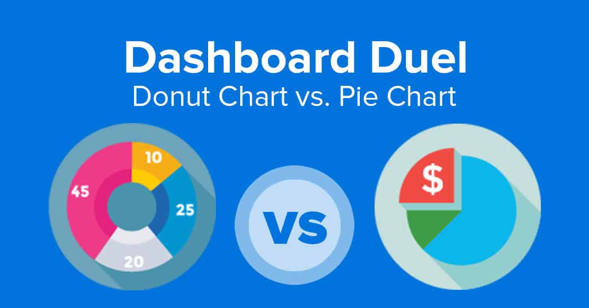
The dashboard Dual visual is very cool. Did you create it yourself? If so, what software did you use?