After visiting vizhealth.org I found a new perspective on how we can use scientific data to communicate health concerns to an audience. The website offers a pretty cool but limited interactive experience through their risk calculator. While it states that the risk assessment is only an estimation and shouldn’t be used for medical diagnosis it can certainly help bring to light a potential risk that maybe people didn’t realize was even a risk. I took some time and ran my own risk calculation and while I wasn’t expecting to be at risk a little reassurance never hurt anyone.
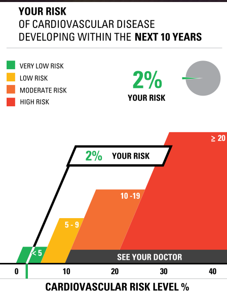
I think that this site is valuable to learning data visualizations. As it shows how a short questionnaire that requires the viewer to interact with then converts into a visual that is simple and easy for a person who has no medical background to understand. It also has an array generator that allows you to create your own. I took some time and created my own.