Pie charts are a form of data visualization that can be used to compare part-to-whole relationships. They are circular graphs illustrated through different proportions of categories within a whole. It is commonly and best used for percentages because it all adds up to 100%. It makes it easier to understand this way because each segment in the pie chart represents the percentage of the whole that each category represents. However, not all data is best represented through a pie chart.
Pie charts work best with minimal components due to the risk of overcrowding. So, if the data has too many points, it becomes challenging to read. In this case, bar charts might be a better fit. Pie charts are also not made to compare more than one data set and do not work well when comparing small differences. Anything that can not be broken down into minimal slices and easy to distinguish, is not meant to be represented by a pie chart.
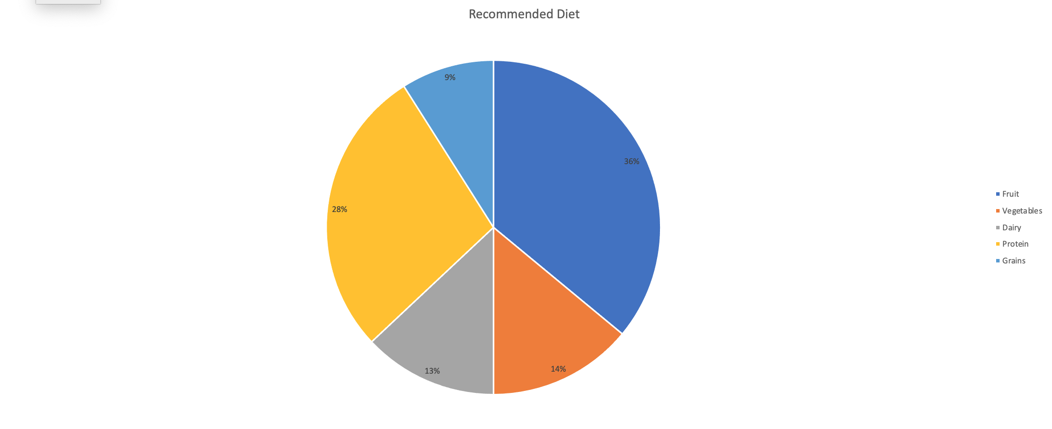
An example of a good data set to be represented by a pie chart would be a recommended diet plan divided into sections. I made myself a diet plan to balance out what food groups should be ingested more than others. In the chart, you can clearly see that fruits, vegetables, and protein are the main components that I need to have compared to dairy and grains. All percentages create a whole and each slice is representative of the whole.