By Joseph
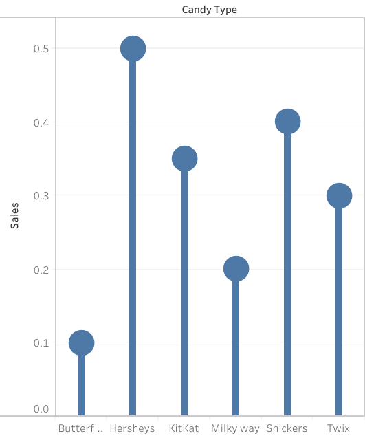
A lollipop chart is a great way to portray large number values in the form of percentages in a simple and easily understandable way. As you can see by the chart above, the data shows the candy type and the percentage of sales generated by the company. Simply by looking at the chart and using the lollipop visualization, one can tell which values are higher and which ones are lower. Much like a bar graph, a lollipop chart is very straightforward in the data that it is representing, there is not a correlation between data points to be determined nor is there significant distribution between the information given. However, one aspect that can be said to be better than a bar graph would be the fact that a lollipop chart is more efficient when it comes to avoiding a cluttered appearance as a result of many data points. Often times, a data graph can look cluttered as a result of too many data points being represented. Furthermore, a lollipop chart can be somewhat inaccurate without the percentage values being included withing the circles at the tip of the line. As shown by the graph, it is somewhat difficult to tell where the value ends with the circles and what value it represents. With that being said, there will always be pros and cons regardless of what chart one decides to use in order to represent data. A lollipop chart is also a great way to be catch the readers attention with its set of tall columns that are evenly spaced out, but it could also be seen as an inefficient method to portray data trends or comparisons. It is up to the individual to decide what kind of visualization is best for the data that they want to portray.
Being able to see tell which values are higher and which ones are lower are the best benefit from a lollipop chart. I agree with your comparison, like a bar graph, a lollipop chart is very straightforward. This visualiztion makes it concise and easy to understand. I also really like that your data points are so large.
Good post Joseph, I agree with your criticisms of lollipop charts. Good discretion about the data is definitely an important factor in when you should or should not use a this chart type over a traditional bar. I love the fact that you went above and beyond to make your lollipop chart vertical, but the one criticism I have is that your lines are the same color as the data points. Visually this draws my eyes to the (unimportant) bars and clutters the graph.