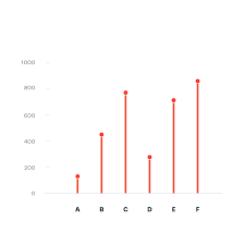
There are many forms in which data can be presented, such as a column chart or a bar chart, but what happens when there is a wide range of percentage rates, such as 90%? It is often the case that data can be visually distasteful when it is aggressive or overstimulating, and this is when the Lollipop chart is recommended and is visually pleasing. An axis is connected to a dot when the value sits on a stick.
By Analytics Vidhya, Lollipop charts are used for comparing different categories within a category. As a result of this chart, a well-organized comparison between classes can be seen. Here is an example of how a Lollipop chart can look. You can see the unique visualization that differentiates it from other charts by the small circles above the lines. When examining relationships, distributions, etc., this type of chart may not be the best option. Also, it does not work with all data as I discovered when I searched for a data set that would look visually appealing with a Lollipop chart. If you do not have the correct data, your Lollipop chart will not be accurate.

With data from the United States Census, I constructed a Lollipop chart that measured the effectiveness of changing business conditions during COVID-19 using the Small Business Pulse Survey. I selected 10 cities and calculated the percentage of businesses affected by the Corona VIrus Pandemic. As you can see in this visualization below, with the 10 cities I selected, I created a Lollipop chart. Choosing more cities in the data center would have made labeling more complex. I would have had to play around with the numbers and ensure they matched the bar that represented them. As well, it is also imperative to consider what tool you are using to create this chart. Excel will you a more complex method than if you go to a reputable website and follow the steps there.