Lollipop charts are flexible tools for comparing data, ranking items, showing distributions, tracking changes, and highlighting outliers. They are great for revealing the order and values of data points. Lollipop charts work well when you want to focus on individual data points or unusual values, serving as a handy alternative to regular bar charts with clear data labels. Lollipop charts should be used when you want to emphasize individual data points or highlight specific values in a clear and simple manner, they are especially effective for showing comparisons between a small number of data points.
Here are some other examples of charts –
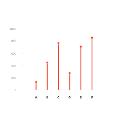

For the lollipop chart I constructed, I choose to use excell since its the eastest and most effectice tool I know how to access and use. For the data set I used a website called https://generatedata.com/, this is where I can get all my random data sets from.

Hey Tyler!
I enjoyed your post on lollipop charts and their versatility in data visualization. It’s great to see you utilizing Excel to create these charts, as it’s a widely accessible tool for many.
I have a question for you: When working with lollipop charts to highlight specific data points, have you encountered any challenges or considerations related to data labeling? How do you ensure that the labels are both informative and visually appealing, especially when dealing with a large dataset?
I’d like to offer a suggestion for enhancing your use of lollipop charts. Since you’ve mentioned using the generatedata.com website for random datasets, it would be interesting to explore other data sources or tools that offer real-world data relevant to specific industries or topics. Incorporating such data into your lollipop charts could provide a more practical and informative perspective, making your visualizations even more compelling.
You might find the “Gapminder” dataset (https://www.gapminder.org/data/) useful as a significant complement to your topic. It offers a diverse set of socioeconomic and environmental data from across the world, which may be used to generate lollipop charts that show noteworthy trends or outliers.
Tyler, you did an excellent job in your data post and explained what a Lollipop chart is used for and how it differs from a bar graph or scatter plot. Further, I read that they can be used when displaying high numbers. Thank you for indicating where you obtained your data, I had difficulty finding a smaller amount of data without so many columns.